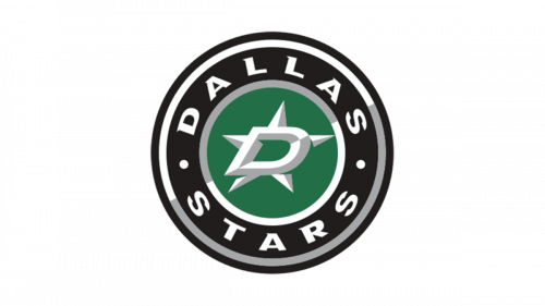
Dallas Stars Logo
Hockey club Dallas Stars from the city of Dallas (Texas, USA) was founded in 1967. This name has been used since 1993. The decisive factor, thanks to which the League gave the “go-ahead” for the club from Minnesota to join it during the expansion was the fact that even then hockey traditions and public interest were strong in this state, like nowhere else in America. In comparison to other cities, residents of the coldest state in the United States literally raved about hockey.
Meaning and History
When in 1967 the leadership of the NHL decided to expand the league, they could not ignore Minnesota, the state that has the largest number of excellent hockey players. The new Minnesota North Stars, as the team was initially called, played their first game in 1967 against the California Seals and won 3-1. Among other proposed names, the “North Stars”, which was the romantic nickname of the state of Minnesota – “North Star State” was recognized as the best option.
What is Dallas Stars?
Hockey would be missing a lot if it was not for the Dallas Stars. Although in 1981 the Stars finally made it to the Stanley Cup Finals, the New York Islanders turned out to be a stronger team and won the game. Nonetheless, this team has a lot of games to be proud of.
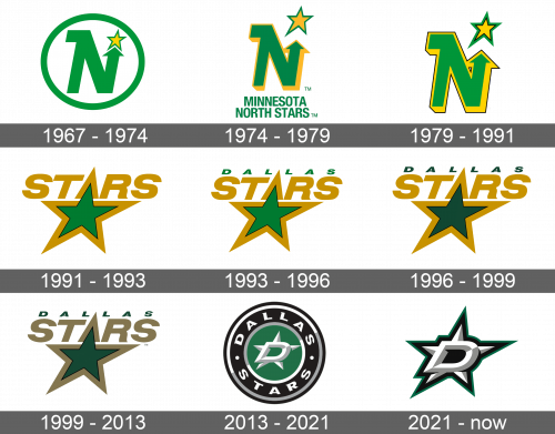
1967 – 1974
An “N” for North and a star that was right at the top of the upper end of the letter stood for “Stars”. The letter was done in green color and one of its ends was done in the form of an arrow on top of which a yellow star with a thin green border was drawn. The letter was placed into a white circle with a green border. Under the medallion, it said the full name of the team in capital green letters.
1974 – 1979
Although there was no more border around the “N”, it was still the key element of the logo as now it had a bright yellow color that gave it a 3D look. The star got bigger and had a different shape. There was also more space between the letter and the star. The name under the letter was not changed in any way.
1979 – 1991
The shape and the color of the letter and the star stayed the same, but there was one detail that made them look different. it was a thin black border around the green and yellow edges of the letter as well as inside the star. This small accent line made a big difference. Another change was the removal of the full name.
1991 – 1993
A new logo design featured a big green star. It had a thin black border, which was followed by a thicker golden one. The word “Stars” was written in the same gold color using a simple font. The star was positioned in such a way that one of its ends was the center of the word and stood for “A”, which peaked above the other letters.
1993 – 1996
The team’s new location was added above the “Stars”. It had the same width as the other word, so the letters were significantly smaller, but also all uppercase. “Dallas” was done in green that match the inside of the star. The gold color was changed to brown, while a black border around the star got thinner.
1996 – 1999
The star, which was the center of the emblem, got a little update. A dark green color was used for the inside of the star as well as the location of the team. Otherwise, the logo was kept exactly the same.
1999 – 2013
There was not much change to the logo as time has passed. The only difference, which was hard to even notice right away, was a use of a lighter shade of brown for the name and border around the star. The green also got just a tidbit lighter.
2013 – 2021
The green color and the star were the only things that were brought from the previous versions. The star, though, looked completely different as it now served as a background for a large 3D letter “D”, which was done using white and light gray and had a black center. The star was done in the same style as the letter. It had a wide black outline followed by a thinner dark green one.
2021 – Today
A slight revision was done in 2021. The changes went only as far as the colors. Actually, the team had only the green border being changed to a lighter shade of the same color.
