Detroit Red Wings Logo
The NHL is one of the oldest and most authoritative hockey leagues, which continues to attract the attention of a huge army of hockey fans from all over the world. Over the long history of its existence, it has gathered many outstanding clubs with talented players. The Detroit Red Wings continue to maintain their reputation as one of the most successful franchises in the hockey league. Besides their numerous achievements and titles, fans remember the Detroit Red Wings from the late 90s, when the legendary “Russian Five” played for the team.
Meaning and history
The club was organized in 1926 and during this time managed to participate in the final matches over 20 times and win 11 Stanley Cups. The Red Wings also boast six Presidential Cups. To say that Jack Adams led the Detroit Red Wings to glory is an understatement. Although he had a filthy character, Adams actually created this team. Having completed his playing career, he almost immediately received an offer to head the Detroit Cougars, which had recently appeared in the NHL. During the early games, things were not going well, and the new name of the team, Falcons, did not help. However, the purchase of the team by James Norris in 1932 led not only to its renaming to “Red Wings” (James was inspired by the Winged Wheelers club he played for when naming the team), but also to a significant increase in the budget. During his 36 years as general manager, Adams won seven Stanley Cups with the club.
What is Detroit Red Wings?
A highly professional team of experienced hockey players, the Detroit Red Wings are the most famous and successful franchise in the NHL. Fans and sportswriters refer to the Detroit area as “Hockeytown”, a registered brand associated with the franchise since 1996. Al the Octopus is the only non-costume mascot of an NHL franchise. The mascot is named after arena manager and pouring machine driver Al Sobotka.
1926 – 1927
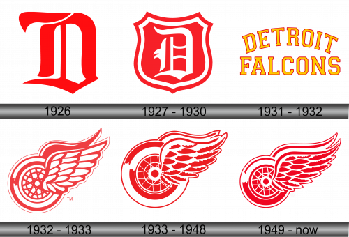
Around a century ago, the Detroit Red Wings logo did not have wings at all. It was just the letter “D” printed using a sophisticated Gothic style font. The red color added a touch of boldness and power. The lack of wings is understandable because the team did not have “Wings” as part of its name yet.
1927 – 1930
The Gothic monogram was slightly redone and placed on a shield base. The color palette stayed the same – red and white, but the letter here is done in white. The logo style and feel have not changed much. However, this version looks more solid and grand. It was easier to use in different cases.
1931 – 1932
The update was prompted by the name change. The design was simple and straightforward, featuring the name printed in two lines. The color palette now featured an energetic yellow as the main color. The red was simply framing each letter. the designers chose a geometric bold font with slab serifs and all uppercase characters to give the logo a bit more weight and fortitude. The arching top line added dynamics.
1932 – 1933
In 1932, the Detroit Red Wings welcomed a fresh proprietor – James Norris. With the acquisition of the sports entity, he promptly revamped its branding. The subsequent emblem, designed from the ground up, bore no resemblance to the preceding insignias. The design, while evocative of a dream catcher, predominantly represented an automobile wheel, paying homage to Detroit’s flourishing car manufacturing era. Eager to encapsulate the city’s automotive heartbeat, the graphic artists seamlessly integrated this with the team’s moniker by affixing wings to the wheel. One wing prominently sprawled forward, adorned with white feathers accentuated by red tracings. Conversely, the other wing, positioned behind, was subtly depicted without intricate detailing. The chosen palette was primarily red and white, with the former emphasizing the logo’s contours.
1933 – 1934
This version introduced the wings the club is recognized for. They were placed on a wheel that appeared to be spinning thanks to the red and white lines with uneven ends around its perimeter. The wings themselves were white with red feathers and outline. They had a relatively short shape, placed on either side of the wheel, so one wing was peaking behind the other. This logo turned out powerful, dynamic, and energetic. Its impressive design was used by the club for close to a century without any major changes.
1933 – 1948
The red color turned burgundy. Although the small details have been tweaked a bit, there were no major noticeable updates to the design. At the same time, the new color shade gave the logo a more sophisticated and majestic look, evoking a sense of respect and admiration.
1949 – Today
The bright red color was brought back, but it was not what caught the attention. The wings were elongated and stretched out upwards, making them a more prominent feature of the logo and creating an impression that the wheel is truly flying. Although the number of feathers has not changed, they are placed more closely and have slightly changed their shape to go with the new design. The red lines that gave the wheel that feeling of motion were redrawn, so one almost filled the white space while the other got very thin. This enhanced the dynamics and gave the logo a little more force.
Font and Color
Although there was a short period during which the yellow color was dominant, it is the red and white color palette that the team is recognized for. While white serves as a neutral base that adds a touch of perfection and creates a nice contrast, red is the color of power and strength. It grabs attention and is often used in sports. This color can convey excitement, energy, passion, courage, and action.
The earlier logo versions featured sophisticated and stylish Gothic fonts that gave the logo a grand and impressive appearance. Later, they used a completely different geometric font that was meant to reflect the strength and confidence of the players. Since 1933, the logos do not have any inscriptions.


