Skittles Logo
Skittles are chewy sweets that are loved in many countries. Multi-colored candies are covered with sugar, the color of which depends on the taste of each individual candy. Red packaging contains chewy sweets with a taste of lime, currants, and strawberries, the purple has cherry, watermelon, and mango tasting candies, while the green packaging has tangerine, apple, and pineapple. advertising is built on the image of a rainbow, which is quite appropriate for such a variety of tastes.
Meaning and History
![]()
The first Skittles were made in Britain in 1974. Their creators were inspired by the ideas of “M&M”, having come up with an original version of colorful sweets. Instead of chocolate filling, they added fruit jelly with sweet and sour tastes. Like “M&M”, “Skittles” contains a branded inscription with the letter “S” on each candy. In 2000, sour-flavored sweets appeared and two years later, Skittles Bubble Gum, which is popular today, was introduced. In 2006, the company released a limited edition of Skittles-Xtreme fruit candies, and in 2009 Skittles for vegetarians appeared. Today, the sweets are produced by Wrigley Company, a division of Mars, Inc.
What is Skittle?
For more than 40 years, the popular Skittles brand thrills children and adults all over the world with wonderful sweets with the taste of berries and fruits. The assortment of the brand has been updated every five years, constantly developing and improving.
1974 – 1981
![]()
Originally, the logo was quite boring considering the bright colors of the candies the brand was making. A light gray color is used for the name with only the first letter being capitalized. The inscription had straight, clean lines and a geometric feel. There was one bright detail in the logo, which was a bright yellow dot above the “i” that looked like candy.
1981 – 1982
![]()
The Skittles logo, designed for the brand in 1981, featured a white diagonally-oriented inscription in a heavy geometric sans-serif typeface with the lowercase characters having distinctive contours and straight cuts of the lines. The lettering was accompanied by numerous candies drawn at the bottom of the banner, and different fruits above the wordmark, which symbolized the flavors of Skittles candies.
1982 – 2003
![]()
The font looked very similar to the one used originally, although the letters looked thicker and closer spaced apart. The name was white with a thin red outline. It was placed at a slight diagonal with a small cloud instead of the dot above the “i”. Four lines were coming out of the cloud and creating a rainbow behind the name. In addition, it said “Bite size candies” in small, uppercase letters right under the name.
2003 – 2007
![]()
The updated version looked very similar to the previous one. The name of the brand was written, though, at a slightly different angle. It had a shadow that gave all the letters a 3D appearance. There was no more cloud and a colorful rainbow had a gradient rather than individual lines. it was a good representation of the various tastes of candies. The company kept a small “Bite size candies” inscription under the name, but gave it a red color and used a cursive, handwritten style of a typeface.
2007 – 2011
![]()
The redesign of 2007 introduced a Skittles badge, with a composition, similar to the logo from the 1980s. Although, the lettering got a bit refined, and the color of the background was changed from red to gradient purple. The bright smooth rainbow was now set above the inscription, decorated by colorful Skittles drops.
2011 – 2012
![]()
In 2011 the logo of the Skittles brand was modernized and rightened up. All elements of the badge, including the stripes of the rainbow, got outlined in black, with the wide rainbow, overlapped by a diagonally-oriented wordmark, and placed against a white background.
2012
![]()
The logo, used by the Skittles brand in 2012 featured a bold white diagonally-oriented arched wordmark in a heavy sans-serif font, placed against a red background and accompanied by the ornaments of Skittles stage along the top and bottom borders of the banner.
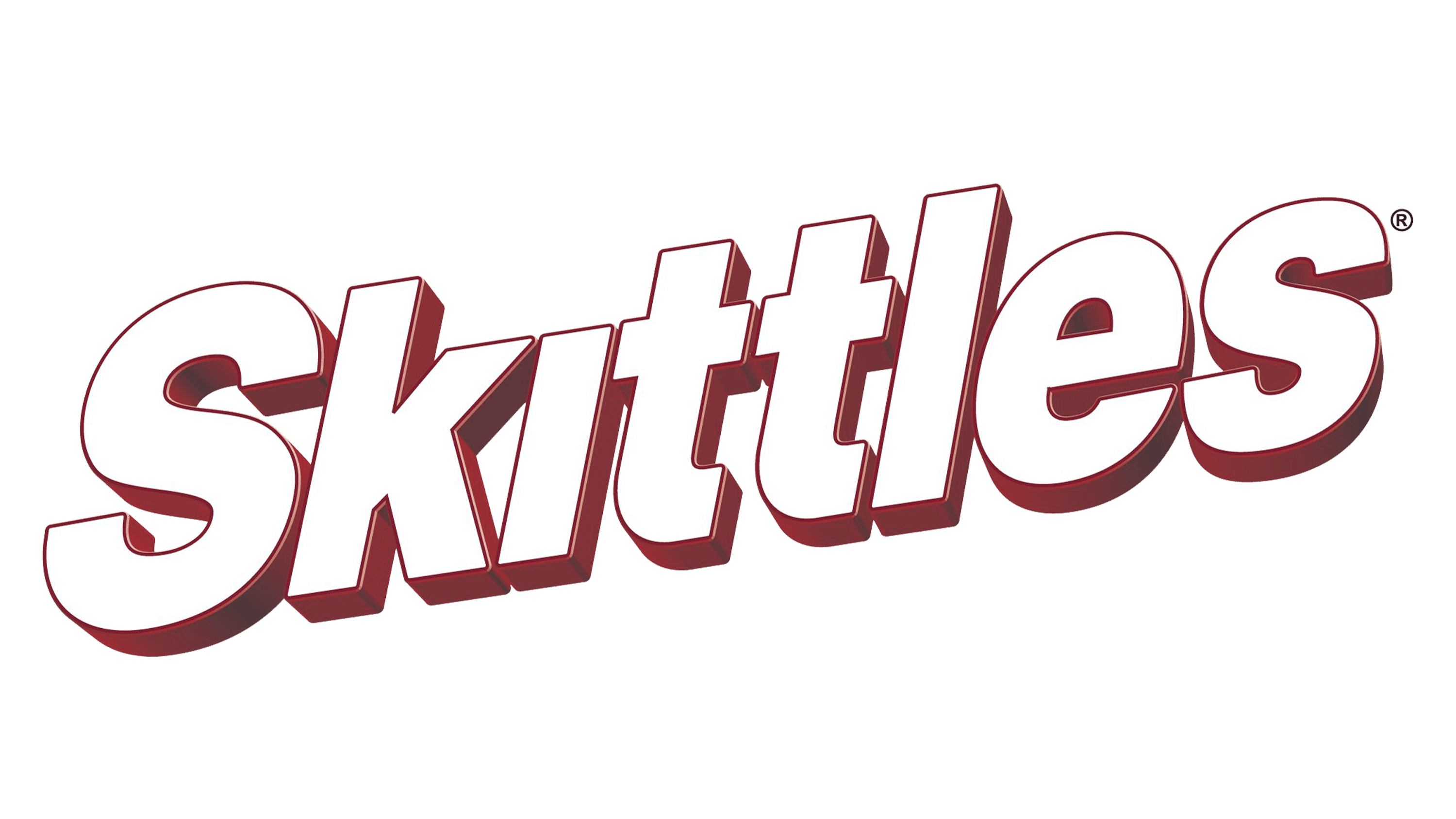
2012 – Today
![]()
The brand kept a bright, colorful palette, but changed the way the logo was designed. Instead of a darker shadow, the designers add some volume to the white portion of the letters with some off-white gradient. The word looked as if it was arched. The rainbow changed its shape and position and now it looked like a colorful slider behind the name that was decorated by the images of realistic-looking candies. One of the candies was serving as a dot above the “i”. The whole emblem was placed on a red background and had a thin red border that was indented outwards to create some white space.
Font and Color
The brand used a customized version of the Helvetica Black typeface. The font was white for most of the time with varying borders/shadows throughout the years. Although initially the color palette was quite conservative with light gray and a bit of yellow accent, it completely changed in 1982. Afterward, the logos featured a rainbow color palette that reflected the colorful palette of the candies the brand was making.


