Garnier Logo
Garnier is a French marque of beauty products, based in Paris, and founded in 1904. They specialize in production of cosmetics goods, as well as things for makeup, hair safety and body care. The firm has been owned by L’Oréal since 1970, and now Garnier is a significant cosmetics brand in Europe and America.
Meaning and history
![]()
In 1904, a French chemist and cosmetologist named Alfred Amour Garnier had registered probably the first patent on hair lotion made of natural components. On this date, it is recognized the company started its business. Most of their history, Garnier was focused on hair care goods production and selling, primarily in France. In 1970, L’Oréal bought Garnier, which let it grow rapidly and expand the product line, as well as the served area. They entered the US market with Nutrisse, a hair color crème, in 1999. Other products, such Fructis, Olia, and Whole Blends, in the 2000s and 2010s.
In 2007, the company started manufacturing skincare and bodycare products and introduced their micellar cleansing water in 2016. Now, most of the company ingredients are natural. They’re used in delicate formulas, used to produce high-performance cosmetics, available for everyone.
What is Garnier?
Garnier is a French beauty company founded in 1904 and headquartered in the capital of France. The company is best known for manufacturing of high quality goods for hair hygiene, as well as facial and body skincare. Owned by L’Oréal, the company has spread its products across the world.
1884 – 1904
![]()
The initial company, used before the official founding date, was a black and white oval seal placed vertically. It consisted of two major areas: the frame, limited by bold lines, and the central picture. The external area showed the ‘J’ai Seme Et Je Moissonne’ slogan, meaning ‘I Saw and I Reap’ and placed centrally at the top. The founder’s surname was placed at the bottom. As for the insignia’s center, so it showed a woman working in the field with a scythe.
1904 – 1996
![]()
The 1904 logotype showed the company’s nameplate – Laboratories Garnier, and the address, placed vertically and written to the left from the name.
1996 – 2002
![]()
The following logotype continued the company’s tradition and showed just the wordmark. The black ‘Garnier’ inscription, written in all bold caps, was accompanied by the ‘Paris’ word in tiny characters.
2002 – 2021
![]()
The Garnier signature, introduced in 2002, had custom sans-serif typeface, continuing the style set up by 1904 wordmark. It was a stylish inscription, featuring power and professionalism.
2002 – 2009
![]()
The next brandmark featured the gray-colored name plus three circles: green, yellow, and red.
2009 – 2013
![]()
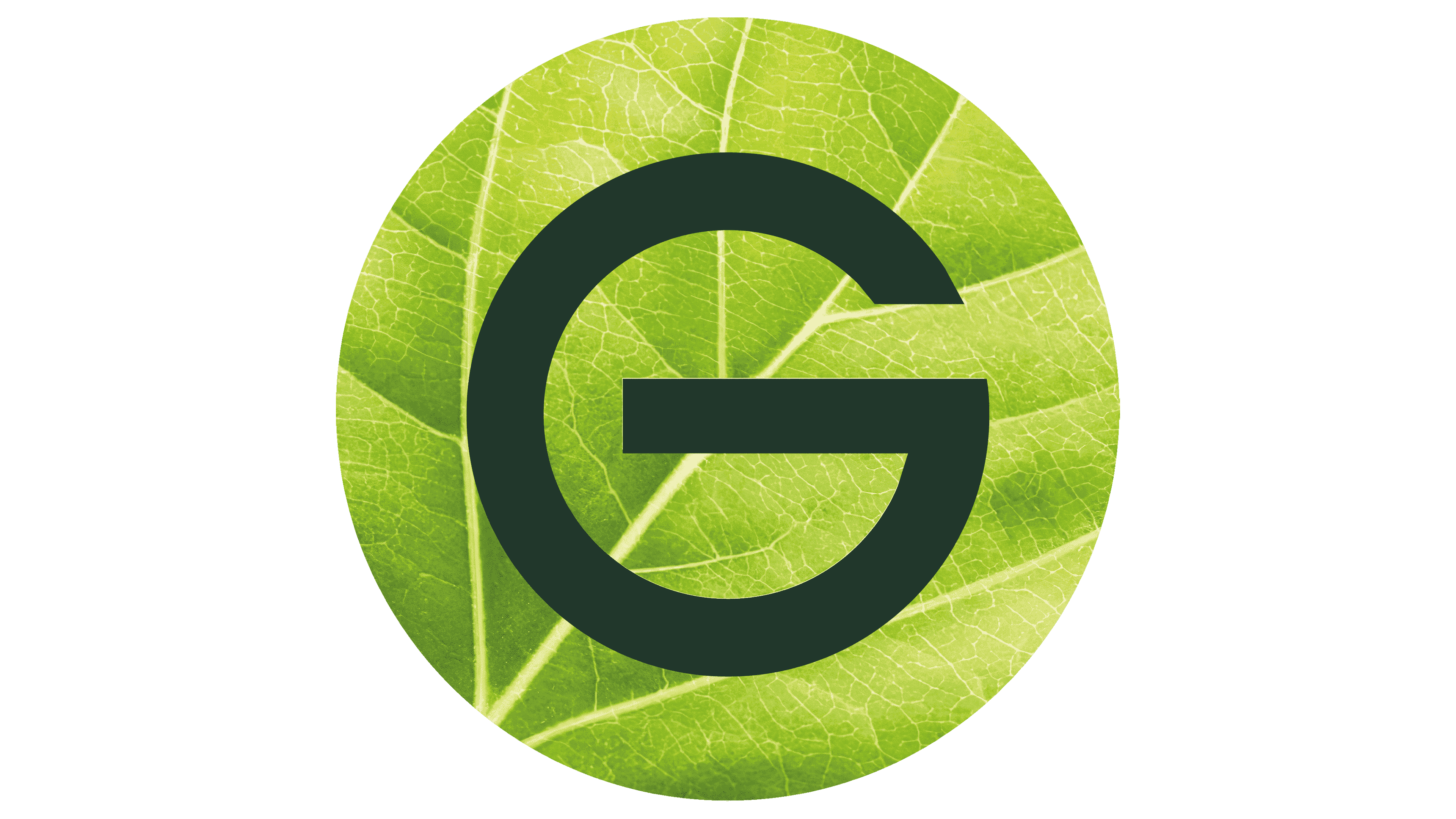
A leaf limited inside a circle was added to the logo and put behind the first three characters in the 2002 redesign.
2013 – 2021
![]()
Later, they had downsized the circle, so now it occupied less space.
2021 – today
![]()
The latter wordmark has its characters larger than previously, while the circular leaf – smaller. It was also placed centrally behind the initial ‘g’.
Font

The current nameplate style is a logical continuation of the original font, which appeared in 1904. At the time, it had thin characters with large intervals in between. All letters were capitalized, except for ‘e’, which was lowercase yet as large as the rest of the lettering. Its horizontal didn’t join to the whole character – there was a small gap, as well as in the ‘g’ symbol’s horizontal bar. The modern typeface is much bolder, and the letters are grouped. The most notable modification affects the ‘r’ letterform, which became longer.
Color
The colorship of the Garnier insignia consists of green and white shades. The name is painted forest green, as it’s the popular choice of the beauty companies producing natural and cruelty-free products. The leaf is painted brighter green, to highlight the brand’s course on green products. The whole logotype is based on a white background.


