Lifebuoy Logo
Lifebuoy is the name of the number one hygienic soap manufactured since 1894. It currently belongs to a British consumer products manufacturer named Unilever. The brand specializes in liquid and solid carbolic soap of various flavors. There were many volunteer programs held under the Lifebuoy name from the foundation, which focus on increasing of hygiene level across the world via handwash propaganda and free soap supply in poor regions.
Meaning and history
![]()
In the end of the 19th century, the whole globe was shaking because of cholera raging on and killing thousands of people everywhere. One of the reasons for this was an unacceptable unsanitary in the hospitals and other public places. In this environment, the Lever brothers had decided to create a ‘lifebuoy’ for people and launch their own brand of soap, accessible for poor class in the UK.
Their soap saved many people during the both world wars, as the company sent numerous trucks and vans full of soap to the front during the WWI and in the most damaged regions of the UK during the WWII.
Throughout the decades to come, Lifebuoy expanded its operations across other markets, spreading handwash propaganda and increasing the basic hygiene level globally. While spreading their product, Lifebuoy brand became not just the best-selling marque of handwash products, but also a social influencer.
What is Lifebuoy?
Lifebuoy is a British brand, launched in 1894 by Lever brothers. They’ve developed a carbolic soap marque, which is manufactured today by Unilever company. There are various versions of the soap, including solid and liquid ones, flavoured ones, et cetera. Now, this is one of the best-selling marques of hygienic soap, spread globally.
1894 – 1993
![]()
During the first century of the brand’s existence, it didn’t have a constant logotype. The soap’s name often appeared in advertisement blocks of the gazettes and magazines, using varying scripts and backgrounds. However, one of the most frequent wordmarks, appearing on the packages and in ads, is a red arch with the white nameplate on it. The letterforms had a heavy script with small yet sharp serifs.
1993 – 2003
![]()
The 1993 redesign was a white wordmark written over a red rectangle with its lower left corner colored yellow. The ‘Lifebuoy soap’ inscription had a semibold typeface with the first characters of each word capitalized. The serifs were prominent and thin.
2003 – 2007
![]()
In 2003, the brand designers of Lifebuoy came up with a new insignia, which lasted for only 4 years. This was a semibold inscription with small gaps separating the uppercase characters. Also, all letters were made italic.
2007 – 2012
![]()
In 2007, Lifebuoy brought a new look at their brand identity. It was now drafted of a pale red oval, contoured metallic gray. Inside it, they wrote the name. Above and below the inscription, there were two halves of a gradient gray and white crest, symbolizing health and safety. The name had a bold white script without serifs. The symbols were tilted.
2012 – today
![]()
In the modern brand signature, the oval was made brighter and more delicate. The modifications affected mainly the figure’s coloring and shape. If previously the contour was bold on the left edge and thin to the right one, now the frame is equally bold in its both edges. Moreover, they added more polish to the name. The typeface has also received a few changes.
Font
The changes affecting the name’s typeface didn’t completely change the letterforms. In fact, the script is basically the same as in 2007, but the letter became more streamlined and smooth.
Color
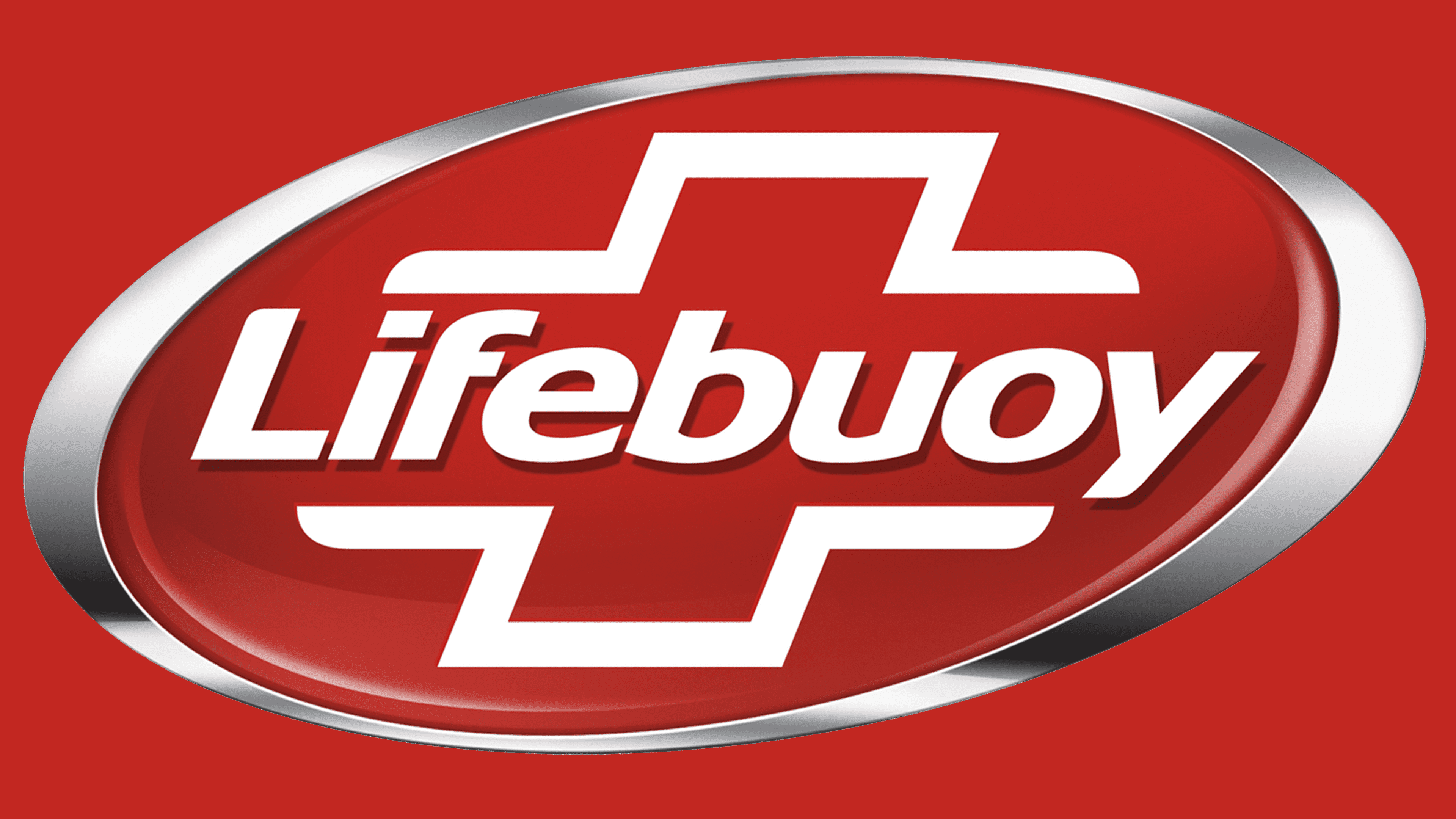
The color palette of the Lifebuoy brand mark reflects its values and mission. Being a brand making its core target preventing illness and unsanitary globally, Lifebuoy uses red for the oval as the symbol of health, and white for the name and the crest as it reflects purity and hygiene. Gray and white gradient is also supposed to translate these characteristics.


