Heinz Logo
Heinz stands out in the culinary world, predominantly acclaimed for its rich-flavored ketchup and a diverse array of seasonings. The brand thrives under the umbrella of Kraft Heinz, born from the strategic unification of Kraft Foods and H.J. Heinz. With a commanding presence in markets from North America to Europe and beyond, Heinz’s product spectrum spans from flavorful sauces to convenient meals and snacks, satisfying a mosaic of taste preferences globally. Investors hold the reins of ownership, with significant strategic direction from powerhouses like Berkshire Hathaway and 3G Capital. The conglomerate steers towards pioneering and eco-conscious practices, evolving in harmony with the planet and the palate.
Meaning and history
Heinz began in 1869, founded by Henry John Heinz in Pittsburgh, Pennsylvania. Its first product was horseradish. Heinz revolutionized food safety and purity, advocating for the Pure Food and Drug Act.
In 1876, Heinz Tomato Ketchup was launched, becoming an iconic product. Heinz expanded globally, reaching the UK by 1886. By 1905, it operated the world’s largest tomato processing factory. Heinz offered over 60 products by 1906, pioneering product diversity. The company survived the Great Depression, innovating with baby food and ready-to-serve soups. Post-WWII, Heinz expanded into frozen foods and baby food. In the 1960s, it introduced computerized management systems. The 1980s saw Heinz acquiring Weight Watchers, entering the weight management market. By the 2000s, Heinz focused on organic and healthier products. In 2013, Berkshire Hathaway and 3G Capital acquired Heinz. In 2015, Heinz merged with Kraft Foods, forming Kraft Heinz Company.
It’s a global food powerhouse, committed to sustainability and innovation.
What is Heinz?
Heinz is a renowned food processing company, famed for its ketchup and a wide range of condiments. It stands as a symbol of quality and tradition in the food industry, with a history spanning over 150 years.
1869 – 1957
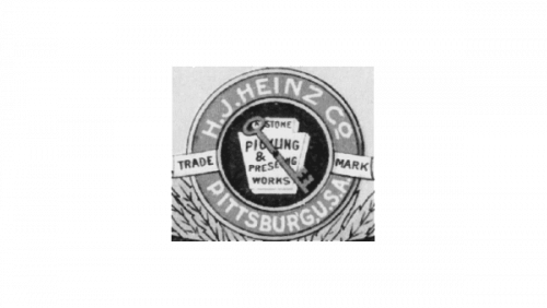
The logo is a vintage emblem of the H.J. Heinz Company, showcasing a keystone design symbolizing Pennsylvania, the “Keystone State.” Inside the keystone, the words “H.J. HEINZ CO.” encircle a pickle, reflecting their specialty in pickling. Below, “PITTSBURGH, U.S.A.” anchors the brand to its city of origin. The design evokes a classic, industrial-era aesthetic, representative of the company’s long-standing heritage. This logo signifies Heinz’s commitment to quality, a hallmark that has endured through the ages.
1957 – Today
This modern Heinz logo is a stark contrast to its predecessor, featuring bold, black, sans-serif letters arched upwards. The simplicity of the design reflects a contemporary shift, focusing on brand recognition. Gone are the detailed illustrations and the keystone emblem, replaced by minimalism that’s easily identifiable on product labels and in advertising. The logo’s curvature suggests dynamism and growth, aligning the brand with modernity and forward-thinking. This design embodies Heinz’s evolution while maintaining its iconic identity.
1969 – Today
The latest Heinz logo radiates with a vibrant red backdrop, giving a nod to the ripe tomatoes in its famous ketchup. The white, cursive lettering flows across the red, resembling a label, and offers a friendly, approachable look. This design is a leap from the stark black and white, infusing color and a sense of warmth, aligning with the sensory experience of taste and flavor. It’s a playful yet familiar reinvention that preserves the legacy while embracing a more modern, inviting aesthetic.


