Holiday Inn Logo
Holiday Inn is a chain of hotels and resorts. Currently, it’s not an independent company but is part of the large international hotel corporation IHG, headquartered in the English city of Windsor. There are several brands under this name. Holiday Inn Express, for instance, represents budget hotels that offer a limited range of services for a moderate fee. Holiday Inn Select provides travelers with a much higher level of comfort, while Holiday Inn Resort and Holiday Inn Club Vacation are built mainly on seaside resorts and offer club holidays, including all-inclusive options.
Meaning and History
The history of the Holiday Inn chain began in the mid-1950s. On a trip to Washington with his family, Kemmons Wilson was not satisfied with the quality of the roadside motels. Thus, he opened his first hotel in Memphis, Tennessee in 1952 by joining forces with Wallace E. Johnson and Eddie Bluestein, who assisted him in the investment and architectural aspects, respectively. The building’s architect, by the way, gave him the name idea Holiday Inn as a joke, using the name of a popular musical film starring Bill Cosby and Fred Astaire. In less than ten years, the number of Holiday Inn establishments reached 100. Holiday Inn became a global success.
What is Holiday Inn?
Hotel Inn offers luxury and budget hotels and resorts. Staying at Holiday Inn truly feels like a holiday. The Holiday Inn Hotel offers high standards of guest service and focuses on enhanced comfort and service.
1952 – 1983
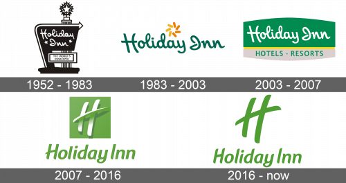
The original logo was the name of the company done in a fancy style. It used cursive, thick handwriting with all the letters being interconnected. A small star instead of an “i” completed the intricate design. The emblem was done in a dark, forest green color.
1983 – 2003
The new emblem as just as interesting and kept the same style as the original one. It also featured cursive writing with the letters being tilted to the left and deep green color. The small star has disappeared. Instead, the designers added bright orange and yellow image that consisted of four short lines creating a swirl. It was a nice addition to the logo as it was now more inviting.
2003 – 2007
A completely new spin was given in 2003. The name of the hotel was placed on a rectangular shape with arches at the top and the bottom. The lower third portion was a metallic gray color, while the upper was green. The two sections were separated by a yellow line that seemed to be indented. The whole emblem had shadow and appeared as if it had some volume to it. The company used the same font for the name and only switched the color to white, so it would pop against the green. At the bottom, it stated “Hotels” and “Resorts”. The two words were separated by a dot and done in green, all uppercase letters using a basic font. The company preserved the green and yellow color palette and the style of writing, which made it easy to trace the logo to its origins.
2007 – 2016
The new emblem did not look anything like the logos seen before. It still featured the name of the corporation, however, it was done using a different cursive font. The letters had rounded ends and smooth lines. Each letter was written separately and a lighter shade of green popped thanks to a barely noticeable shadow. Above the name, the emblem featured a square of the same green color with a large “H” written on it. The letter featured a long, sharp horizontal line, with the upper half being white and the lower half blending with the background and being seen thanks to a shadow.
2016 – Today
A small update was introduced in 2016. The emblem changed the shade of green and the shadow behind the name was removed. In addition, the big “H” was now standing along and done in the same green as the rest of the logo. It also featured a rounded horizontal line to go with the rest of the emblem. The first letter in the name also changed its shape and looked almost exactly the same as the big initial, only the horizontal line was not sticking out on both sides.
Font and Color
During the period from 1983 until 2007, the company used a font that resembled Holiday India typeface, a lovely cursive handwriting. Later, the designers introduced an italicized sans-serif typeface that featured rounded ends at the bottom. When it comes to colors, green has always been the main one. Even though the green changed its shades, it still represented the peace, security, and tranquility one would feel at the hotel.


