Huawei Logo
Huawei is a Chinese brand under which consumer electronics are produced. The Huawei brand is owned by Huawei Technologies Co. Ltd., which was founded in 1987. It is one of the largest telecommunications equipment manufacturing companies in China. The entire history of the company demonstrates its continuous development and growth. To do this, it created research and development centers in several countries around the world.
Meaning and History
Huawei is made up of two characters: “Hua” – “China” and “Wei” – “achievement”: Therefore, it can be translated as “Chinese achievement”. The brand was founded in the 1980s and originally produced communication equipment. Since 1987, the company has set itself a more ambitious goal, which was to make China a leading country in technology. Since the early 2000s, the company began to develop its activities outside of China, including Asia, Europe, and Australia.
What is Huawei?
The Chinese company Huawei is one of the largest smartphone manufacturers. Huawei is the first Chinese company to be included in Interbrand’s “World’s Best Brands” in 2014. It is also ranked among the most influential companies in the world.
1987 – 2006
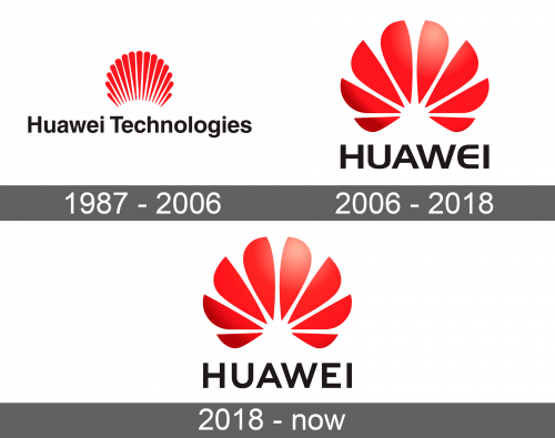
The main element of the logo was the name of the company. It was written in black using a simple typeface. The first litters were capitalized. A bright red element was added above the words. It resembled the sun’s rays that were drawn closely together and had rounded ends. The width of the “sun” was about two-thirds of the length of the name.
2006 – 2018
The name of the company was shorted down to just “Huawei”. It was written in large capital letters using a bold sans-serif typeface. The letter “E” had a rounded shape, which added an interesting detail to the otherwise plain look of the name. However, the eye-catching part was the red sun that now looked more like a flower because its rays got significantly thicker and resembled petals with a pointy end. The flower, which was painted using a red gradient, was still positioned above the name. This time, though, it was the same width as the name. This gave the logo a more impressive and powerful look.
2018 – Today
Although the logo of the company was updated once more, the original idea was maintained throughout all these years. In fact, the new logo presented in 2018 has barely changed. The petals have lost that 3D look and were painted in one even dark red color. Another noticeable change was the letter “E”, which now looked more like a typical “E” with square corners and straight lines. Overall, the logo had a more defined and bold look.
