Lenovo Logo
Lenovo Group Limited or simply Lenovo is a Chinese brand of electronics and IT products that occupies a leading position in its niche. It is the largest manufacturer of personal computers in the world, steadily introducing innovations that make the modern world a better and more interesting place. The company is also recognized for the idea of accessing the internet with just one click and its implementation.
Meaning and History
![]()
Lenovo was founded in 1984 by a group of Chinese scientists with funds from the Chinese Academy of Sciences. Initially, it was called New Technology Developer Incorporated. Two years later, the company got the name Legend and existed under this name for quite a long time. Legend products have taken a leading position in the Chinese market. In 2003, the corporation announced a name change to Lenovo, the latter meaning “new legend”. This marked the beginning of a new stage in the development of the company. Shortly, it entered the global market. The turning point in the development of Lenovo was a deal with IBM, so IBM products got marketed under the Lenovo name.
What is Lenovo?
Lenovo is one of the world’s top technology companies. The company’s activities cover the design, development, production, and sale of computers, multimedia devices, mobile communication devices, and consumer electronics. No matter what it is, Lenovo delivers products that are in great demand among consumers.
1984 – 2003
![]()
The name under which the company has originally existed for almost 20 years is featured in English and Chinese. Both versions are done in black and stacked up to form a rectangle. To the left, there is a white square with a black frame. Inside, it has a geometric shape that resembles a combination of letters “b” and inverted “p”. It looked very bold.
2003 – 2015
![]()
The new brand image looked completely different, which was very appropriate since the company was shooting for international sales. It was clean, without any extra details, and the blue color instilled trust in the reliability and quality of its products. The logo featured just the name of the brand in all lowercase, italicized letters. It used a sans-serif font with a slanted “e” giving it a unique look.
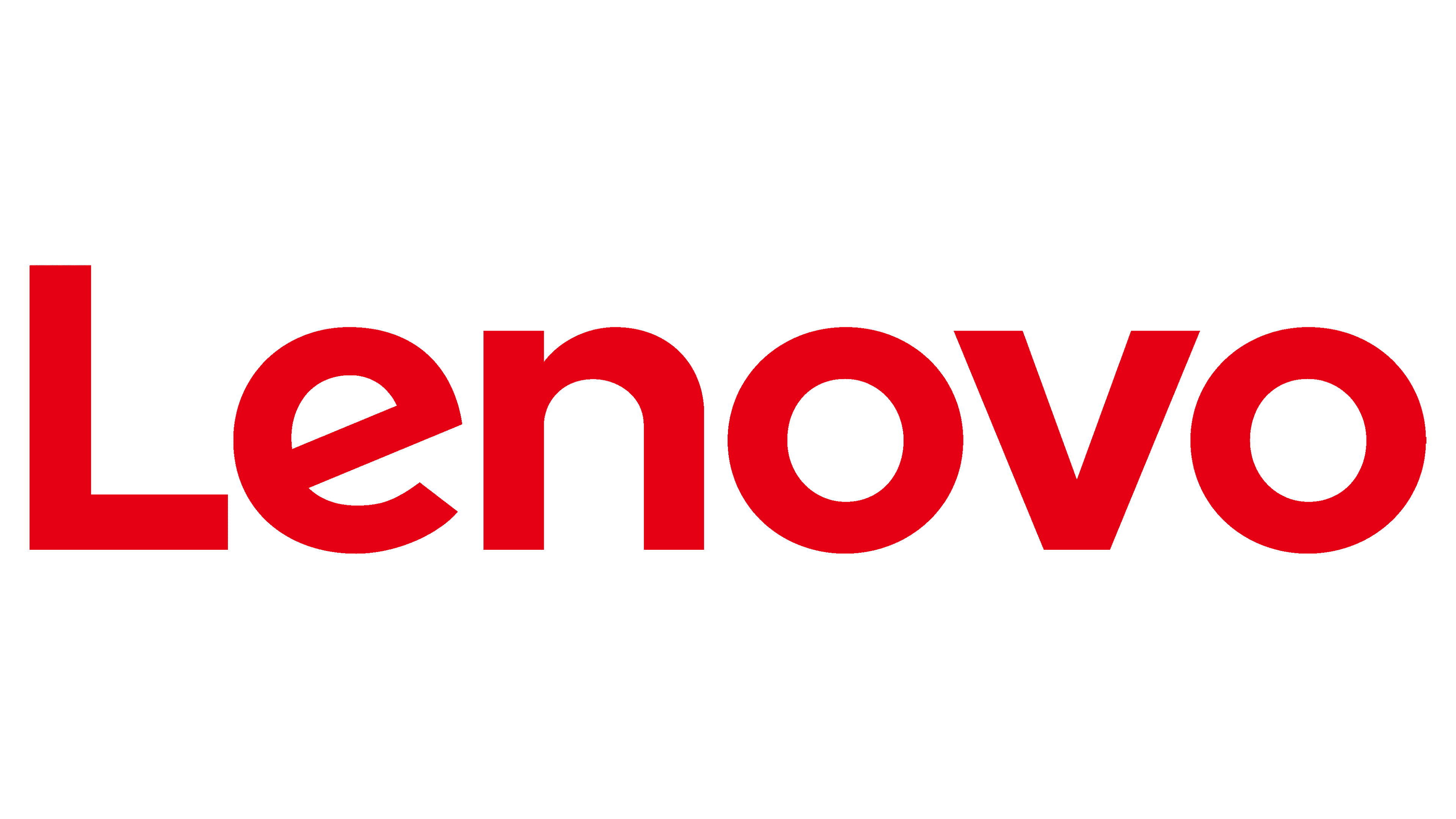
2015 – Today
![]()
In 2015, the logo underwent some changes. The boldest update was the introduction of a bright red. The font was also different. For brand recognition, the company went for a sans-serif font that also featured a slanted “e”. Finally, the designers decided to forgo the italicized letters and made the first letter capital.
Font and Color
No matter which version of the Lenovo logo, you will see stylish, sans-serif fonts. Their unique detail is the slanted “e”, with the last version resembling Montserrat Alternates Bold typeface. All the color choices were quite traditional and gave the emblem a formal and powerful appearance. Initially, it was black, which was replaced by blue and then red.


