Lunchables Logo
Lunchables is a brand that sells a variety of snacks and protein-packed lunch kits. It has gained recognition among parents and is enjoyed by kids. Observing a market for Lunchables containing fruits, the brand launched a meal kit with pineapple, clementines, grapes, and apples. It also made changes to the ingredients to ensure that they stay in line with the national requirement for food children consume in school.
Meaning and History
Before being made available across the country in 1989, Lunchables first debuted in Seattle a year earlier. The brand was initially created as a creative method to repurpose bologna, which started to lose appeal in the middle of the 1980s. The company has changed over the years, offering and then withdrawing hot dogs and hamburgers, as well as experimenting with breakfast. However, its key product, the convenient and fun snacks, has stayed true since the beginning. The packaged food giant Lunchables brand has become a profitable franchise. In 2024, the brand returned to Canadian shelves after a fifteen-year break.
What is Lunchables?
Made in the USA by Kraft Heinz, Lunchables is a brand of compartmentalized food and snacks. It is aimed at children as an easy and relatively healthy option for lunch kits.
1988 – 2004
The red and yellow color of the emblem instantly makes one feel energized and arouses appetite. The brand name is printed in red using a serif font. A red line underneath carries a tagline aligned to the right that says “Lunch Combinations”. The brand owner is also included in the logo. This version looks clean and solid.
2004 – 2008
This logo has a more inviting and warm appearance thanks to the rounded font that has some volume thanks to highlights. Instead of a strict rectangular base, the designers chose to use a base that repeated the shape of the inscription. The logo turned out to be fun and dynamic.
2008 – 2010
The yellow color is no longer such a prominent player. Instead of arching the brand name, the designer decided to place the letters at different heights and tilted some. The bright colors and interesting letter placement made one feel happy and stimulated appetite.
2010 – 2013
A few modifications have been done in 2010. However, the difference is almost unnoticeable.
2013 – 2022
The most noticeable change is the fact that the red is used as an outline, rather than the main color. It was replaced by white that popped next to red. The designers also removed the “Oscar Mayer” emblem and tagline as these were deemed no longer necessary. It also placed the name on a diagonal, similar to the one introduced in 2004. The logo turned out bold and at the same time friendly.
2022 – Today
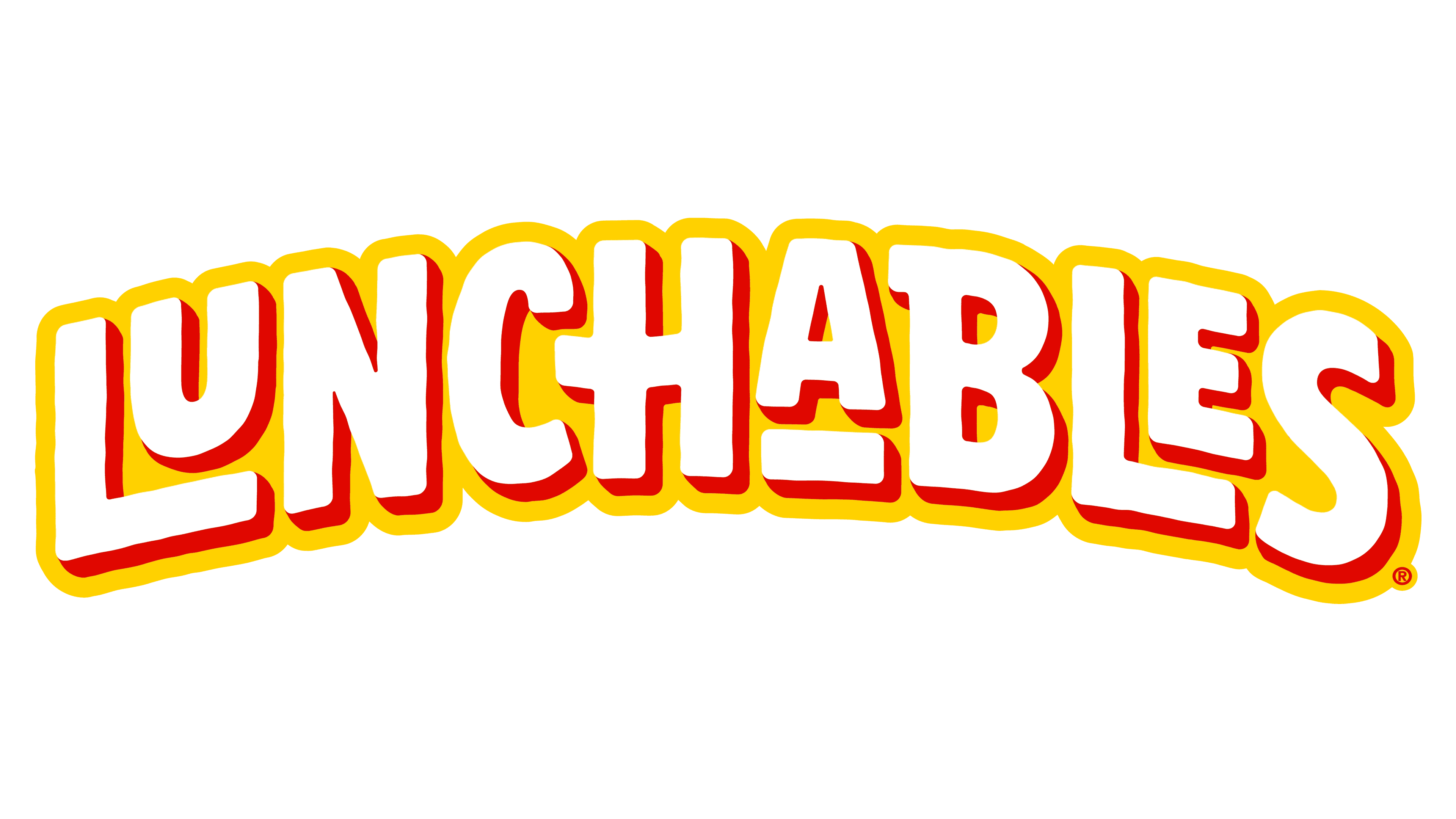
The yellow color was bright back in the form of a base that repeated the shape of the inscription. The letters were still printed in white, but the red was used as a shadow instead of an outline. Another update was the use of all caps. To preserve a playful and welcoming impression, the designers made some of the characters smaller. Although the brand’s logo underwent significant changes over the years, one can see that it reflects the same values and gives the same feelings as it did 20 years ago.
Font and Color
Researchers have discovered that the color red is the most stimulating to our appetites. Red piques one’s interest so strongly that it’s frequently utilized in menus, tablecloths, napkins, and restaurant logos. Yellow is thought to bring happiness. When people see yellow, their brain actually releases more serotonin, a hormone that promotes happiness. It evokes feelings of coziness and warmth. Although these colors are quite popular among food industries, the brand minimized its opportunity to look unique.
The company originally went for a classic serif font with high stroke contrast. It resembled Kepler Std Black by Adobe Systems Incorporated or Kazimir Black font. The closest font to the one used in other versions is a sans-serif font called DIN Neuzeit Grotesk Std Bold.


