Mars Logo
Mars, Incorporated is a titan in the world of confectionery, pet care, and other food products, founded by Franklin Clarence Mars in Tacoma, Washington, USA. Initially, it began with the simple goal of crafting delectable candies that could bring a smile to anyone’s face. Over the decades, Mars has grown into a global powerhouse, spreading joy through its iconic brands like M&M’s, Snickers, and the eponymous Mars bars. It stands as a testament to innovation, quality, and the sweet joy of sharing.
Meaning and history
Founded in 1911 by Franklin Mars in Tacoma, Washington, Mars began as a humble candy company. Franklin’s vision: sweeten the world. In the 1920s, Mars introduced the Milky Way, revolutionizing candy bars. The 1930s saw the birth of the Mars Bar in England, a global hit. Post-war expansion fueled growth, diversifying into pet food with Whiskas in the 1950s. The 1960s introduced M&M’s, colorful chocolate gems loved worldwide. By the 1980s, Mars expanded into staple foods and veterinary services. The 21st century marked Mars’s focus on sustainability and health. Mars operates in over 80 countries, embodying innovation, quality, and joy, maintaining a family-owned ethos in a multinational footprint.
What is Mars?
Brand Mars is a tapestry of sweet indulgence woven into the global fabric of snack foods, pet care, and beyond. Born from a single candy bar and blossoming into a myriad of beloved treats, it’s a testament to timeless taste and innovation. Mars encapsulates a universe where every bite is an odyssey of flavor, and every product a chapter of a family legacy that spans over a century.
1932 – 1950
The logo brandishes “MARS” in bold, assertive strokes, exuding a timeless strength. Black letters, each leaning, suggest a dynamism, an eagerness to march ahead. It’s both a declaration and a signature, a promise of quality, and a nod to tradition. This emblem, devoid of excess ornamentation, stands out for its straightforwardness and clarity, encapsulating the essence of the brand it represents in a mere four letters.
1950 – 1978
The updated logo vaults energy with a star perched at its peak, a beacon of excellence and adventure. Bold, assertive lines construct the word “MARS,” now underscored by a sweeping tail, infusing motion and forward momentum. This design captures a sense of achievement and aspiration, resonating with a post-war era’s optimism and the company’s cosmic namesake. It’s a reimagined classic, retaining its roots while reaching for the stars.
1978 – 1988
The logo leaps from monochrome to a radiant burst of color, red and gold enlivening the text against a midnight backdrop. The font is rounder, softer, suggesting warmth, approachability, and a spoonful of nostalgia. This design embodies a blend of vibrancy and retro charm, inviting with a sense of richness and a hint of the decadent treats that lie beneath the name “Mars.”
1988 – 2002
In this evolution, the logo casts a shadow, gaining a striking 3D effect, suggesting tangibility and presence. Red deepens to a rich maroon, edged with a golden trim, evoking a premium feel. Below, a twin-streaked underline races across, adding a dynamic finish, a nod to speed and precision. This rendition of “Mars” seems to leap off the surface, reflecting the brand’s forward leap into the era of bold branding and standing out on any shelf.
2002 – Today
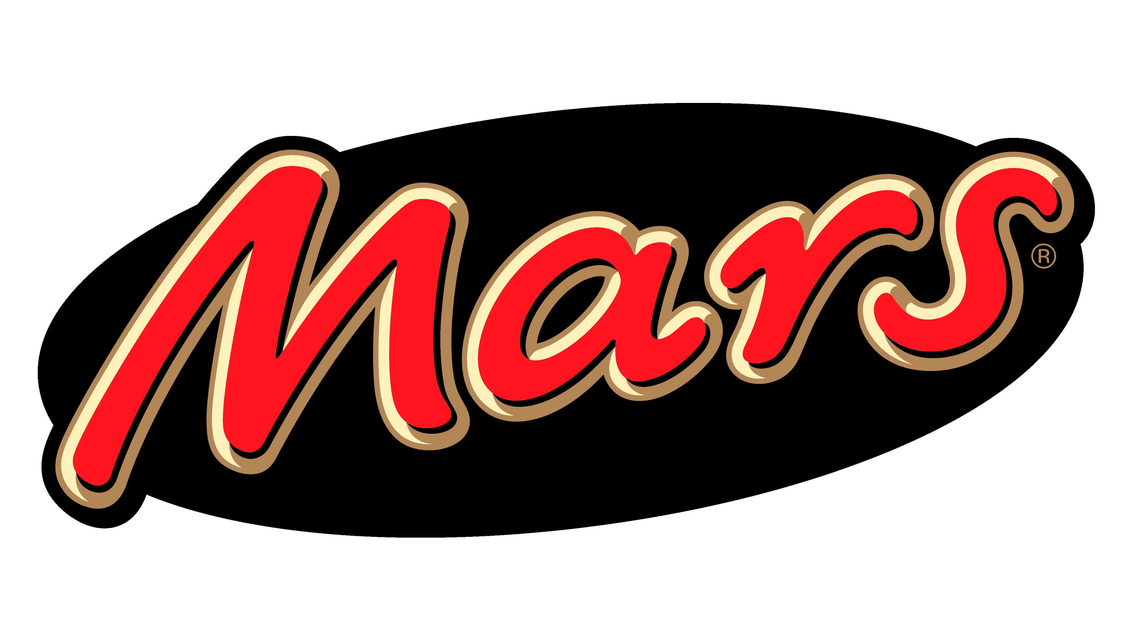
The logo now bursts with a creamier red, swirled like caramel within the outlines. Gold trim transforms to a creamy beige, softening the edges with a vintage touch. Each letter nests in a shadowy oval, creating a cozy nook, enhancing the allure. This logo whispers rather than shouts, a subtle beckoning to the nostalgic and the sweet-toothed. It’s a blend of boldness and comfort, evoking the creamy richness waiting within a Mars bar.


