Mastercard Logo
Mastercard is an international corporation focused on financial services and operating the pay system with the same name. The company was founded in 1966 as an interbank card association. In 1979 it was transformed to an independent company which is now headquartered in Purchase, New York.
Meaning and History
As we have mentioned, Mastercard once was an interbank association, so their cards could be used in many banks in the US. Time passed, and Mastercard (or Master Charge, as it was once known) was spread across the world, so the word ‘Master’ was a very suitable to the conception of the brand.
1966 – 1979
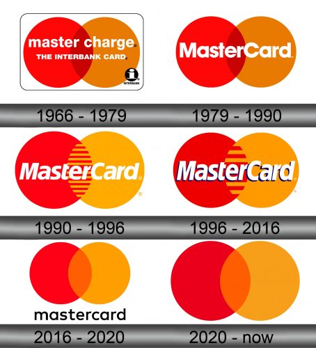
The very first logo of the brand depicted two circles made in red and yellow colors intertwining each other in the center of the emblem, which had the darker shade. This feature remains with the brand until today, although in another variation.
The circles are the background for the inscription ‘master charge, the interbank card’, which was using the simple office-like typeface in white color. Also, the whole logo is bordered by the thin black rectangular.
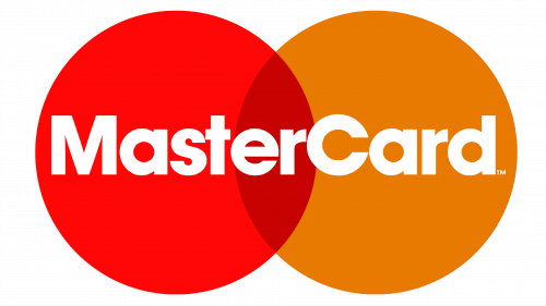
1979 – 1990
When Mastercard became an independent company, it had to change its brand identity as well. The new logo represented the name, placed above the familiar circles, while the outline passed away. The typeface of the name was changed as well, getting the bolder letters and bigger size.
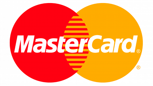
1990 – 1996
The next logo made more emphasis on the central part of the emblem. In this version, the circles (which had another color palette than in the previous version) had been connected to each other by the striped pattern. The name of the company had had a few changes too: it was a little sharpened, and became bigger.
1996 – 2016
Time passed, and the logo was changed as well. The central pattern became sparser, and the lines got rather thicker. The shades of the emblem got darker, the inscription became wider and got a little of volume.
2016 – 2020
Another version of the brand’s logo was introduced in 2016. It had lost the striped pattern in the center of the emblem, and returned to the old darkened shades. The inscription was placed below, and had the same typeface as the version of 1966, but in the bold black color, which looked quite stylish on the white background.
2020 – Today
The current logo does not have any inscription on it – there is just an emblem, precisely as it was before.
Emblem and Symbol
The circles emblem has become an iconic symbol for Mastercard and their subsidiaries. Some, such as Cirrus, use the image but repaint or otherwise rearrange for a little unique touch. Others use Mastercard’s own circle pattern with little change or rearrangement.
