PayPal Logo
PayPal is one of the most frequently used services for online money transfers. It gives you an alternative to the paper interactions with money such as cash or checks. Launched in 1999, PayPal quickly became the worldwide Internet payment system, supported by many countries and banks.
Meaning and History
The company is known for its absolutely unchanging style. This decision can be explained by the company’s nature as a massive money exchanger for many people. Naturally, the swindlers could easily hide behind the name and the emblem of the company if it often changed its brand style.
However, the service changed its logo a few times.
1999 – 2000
Certainly, PayPal, the financial services company, initially embarked on an innovative journey involving the iconic dollar symbol. They incorporated a circular element, reminiscent of a coin, and artfully embedded the “$” symbol within it. To establish a direct link with the brand name, the creative minds behind this endeavor ingeniously fashioned it upon two interconnected “P”s. One of these letters was deliberately reversed, and both featured elongated upper strokes, evoking the impression of skillful brush strokes. The primary hue dominating this emblem is a vibrant shade of blue.
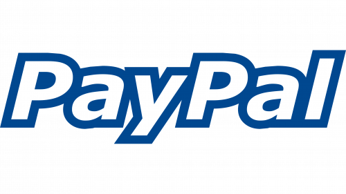
2000 – 2007
The initial PayPal logo was created the year after the company was founded and stayed with it until 2007. The emblem depicted the white lettering with a blue bold contour. For now, it was a sharp angular typeface with clear outline with every symbol sewed to another one.
2007 – 2014
In 2007 the wallet’s signature endured a major redesign. From now, the lettering was in dark for ‘Pay’ and bright blue for ‘Pal’, with no outline. The letters got more space between one another while the entire font became more minimalistic and eye-catching for its simplicity and clearness.
2014 – Today (International), 2014 – 2022 (United States), 2014 – 2023 (Canada & Europe)
This logo was created in 2014 and became the most recognizable so far. The new logo developed in San Francisco had a new image left side to the name of the company made in the same colours as the inscription, which hadn’t any changes except a little lightening.
The new image represented the double ‘P’ and was meant to be the company’s stylish watermark which symbolizes the connection with the clients, its openness to conversation.
The accurate and rounded typeface of the 2014 logo looks very similar to the previous ones. But there are some visual features in this version. For example, the lettering became wider and clearer: the characters ‘a’ and ‘y’ changed their designs and got more space.
2022 – 2024 (United States), 2023 – Today (Canada & Europe)
The 2022 PayPal logo bears a striking resemblance to its predecessor, leading many users to overlook the change. The primary objective of the designers was to embody the “people-first” concept, emphasizing the company’s commitment to millions of customers within its payment ecosystem.
In an effort to align the visual identity with the brand’s new strategic direction, PayPal collaborated with the independent studio Gretel. To ensure that the emblem adhered to principles of inclusivity, it was adapted to meet ADA standards, accommodating the needs of individuals with disabilities.
The logo now features a combination of dark and muted colors, enabling its use against a vibrant gold background, such as on a payment button. Additionally, subtle adjustments to the font have rendered both the monogram and wordmark more distinct, significantly enhancing readability.
2024 – Today (United States)
The redesign of 2024 was a true surprise for everyone, as PayPal has been associated with the blue color palette for years. The new logo is executed in black-and-white, with the iconic emblem erased. The text part was rewritten in a stricter sans-serif.
Emblem and Symbol
The ‘double P’ symbol is used by the company extensively. Some variations have the letters come together much closer in order to save space. For instance, this emblem was used as an icon for a mobile app for the longest time.


