Microsoft Power BI Logo
Microsoft Power BI is a dynamic business analytics tool developed by Microsoft. It was created to enable businesses to aggregate, analyze, visualize, and share data through intuitive interfaces. Originating in the United States, its creation was aimed at providing users with insights and the ability to make informed decisions by transforming raw data into compelling visualizations and reports. Power BI facilitates easy data exploration and sharing, making analytics accessible to a wider range of users.
Meaning and history
Microsoft birthed Power BI, revolutionizing data analytics. Initially, it emerged from Excel add-ons, evolving into a standalone powerhouse. U.S.-based, its journey began to democratize data insights. Aimed at making complex analysis user-friendly, it quickly became a tool of choice for businesses. Launched officially in 2015, it marked a new era in data visualization. Constant updates enriched its capabilities, making it a cloud leader. Transforming raw data into visual stories, accessible to all. Power BI’s growth mirrors the data-centric shift in business, making informed decisions the norm. A blend of innovation and user needs, it stands as a testament to Microsoft’s vision in analytics.
What is Microsoft Power BI?
Microsoft Power BI is a cutting-edge analytics platform designed to transform data into actionable insights through compelling visualizations. It empowers organizations to connect, model, and explore their data, fostering informed decision-making across all levels.
2013 – 2016
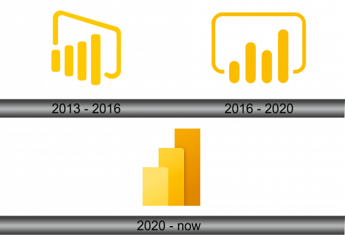
The logo depicts an abstract, modernistic graph with ascending bars, encapsulating growth and analytics. Cast in a vibrant yellow, it stands out with a bold simplicity. The silhouette gently curves into a stylized ‘P’. It’s a visual nod to data’s upward trajectory and the tool’s prowess in transforming numbers into narratives. This emblem is not just a brand mark but a beacon of insight in the data-driven world.
2016 – 2020
This iteration of the logo retains the vivid yellow hue but embraces a more streamlined, rounded form. The bars, symbolizing data metrics, appear sleeker and more uniform, reflecting precision. The surrounding border has morphed into a continuous loop, suggesting infinity and the cyclical nature of data analysis. This design shift subtly hints at Power BI’s evolution towards a more integrated and fluid user experience in data management and visualization.
2020 – Today
In this design, the logo abandons the frame, opting for a bold trio of bars in a gradient of yellow shades. This minimalist approach suggests a hierarchy of information and a refined focus. The tallest bar reaches up, signifying aspirations and the reach of data insights. There’s a palpable shift towards a more contemporary, clean-cut aesthetic, which mirrors the software’s streamlined data processing prowess. This logo reflects a matured identity, focused on clarity and impact in data visualization.


