Windows Logo
Windows is a brand of OS that can’t be underappreciated. It’s the single most important piece of electronic software that you can thing of right now. Almost all personal computers in existence use Windows of one version on another, and they’ve been doing so since the time immemorial.
Meaning and History
![]()
Windows is a family of operational system released by the company Microsoft since 1985. Over time, it’s become the main software to run on your personal computer, owing in part to the versatility and integration of the systems. The name – ‘Windows’ – is a reference to this versatility and multi-tasking capabilities.
1985 – 1990
![]()
The very first logo of the very first Windows version had a peculiar logo. There were four rectangles, like today, but back then they weren’t identical even in their shape. The color was very pale blue, and they also used the name – ‘Microsoft Windows’ in serif to the right of the main emblem.
1990 – 1992
![]()
In 1990 the emblem changed its style. It depicted the dark window, which looked stern and serious, with a white shine behind the bars. The name was put under it in the same serif, although the words were now equally-sized.
1992 – 1993
![]()
In 1992 Microsoft had drawn the first instance of the iconic emblem where each ‘glass piece’ was a different color – green, yellow, blue and red (clockwise). The emblem was also warped upwards and had a mirrored twin to the left. That one, however, wasn’t fully visible, seeing how it was just a collection of specks.
1993 – 1994
![]()
They basically used the same design for the Windows NT, except they changed the inscription for obvious purposes.
1994 – 1995
![]()
This image presents a logo that’s symbolic of technological progress and ubiquitous computing. The emblem showcases a four-pane window, with each pane colored in red, green, blue, and yellow. This window, with its distinctive colors, has become a fundamental icon of personal computing over the decades. The colors are vibrant, standing out against the black background, signifying diversity, energy, and accessibility. The design is reminiscent of a flag or a signal of interoperability and connectivity, reflecting the software’s purpose to serve as a portal to a world of computing tasks.
The window panes are trailed by a flurry of the same-colored squares, which appear to be breaking away or zooming out from the main logo. This creates a dynamic effect, as if the window is in motion or dispersing into a digital space. This could be interpreted as a metaphor for the dissemination of technology into various facets of life or the expansive reach of the software.
Accompanying the graphic is the word “Windows,” written in a bold, italicized typeface, giving an impression of speed and forward motion. The font choice, with its sleek and elongated lines, complements the graphic and conveys a sense of modernity and innovation. It’s a visual communication of the brand’s promise to deliver a seamless and forward-thinking user experience.
1995 – 1996
![]()
Another redesign took place with the release of Windows 95. The little part ‘Microsoft’ made in delicate sans-serif typeface was put above the bold and large ‘Windows’. The colored square was reduced in size and placed left to the inscription.
1996 – 2000
![]()
In 1996 the company produced the Windows NT. It was using the same style as the previous one. The only modification was the bold letters NT placed instead of the number 95.
1998 – 2000
![]()
In 1998 the brand used this style one more time, and the only thing that changed was the text.
2000 – 2003
![]()
For the 2000 logo they simply took the emblem they’ve been using all along, put it on a white square and surrounded it with four other squares of varying sizes – including three of color blue and one red square. Beneath it were the words ‘Windows 2000’.
2000 – 2006
![]()
For the newly-released Windows ME, Microsoft used the previous concept. They took two squares – red and blue, put them one over the other and then covered the bunch with a green-outlined square that had the usual Windows logo of the age inside (and it was also tilted a bit).
2000 – 2014
![]()
In 2000, Windows XP was released and Microsoft finally decided to break the tradition and design a new ‘Window’ for their OS. It had the same colors as the previous emblem but without the black frame. In addition, they warped the image, so it looks like they are waving in the wind.
In comparison to the previous designs, the text here is also not bold anymore and is generally bigger in proportion.
2006 – 2017
![]()
The Vista used the same concept, but this time they took the emblem and put it inside the dark blue circle. Like the emblem itself, it’s rich with gradient, shading and lighting. The text also didn’t change much, except it became a bit thinner than before, barring the obvious additions.
2009 – 2020
![]()
The Windows 7 logo is even simpler. They basically just took the new emblem and put it above the words ‘Windows 7’. The text parameters are very similar to the 2016 variant, so not much changed.
2012 – 2016
![]()
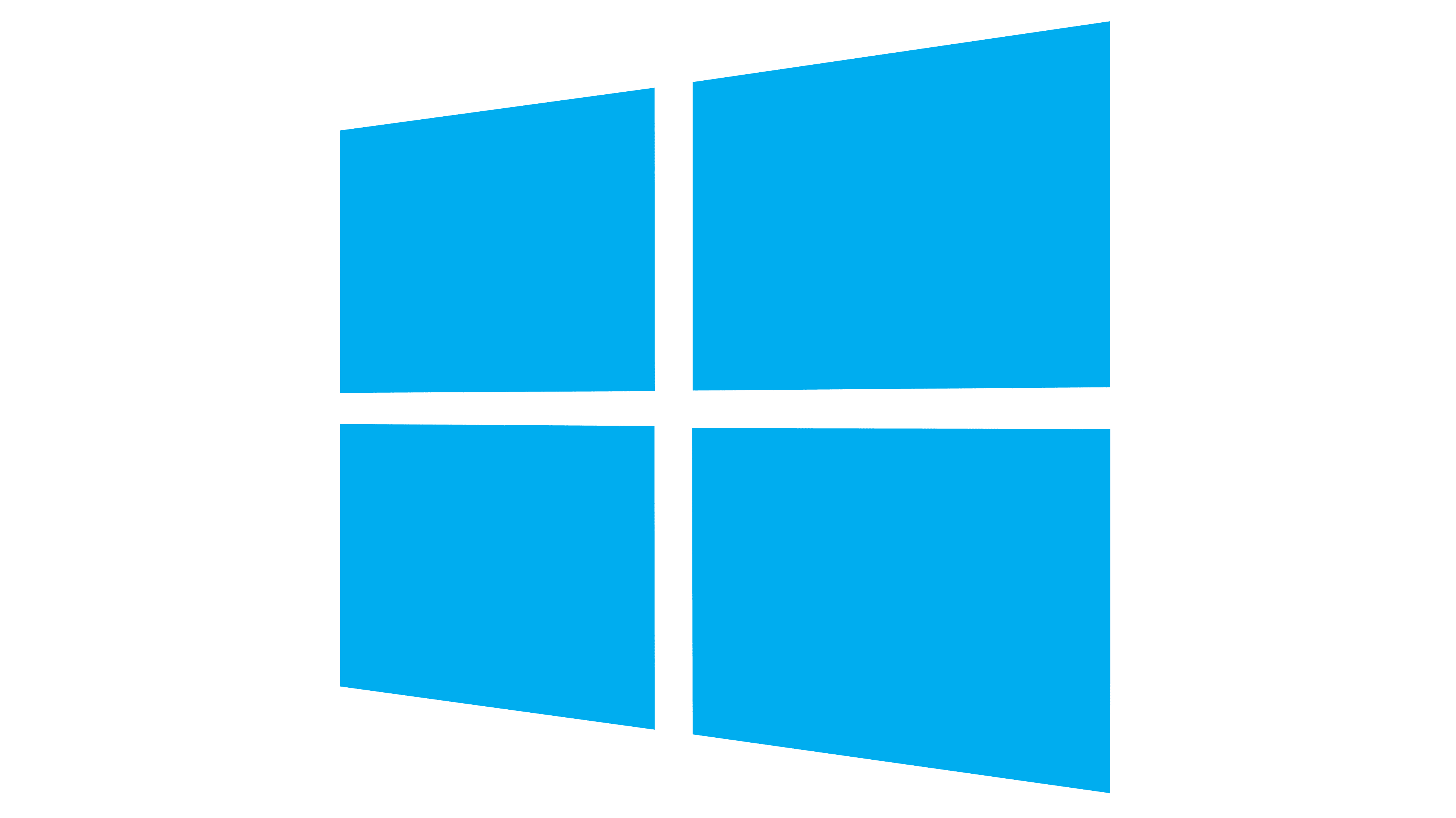
The Windows 8 logo saw some rebranding attempts again. The wavy emblem was no more – it was now just four azure squares with a shifted perspective. To the immediate right of it was the word ‘Windows’ just as it appeared on the previous logo, but blue, and then the number ‘8’, also in light blue.
2013 – Today
![]()
They pretty much used the same logo for the Windows 8.1 released in 2013, except they changed the numbers for the obvious reasons.
2015 – Today
![]()
The Windows 10 logo also didn’t see much change. The number on the end changed to ‘10’, and the coloring became a bit darker than usual, but that’s about all that happened.
2020 – Today
![]()
In 2020, Windows 10X was released, and Microsoft recycled the old logo once more. This time, they made the text slightly higher and darker. In terms of the imagery on the left side, the coloring of the squares changed from the darkest blue to the palest blue clockwise from the bottom left.
2021 – Today
![]()
Windows 11 is an interesting change. Microsoft decided to set the default icons panel in the center, which is also reflected by the logo. It’s basically the 10’s logo, but with a new number and not shifted anymore. It stares right on into your eyes.
Emblem and Symbol
It’s also worth mentioning that the emblem in question changes shades and coloring very actively. It can be white if the design calls for it, black if set against the bright background, as well as other colors. This, however, only applies to the icon on your PC or the emblems used in some promotional materials.


