Adobe Photoshop Logo
Adobe Photoshop, a renowned software by Adobe Inc., stands out as a pivotal tool in graphics editing. It offers vast functionalities allowing users to create, enhance, or edit images, artworks, and illustrations. With its extensive features like layers, filters, and brushes, it caters to professionals and amateurs, making it a staple in design, photography, and digital art. Its capabilities extend to 3D design and augmented reality, demonstrating unparalleled versatility in the realm of graphic design.
Meaning and history
Adobe Photoshop originated in 1987, conceived by Thomas Knoll, a Ph.D. student at the University of Michigan. Initially dubbed “Display,” it was intended to showcase grayscale images on a monochrome display. The potential of this project was evident, leading to collaboration with his brother, John Knoll. Together, they expanded its capabilities, and by 1988, it was rebranded as Photoshop.
Adobe Systems Incorporated acquired the license to distribute Photoshop in 1988. The first official version, Photoshop 1.0, was launched exclusively for Macintosh in 1988. Its groundbreaking features set industry standards in digital imaging, drawing users from diverse fields like photography, graphic design, and professional artistry.
With consistent advancements, Photoshop incorporated layers in 1994, a pivotal development allowing users to manipulate specific sections of an image independently. Subsequent versions introduced enhancements like adjustable transparency and blend modes, providing users with unmatched creative freedom.
Photoshop’s evolution continued with the integration of Camera RAW and 3D image editing, solidifying its role in the design ecosystem. The transition to the Creative Cloud subscription model in 2013 marked a significant shift, enabling seamless updates and cloud-based services, fostering collaboration and accessibility.
Today, Adobe Photoshop remains an indispensable tool, synonymous with image editing, continually evolving to meet the dynamic needs of creatives worldwide, embodying innovation and versatility in the realm of digital imaging.
1988 – 1990
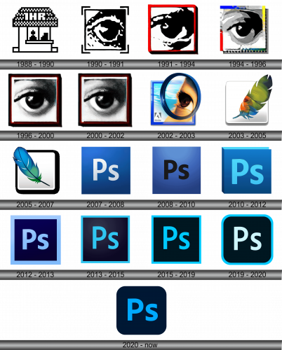
Initially, during the functionality of the photo editor’s 0.07-0.87 beta version, a diminutive symbol, representing a basic abode, was utilized. This symbol was exclusively constructed of pixel-based components. Atop the dwelling, a pattern of interchanging black and white quadrilaterals existed, accompanied by the notation “1HR”. The inferior section of the icon was framed by a pair of entry platforms and an extensive observational aperture. The entire representation was crafted in a singular chromatic scheme, maintaining a monotone appearance, reflecting the preliminary and foundational nature of the software at this developmental phase, symbolizing simplicity and the rudimentary essence of the initial versions.
1990 – 1991
Post-evaluation, the first official rendition of the software was unveiled, featuring an emblem characterized by a prominently illustrated eye. The remnants from its precursor included merely the quadrilateral configuration and the pixelated aesthetic. The creators adorned the angles of the geometric illustration with diminutive lines, reminiscent of a camera’s viewfinder, subtly alluding to Adobe Photoshop’s specialization in handling photographic elements. This transition indicated a shift towards a more sophisticated and purpose-driven identity, reflecting the enhanced capabilities and the focus of the application in processing and manipulating visual imagery in a professional manner. The revised design signified a more mature and refined phase in the development and branding of the software, emphasizing its dedicated functionality in the realm of photo-editing and visual design.
1991 – 1994
Following the advancement to version 2, a new formal symbol was instituted. This iteration again features an eye, albeit distinctively varied – exhibiting fewer shadows and adopting an appearance closer to realism. The development team elected to omit the angular components, altered the boundary hue to red, and incorporated a three-dimensional aspect by replicating the lines (located at the bottom right). This transition signaled a commitment to refining visual elements, achieving more realistic representation, and enhancing user interaction by leveraging progressive design elements, enabling the software to continually evolve and adapt to the dynamic needs and preferences of its diverse user base. The alterations were not merely aesthetic but also reflective of a more nuanced approach to symbolizing the core functionality and innovative essence of the program. The enhanced iconography represented a harmonious blend of realism and design innovation, aligning with the software’s evolving capabilities and its foundational ethos of empowering visual expression.
1994 – 1996
Upon the unveiling of Adobe Photoshop’s third version, the emblem experienced a transformative redesign. The contemporary iteration features a conspicuously sharp, reduced eye. The chromatic palette expanded, introducing a spectrum of shades. The inherent depiction utilizes a variety of gray tones, accentuating the upper eyelid and the eyeball with heightened clarity. The surrounding frame embraces a multifaceted color scheme, incorporating red, blue, yellow, and green, enhancing the visual diversity of the logo. The three-dimensional attribute is retained, accentuated by shadows on the lower and right segments and discernible dark pixelated spots. These elements ascend and shift leftward from the foundational corner, adding a layer of depth and texture to the overall design, reflecting the software’s enhanced functionality and diversified capabilities. The refined aesthetics signify the continual evolution and adaptive innovation inherent to Adobe Photoshop, aligning with the multifunctional essence and advanced user-centric approach of the application.
1996 – 2000
Throughout the iterations of versions 4 and 5 of the digital imaging software, an emblem featuring a highly realistic eye remained prevalent. The prior pixelation effect had been supplanted by a style grounded in realism. Consequently, the eye manifested as a segment of an authentic photograph. The creative team accentuated the square through the application of a deep hue, bordered by replicated lines, conferring a three-tiered composition upon the frame. The external boundary is characterized by a black hue, while the internal confines are delineated in shades of white and red. This intricate detailing and structural enhancement embody the advancements and refined capabilities inherent to the software during these versions, reflecting the meticulous attention to realism and depth, aligned with the evolving needs and preferences of the user base, ensuring optimal functionality and user-centric experience in the realm of digital photo editing.
2000 – 2002
Following the ratification of the program’s sixth version, the logo underwent minimal modifications. The designers subtly alleviated the intensity of the upper shadow, injecting a heightened sense of realism into the depiction of the eye. This subtle enhancement was crucial in rendering a more lifelike and visually engaging representation, aligning the logo more cohesively with the evolved and sophisticated capabilities of the software. It highlighted the brand’s commitment to refinement and precision, focusing on even the subtlest elements to deliver a more polished and authentic visual identity, emphasizing the program’s dedication to realism and advanced graphic solutions. The nuanced alteration exemplified a meticulous attention to detail and a continuous pursuit of perfection in visual portrayal, resonating with the intricate and advanced nature of the software’s functionality.
2002 – 2003
This era marked a pivotal transformation in Adobe Photoshop’s logo journey, seeing the phasing out of monochromatic designs and the ushering in of vivid colors. The icon metamorphosed into a more radiant embodiment of its predecessor. The creators, in a revolutionary approach, altered the perspective of the eye, illustrating it from a lateral viewpoint and incorporating a fragment of a face, a backdrop, a circle, and the brand’s emblem to enhance its complexity and appeal. The surrounding frame adopted a blend of blue and purple hues. In the seventh iteration of the photo-editing software, the eye is artistically situated within a circle, gracefully overlapping the square at two opposite ends, enhancing the aesthetic fluidity and modernity of the design. This evolution embodied a synergy of dynamic elements and vibrant colors, reflecting a more comprehensive and holistic brand identity, embodying the progressive spirit and multifaceted functionality of the software. The logo’s transformation encapsulated the innovation and artistic expression inherent in Adobe Photoshop, aligning visual elements with the software’s evolving capabilities and aesthetic aspirations.
2003 – 2005
In the subsequent years, the creators embraced an emblem centered around a feather. The quill is orchestrated diagonally, traversing from the right to the left, introducing a dynamic visual flow. The palette is notably diversified, encapsulating a myriad of colors from the visible spectrum, blended seamlessly through gradients.
The square was reconceptualized to white, accompanied by a subtle shadow beneath, symbolizing a pristine canvas awaiting the infusion of creativity through the software. This representation acts as a metaphor for limitless artistic possibilities and creations attainable with the program. The cornerstone of the brand imagery revolves around the simplicity and user-friendly interface of Photoshop, its alignment with creative endeavors, and its dedication to artistic excellence and expression. This revamped aesthetic signifies a confluence of creativity, flexibility, and the boundless artistic horizons unlocked by the mastery of this innovative software, reflecting the versatile and multifaceted nature of Photoshop in catering to diverse artistic needs and visions.
2005 – 2007
In the refreshed version of the logo, the feather now orientates itself from the left side to the right. The emblem predominantly features two fundamental hues – green and blue, intermingled through a gradient effect. This refined visual identity reflects a harmonious blend and smooth transition between the two colors, symbolizing fluidity, adaptability, and a seamless integration of features within the software. The minimalist approach to color usage underscores the brand’s commitment to simplicity and user-centric design, enabling users to focus on their creative processes and artistic endeavors, unburdened by unnecessary complexities. This evolutionary step in the logo’s design illustrates the ongoing refinement and optimization of the brand’s visual representation, aligning with contemporary design trends and user preferences.
2007 – 2008
Upon the sanctioning of version 10 (CS3), an entirely reimagined emblem was unveiled, inaugurating the epoch of typographic symbolism. It displays a pair of letters extracted from the software title – “Ps,” standing as an acronym for “Photo” and “shop.” The white alphabetic characters are nestled against a backdrop colored in shades of blue, adorned with a gradient shift from a denser to a lighter hue. A subtle luminance is noticeable in the upper left segment.
This innovation in design philosophy denotes a transition towards a more streamlined and concise brand representation, emphasizing the utility and precision of the application in the realm of photo editing and graphic design. The modernized logo aligns with contemporary aesthetic preferences, providing a visual cue that resonates with the evolving needs and expectations of the user base, highlighting the brand’s commitment to maintaining relevance and staying attuned to emerging trends in design and user experience. The nuanced interplay of light and shadow within the logo subtly hints at the software’s capability to manipulate and enhance visual elements, offering a glimpse into the transformative potential housed within the application.
2008 – 2010
In that particular year, the developers conceptualized an exclusive emblem specifically for the iOS application. This symbol emerged as the most vibrant insignia in Photoshop’s history: the polychromatic square encompassed the letters “Ps,” fabricated in a raised font style. This iconography projects an aura of elegance, depth, contemporaneity, and vitality.
The enhancement in color spectrum and the textured typography underscore the versatility and the comprehensive range of functionalities offered in the iOS environment. It signifies a blend of sophisticated aesthetics and advanced technology, embodying the ever-evolving nature of digital artistry. This vivid and dynamic representation resonates with the forward-thinking and innovative spirit of the Photoshop brand, striving to meet the diverse needs and creative aspirations of its global user community. The visually stimulating and modern design aligns seamlessly with the cutting-edge features and intuitive interface of the application, reinforcing its status as a pioneering force in the realm of digital imaging and design.
2010 – 2012
For the twelfth iteration of the software (CS5), the creators opted for a logo resembling a square container—viewed head-on. This is indicated by the diagonals, shifted obliquely, a shaded lateral facet, and a luminous segment, illustrating the contrasting side of the conceptualized “container.” Situated at the core are the alphabetic elements “Ps,” rendered in a shade of blue. They maintain a conventional configuration.
This design signifies a deviation into a more dimensional and depth-oriented visual representation, suggesting the multifaceted and layered functionalities encompassed within the software. The juxtaposition of light and shadow on the emblem serves as a metaphorical reflection of the program’s inherent ability to alter and refine visual components, illuminating the vast spectrum of creative possibilities and transformative capacities ingrained within the application. The incorporation of classical lettering anchors the logo in a sense of tradition and reliability, reaffirming the enduring value and established credibility of the brand in the ever-evolving landscape of digital imaging and graphic design. This amalgamation of modernity and tradition encapsulates the essence of Adobe Photoshop’s identity, portraying its dynamic nature and steadfast dedication to innovation and excellence in the realm of visual arts.
2012 – 2013
Upon launching version 13 (CS5), the creators opted to abandon the boxed configuration, eliminating the 3D aspect. However, they introduced more complexity to the design by incorporating an extensive azure frame around the symbol. The lettering was harmoniously adjusted to align with this enhancement. The remaining portion of the meticulously accurate square received a coating of a deep blue shade.
This decision marked a shift in design philosophy, reflecting a preference for a more layered, yet flat visual aesthetic, conveying depth through color variation and border delineation instead of three-dimensional shaping. The harmonization of the azure border and the lettering denotes a thoughtful approach to design coherence, ensuring that each element complements the other seamlessly. The deep blue shade of the square accentuates the overall visual impact of the logo, highlighting the harmonious blend of simplicity and sophistication embedded within the software’s interface and functionalities. This design alteration is not merely aesthetic but also symbolic, reflecting the evolving nature and the continual refinement of the software, aiming to meet the diverse and expanding needs of its global user base in a visually appealing and intuitive manner.
2013 – 2015
In 2013, the image-editing software advanced to versions 13-15 CC-CC2015, witnessing a subtly refined design. The adjustment was rather minimal, with the line within the logo undergoing a slight reduction in width, and the backdrop color elevating in intensity.
This nuanced transformation in the logo’s aesthetic reflected the software’s continual evolution, subtly underscoring the advancements and enhancements embedded within these versions. The intensified background color symbolizes the enriched and more powerful features, while the slender line represents precision and attention to detail. This subtle design modification aligns with the brand’s commitment to progressive development, focusing on both visual refinement and functional improvement, delivering a more streamlined and robust user experience to meet the varying needs of photographers, designers, and digital artists globally. The slight alterations in the visual representation signify Adobe’s constant pursuit of excellence and innovation in the dynamic realm of photo editing.
2015 – 2019
The application icon for versions 16-20 (CC2015- CC2016) bore significant resemblance to its predecessor. The alteration resided primarily in the intensified shadowing of the background, and modifications were made to the border and letters, enriching them with several intensified tones.
This subtle evolution in design retained the core visual elements, enhancing them with nuanced modifications to accentuate the logo’s defining features. The strategic enrichment of the tones lent a heightened sense of depth and vibrancy to the emblem, allowing the refined elements to stand out with more clarity against the intensified backdrop. The purposeful darkening and tone enhancements are indicative of a careful approach to maintaining brand continuity while introducing subtle refinements, ensuring the icon remains instantly recognizable, yet progressively adapted to contemporary design sensibilities. This showcases a meticulous attention to detail and a commitment to balancing preservation of established design principles with subtle enhancements to reflect ongoing evolution and development in the application’s capabilities and aesthetic trends.
2019 – 2020
In 2019, Adobe Photoshop underwent enhancements, moving to versions 21-21.1.3 (CC2020). Prior to the unveiling of the product, the logo experienced a design modification. The formerly sharp edges of the square were softened to form rounded corners, infusing the design with a more modern and sleek appearance. Additionally, the ‘Ps’ inscriptions underwent a transformation to a stark white hue.
This amendment in design represents a subtle yet impactful evolution in the visual identity of the software, harmonizing modernity with familiarity. The incorporation of rounded corners signifies a transition towards a more contemporary and user-friendly aesthetic, while the transition to white for the ‘Ps’ inscription enhances visibility and contrast against the background. The meticulous refinements in the design elements symbolize Adobe’s ongoing commitment to innovation and adaptability, ensuring the software’s visual representation aligns with evolving design trends and continues to resonate with its diverse user base, all while maintaining the integral essence of the brand identity. The nuanced changes demonstrate a thoughtful approach to balancing tradition and modernity in the logo’s design evolution.
2020 – Today
In the release of software version 21.2 (CC2020), the creators undertook another revision of the logo. The boundary line, which was formerly blue, has been eliminated, shifting the background shade from a deep black to a rich dark blue, instilling a sense of depth and sophistication to the overall aesthetic. Furthermore, the letters received enhancements in terms of both breadth and hue, making them more prominent and vivid.
This refined iteration signifies a progressive step in the evolving identity of the software, emphasizing modernity and refined aesthetics. The background’s transition to dark blue imparts a serene and profound visual impact, while the enriched and broadened letters underline the brand’s prominence and solidity in the realm of photo-editing software. These enhancements mirror the ongoing advancements within the software, reflecting a commitment to remaining attuned to contemporary design sensibilities and user preferences. The meticulous attention to detail in each element of the logo underscores Adobe’s dedication to delivering a visually and functionally superior product, aligning the brand’s visual representation with its innovative essence and maintaining relevance in an ever-evolving digital landscape. The alterations, though subtle, play a crucial role in conveying the brand’s values and vision through its visual insignia.

