Microsoft Excel Logo
Excel, developed by Microsoft, is a widely-used spreadsheet software that enables users to perform various data analysis, calculations, and visualization tasks. It has a global presence and is essential in diverse industries, including finance, education, and business. Microsoft Corporation owns Excel as part of its Office suite, serving both individual users and enterprises worldwide.
Meaning and history
Microsoft Excel, a widely used spreadsheet software, has a rich history dating back to the early 1980s. Its journey began when Microsoft introduced Multiplan, a spreadsheet program created by Doug Klunder and Ron Breneiser, for CP/M operating systems. However, Multiplan faced fierce competition from Lotus 1-2-3.
In 1985, Microsoft released the first version of Excel for the Apple Macintosh, marking its initial foray into the spreadsheet software market. This Macintosh version gained popularity for its user-friendly interface.
The real turning point came in 1987 when Microsoft launched Excel for Windows as part of Microsoft Office. This release established Excel as a dominant player in the spreadsheet software realm, as Windows-based computing gained prominence.
Excel continued to evolve through the late 1980s and early 1990s, introducing features like macros, improved charting, and enhanced formula capabilities. This constant development solidified Excel’s reputation as a powerful spreadsheet tool.
In 1993, Microsoft acquired the rights to Spreadsheet 2000, a third-party add-in for Excel, incorporating its OLAP (Online Analytical Processing) capabilities into Excel. This move transformed Excel into a versatile data analysis tool.
Throughout the late 1990s, Excel gained widespread popularity as businesses relied on it for tasks such as financial modeling, data analysis, and reporting. Excel 2000 introduced PivotTables for advanced data analysis and improved web-based collaboration features.
Excel’s journey continued into the 2000s, with Excel 2003 enhancing data visualization. A significant change occurred in 2007 with the introduction of the Ribbon interface, which made Excel features more accessible to users.
In subsequent years, Excel’s compatibility with Microsoft’s cloud-based services and online collaboration tools expanded its reach. Excel 2010 introduced PowerPivot for advanced data analysis, while Excel 2013 further improved data modeling capabilities.
Recent updates have continued to enhance Excel’s functionality. Features like Power Query, Power Map, and integration with Power BI have made Excel a powerful tool for business intelligence and data analytics.
Today, Microsoft Excel is an integral component of Microsoft 365, serving millions of users worldwide. It is utilized across various industries for tasks ranging from simple calculations to complex data analysis, financial modeling, and reporting. While Excel has seen numerous updates and adaptations, its core functionality as a spreadsheet software remains central to its enduring success.
1985 – 1990
In the lower portion of the logo, a series of geometric shapes cleverly formed the letters “X” and “L,” with the “L” resembling the structural elements of the “X.” These three pairs of symbols were intricately combined, stacked on top of each other. The background of the logo was composed of widely spaced dots, with the middle section featuring clearer imagery due to reduced spacing between the dots. The top element was entirely black.
This same logo design continued to be used in subsequent versions of Excel, including the one developed for the Windows system in 1987.
1990 – 1994
In the year 1990, Microsoft introduced Excel 3.0, unveiling a fresh visual emblem on the splash screen. This new symbol took the shape of the letters “XL,” cleverly crafted as two three-dimensional blocks. The gray corner of this emblem simultaneously represented the letter “L” and half of the letter “X.” Across this corner, there extended a diagonal “X” in a striking blue parallelepiped form. To enhance the emblem’s contrast, all visible edges were accentuated in black.
The base of the emblem featured a grid pattern, crisscrossed with gray horizontal lines. Positioned at the top of this design was the word “Microsoft,” rendered in pixelated font without the inclusion of serifs, contributing to a distinctive and pixel-inspired aesthetic.
1994 – 1995
In the backdrop, there was a symbolic depiction of a table, representing the program’s interface. It featured a white sheet with a black border and a deep gray shadow, evoking a sense of depth. Within this representation, a grid of cells was arranged in rows and columns, mimicking the structure of a spreadsheet. Notably, purple bars appeared in the upper corners, serving as replacements for traditional headings.
1995 – 1999
When Excel 95 was launched, it marked a redesign of the icon. The artists opted for a two-dimensional approach to the “XL” symbol, changing its color to blue while retaining the black outline for contrast. The letter element was downsized and relocated to the upper-left corner, streamlining the design.
A prominent feature of this new icon was a diamond-shaped representation of a table that occupied most of the available space. This table was intersected by lines and featured an illustration of a three-color graph with three columns: dark pink, blue, and red. It’s noteworthy that this same icon design carried forward for Excel 97.
1999 – 2003
Excel 2000 marked a shift towards innovative design standards. The software’s interface received a contemporary makeover, and the logo underwent a transformation embracing stylish minimalism.
The corporate emblem still featured the recognizable “XL” monogram, but now it adopted a vibrant green hue. The individual outlines of the monogram’s blocks were eliminated, resulting in a more streamlined appearance. The only distinguishing features between the two parts of the design were a white diagonal line and a protruding lower corner edge.
For the base, a bold dark green frame enclosed a white square, contributing to the software’s fresh and modern aesthetic.
2003 – 2007
In 2003, a new iteration of the application introduced a 3D logo. Designers introduced numerous additional contours and skillfully blended diverse shades of green, imbuing the emblem with a convincing three-dimensional quality. The monogram’s shape underwent subtle alterations. The original white base transitioned to a light gray hue, and small triangles emerged at the corners of the outer frame. The adept use of gradients further intensified the emblem’s sense of depth and dimensionality.
2007 – 2010
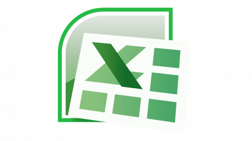
The Excel 2007 icon marked a departure from its predecessors, featuring a more intricate composition. In the foreground, a white sheet levitated above the surface, casting a subtle gray shadow. The sheet prominently displayed the monogram “XL,” wherein a dark green diagonal intersected a light green corner. Occupying the remainder of the icon’s space, specifically the bottom and right sections, were five green rectangles. These rectangles featured a noticeable gradient, adding depth to the design.
Behind the sheet, a geometric shape, possibly a square with a single rounded corner, partially concealed itself. While obscured, a double white-green border and a gray top section peeked through, contributing to the icon’s overall complexity and visual appeal.
2010 – 2013
Following the redesign, the diagonal segments of the monogram underwent a transformation, becoming slimmer and more elongated. Conversely, the lower stripe was shortened for a balanced visual effect. Both elements of the monogram now featured a radial gradient, each possessing its unique gradient pattern. The white sheet found its place within an asymmetrical square, a departure from its previous background positioning. The backdrop was divided into two distinct color blocks, exhibiting varying shades of light green, thus enhancing the icon’s overall visual appeal.
2013 – 2019
A unified logo was introduced for subsequent iterations of Excel, commencing in 2013. This emblem embraced a two-dimensional design characterized by its absence of gradient effects. Resembling an open book, it sported a dark green cover and a page partitioned into cells. The monogram was substituted with a solitary white “X,” positioned atop an improvised trapezoidal “cover.” This minimalist design approach conveyed a modern and straightforward aesthetic, aligning with contemporary design trends.
2019 – Today
As a part of the extensive Office 365 rebranding initiative, Excel introduced a fresh icon adhering to contemporary design conventions. The primary components consist of two rounded-edge quadrangles, accompanied by a background featuring a prominent vertical rectangle. This rectangle is subdivided into six distinct color segments, each representing varying shades of green. Partially overlapping this background is another geometric shape – a square housing a white letter “X” in its center. This redesigned icon exemplifies a modern and uniform visual language, aligning with prevailing design standards.


