Nabisco Logo
Nabisco Brands Inc. is regarded as one of the strongest and most appealing corporations in the food sector thanks to a combination of aggressive marketing and powerful brand names. Nabisco is a company behind American snacking favorites, which include Oreo cookies, Barnum’s Animal Crackers, Honey Maid Grahams, Ritz crackers, and Wheat Thins. Eventually, Nabisco expanded its selection to include Planters Peanuts, Fleischmann’s spreads and margarine, A1 Steak Sauce, and Grey Poupon mustards.
Meaning and History
![]()
The American Biscuit and Manufacturing Company, founded by brothers Jacob and Joseph Loose in 1890, was a merger of various confectionery factories in the western United States. With the help of lawyer Adolph Green, they convinced other companies to merge into one entity, resulting in the second-largest bakery in the country. To end price wars with rivals like the New York Confectionery Factory and the American Baking Company, Joseph signed another merger agreement, establishing the National Biscuit Company – Nabisco in 1898, which still exists today. The name Nabisco was originally used in 1901 as a part of the name of a sugar wafer. Nabisco did not become the company name until 1971.
What is Nabisco?
The billion-dollar brand Nabisco is owned by Mondelez International. Some of the most well-known cookies and crackers in the world today are produced under Nabisco brands, including Ritz, Chips Ahoy!, Oreo, and Newtons.
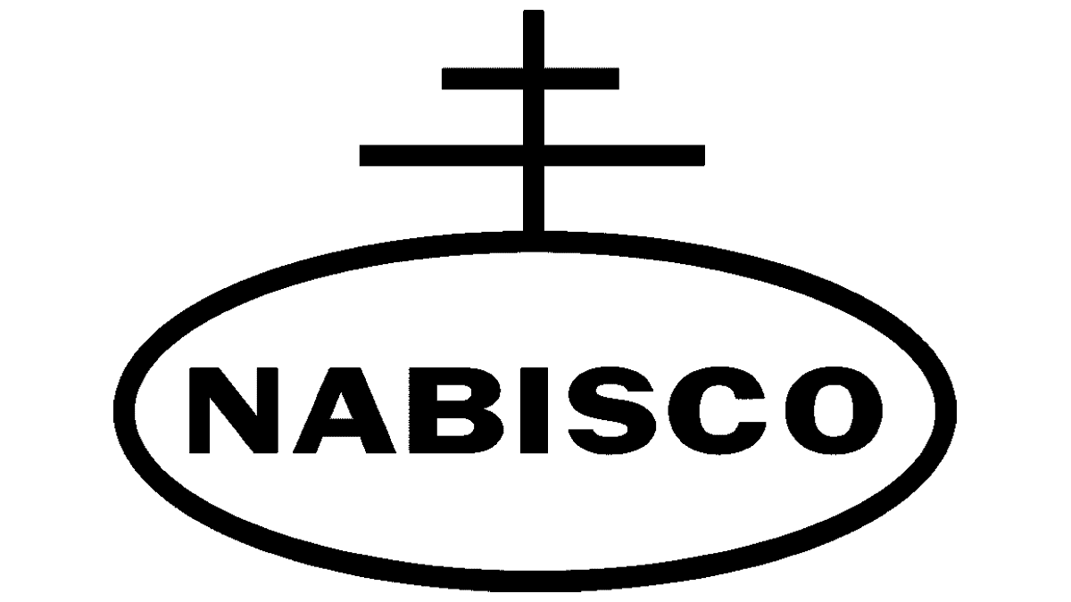
1898 – 1914
![]()
An oval shape with a two-bar cross on top of it has been representing the brand since the end of the 1800s. The Cross of Lorraine, which the Knights Templar carried during the First Crusade in the eleventh century, is thought to have inspired the shape of the Nabisco emblem. The term “IN-ER SEAL” is printed inside the oval shape. It refers to the then-novel sealed wax paper sealed packages that contained the crackers. The company used royal red and beige colors as well as serif font, creating a grand overall image.
1914 – 1947
![]()
The logo underwent minimal changes. First of all, the oval shape now carries the name abbreviation “NBC”. The red color got significantly brighter and bolder. All the elements are done in a contrasting white. Alternate versions featured the cross and oval shape with the letters done in black with a white base.
1947 – 1958
![]()
The brand image was not any different. It was decided to remove cross lines inside the oval shape. The whole space is now filled with the company name printed using a very similar font. This meant that the logo stayed recognizable.
1958 – 1960
![]()
The most noticeable update was the switch from an octagon-shaped base to a triangular one with a right angle at the upper left corner. The emblem was positioned on a diagonal. It stayed almost the same with the exception of a switch to a bold, sans-serif font. The company was updating its logo to go with changing consumer preferences while keeping the company’s image familiar.
1960 – 1990, 1970 – 2016 (Japan)
![]()
The new update touched only the size of the cross and oval shape inside the red triangle. The emblem was stretched and adjusted in other ways to better fill the base. Raymond Loewy, the designer, also changed the font to one with cleaner, straighter cuts and a stronger appearance. Alongside a red, triangular emblem, the company used a black version positioned straight on a white base.
1990 – Today, 2016 – Today (Japan)
![]()
Gerard Huerta, a designer from Bernhardt Fudyma Design Group, was in charge of work on this logo. This revision to the logo design makes several improvements that enhance legibility, and reproduction accuracy, and express a more modern and approachable appearance. At the same time, no major changes were made to the logo. They made the logo look softer by introducing rounded corners in the triangle, rounded ends on the cross, as well as rounded stroke ends for the inscription. It seems that the company did not want to lose an image that became strongly associated with its products. At the same time, it had to keep the customers interested and involved in one way or another.
Font and Color
Although the print version is typically done in black and white, the signature colors of the brand are bright red and white. The red color is a perfect choice for a company that has so many brands and such popularity. It radiates a strong and powerful energy.
The original logo features a serif font that resembles Fairmont font. Later, it switched to a font similar to Mythica Medium font, then Monotype Grotesque Display Bold Extended. The logo introduced in 1990 features a modified Helvetica font.