Nestlé Logo
Nestlé is an international corporation from Switzerland. The company is focused on producing and development of food and drinks, which include baby food, breakfasts, cacao, coffee, various snacks, etc. In the list of Nestlé brands, there are such popular brands as Nesquik, Nescafé, Kit Kat and many others.
Meaning and History
Nestlé was established in 1866 by Henri Nestlé, a pharmacist who initially produced a nutritious baby food product named Farine Lactée. The company gained international recognition in its early years, particularly for its revolutionary approach to infant nutrition. Nestlé’s innovations were instrumental in combating infant mortality due to malnutrition and made significant contributions to the field of food science and nutrition. Over the decades, Nestlé expanded through acquisitions and diversifications, acquiring major brands and diversifying its product lines to include beverages, dairy products, frozen foods, pet food, and more. Significant milestones include the development of Nescafé in 1938, which became one of the most popular instant coffee brands globally, and the introduction of Nestlé Toll House real semi-sweet chocolate morsels in 1939, which brought the company substantial growth in the U.S. market. Today, Nestlé stands as a global leader in the food and beverage industry, maintaining a strong presence in over 189 countries. Its commitment to sustainability, quality, and nutrition continues to be core to its business philosophy, driving its ongoing success and innovation.
What is Nestlé?
Nestlé is a global food conglomerate known for its vast range of products that cater to various consumer needs, from nutrition and health to pleasure and convenience. Spanning across many countries, Nestlé is dedicated to enhancing the quality of life and contributing to a healthier future, addressing global food challenges with sustainable practices and innovative solutions.
1866 – 1868
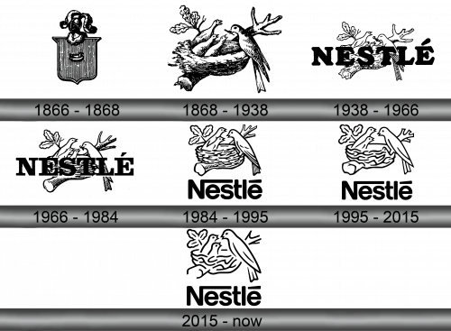
When Henri Nestlé founded his company, it bore the name ‘Anglo-Swiss Condensed Milk Company’ and had the logo which showed the shield and the knight’s helmet on it. The colors used for the logo were black and white, making the emblem look rather menacing and serious.
1868 – 1938
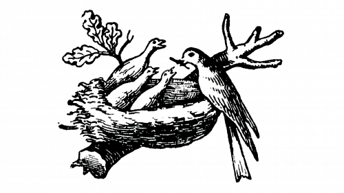
The 1868 logo featured the Henri Nestlé’s family emblem, the little nest. It featured the nest proper alongside the mother bird and her chicks. This logo outlived both the Anglo-Swiss Condensed Milk Company and its transformation to Nestlé, and even 150 years later remains the main design of Nestlé’s, although with severeal changes.
1938 – 1966
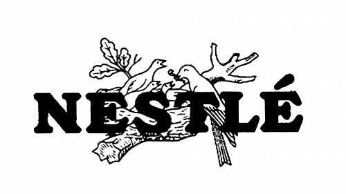
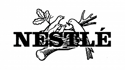
The following logotype used the little nest icon and depicted it on the background of the big inscription with the company name of the bold serif typeface. The icon of the nest itself was a bit simplified to make it not stand out of the whole picture.
1966 – 1984
The tendency to simplify the icon of the nest continued also in the 1966 logo. If in 1868 it was a highly detailed picture with many shades and shadows, in 1966 it became a simple nest drawn in dashes. In contrast, the company name style in 1966 logo was turned to a stricter one, with the thin letters and bold black color.
1984 – 1995
On the 1984 logotype, there’s still the nest. Now, there are only three birds, and the lettering saying ‘Nestle’. This time, the ‘N’ had a long extension in the shape of a line starting from ‘N’ and ending over the last letter ‘E’. The nest was also elevated above this usual writing.
1995 – 2015
The next variant didn’t have many changes, except for a more minimalistic nest. It had even fewer strokes and contours than in the previous versions.
2015 – today
In 2015, the emblem was simplified a bit further, and it was mostly manifested in the simpler shapes and fewer lines. Some elements – like the birds – also grew thicker. Other than that, very little changed.
