Norton Logo
Norton motorcycles have a long and controversial history. The main reason the brand keeps failing is also the main reason why it attracts so much interest. It is racing. Their leaders were passionate about the brand, but not very good at running a profitable business. In the 80s, Norton Interpol motorcycles served in the British police and numerous races in the legendary Tourist Trophy on the Isle of Man. When it comes to total Isle of Mann TT race wins, Norton shares its position with Suzuki as the third most winning manufacturer, right after Honda and Yamaha. The most famous model, Specter, starred in the epic film about James Bond.
Meaning and History
Norton was founded in 1898 by James Lansdowne Norton. It first supplied parts for bicycles before moving into the production of bicycles. The year 1902 marked a turning point in the company’s history when it began making motorcycles. After changing hands several times, it looked like the brand died by the 90s. Norton Motorcycles, though, was relaunched in 2008 by CEO Stuart Garner and some sponsors, who acquired the brand. Its success was short-lived and in 2020, the Indian TVS Motor Company acquired Norton and intended to continue the production of motorcycles.
What is Norton?
More than once, it seemed that one of the oldest British motorcycle brands, Norton, ceased to exist. No matter what the future brings, Norton has already made a significant contribution to the world of motorcycle history, although its glorious years are long gone.
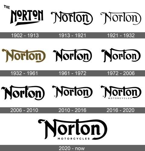
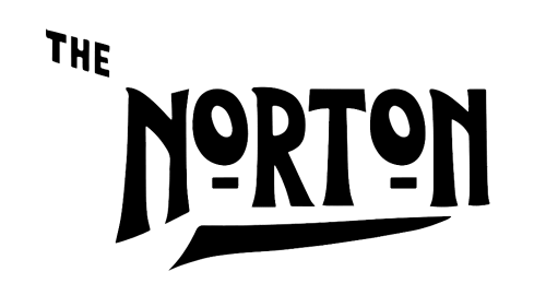
1902 – 1913
“The Norton” was printed using black, bold, and funky lettering. The article was much smaller and placed in the upper left corner of the inscription, which placed the accent on the brand name. It was further boosted by a bold, pointed line going underneath most of the letters. The letters had different heights, with the most noticeable height difference being the two short “o”s that were aligned with the other letters at the top.
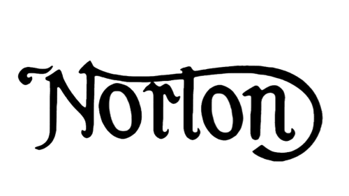
1913 – 1921
The logo of this brand got a very sophisticated and elegant appearance. It featured a stylish font with interesting elements. The first letter, for instance, had a line coming from the top and curving all the way around the “n”. Both “o”s also had an interesting twist and the inside portion was turned diagonally instead of being straight vertically.
1921 – 1932
The inscription looked more delicate thanks to thinner lines. Although the font has undergone some modifications, mainly smoother curves, the overall image was not changed.
1932 – 1961
The brand name was made bold again, which made a connection to the original logo. Otherwise, it featured lettering that had similar strokes and terminals. The color palette, though, made this logo very unique among all the other versions. It was a green-gold color with a thin yellow outline.
1961 – 1972
The logo acquired a touch of sharpness. The terminals were just a bit more pointy, while the “t” not only got a horizontal bar instead of just the “N” crossing it but also looked straight and had diagonal cuts. The letter “o” was also changed. Its oval shape inside was replaced by one that resembled a rectangle with rounded corners.
1972 – 2006
A little over ten years later, new modifications were introduced. Once again, the designers worked mainly with the small details of each letter, preserving the familiar brand image. This time, the letter “N” has undergone the most significant changes, as its terminals got rounder and it was enlarged.
2006 – 2010
The main update this time was the thickness of the strokes. The bolder look of the inscription reminded of the logo designed back in 1932, although the company stayed true to the original black.
2010 – 2016
This updated version featured smoother strokes and curves. This was reflected in each letter and especially noticeable in the letters “N”, “o” and “t”. The inside of the “o”s was now oval and not as tilted to the left. In addition, the horizontal bar in the letter “t” was now gone and the ascender was curved, once again bringing the logo closer to the one created almost a century ago.
2016 – 2020
The logo looked the same as it did before, it was now accompanied by a small inscription under the main name. It said “Motorcycles” in all title case letters using a basic, sans-serif font.
2020 – Today
With Norton’s logo, it is obvious that it is the small details that make all the difference. This was the first time the “r” was not as curvy and had sharper terminals and ascenders. The same goes for the “t”. These modifications definitely gave the overall image a more modern look, while preserving the original idea.
Font and Color
Norton used a cursive, bold font for its logos. It looks very similar to Vintage Fonts Collection VFC Ruiz. Both versions have something classic, glamorous, and graceful about them. The black color of the inscriptions enhanced this impression, creating a timeless brand image. The smaller inscription that was added in 2010 was done using a simple font without any serifs.
