Opel Logo
Opel is one of the oldest car brands that still exist. The beginning of the nineties can be safely called the peak of the concern’s development. It was during this period that many new car models were produced and conditions were created for the further popularization of this brand. The company, known for its engineering and design solutions, currently controls a quarter of the production of mid-range cars in Germany. It looks like Opel is not going to stop on its current achievements.
Meaning and History
Founded by Adam Opel back in 1863, at first, the company made bicycles and sewing machines, as the automobile had not yet been invented. By the end of the 19th century, it bought out an automobile factory owned by Friedrich Lutzman. After Adam’s death, his sons built cars with Lutzman for a couple of years before deciding to start their own production. From 1907 to 1911, cars began to be produced at the Opel plant along with sewing machines. Just a couple of years after the factory was restored after a fire, Opel achieved the title of the largest German car manufacturer. Later, it joined the American concern GM.
What is Opel?
Part of the General Motors’ concern since 1929, Opel GmbH is a beloved German automaker for many decades. Cars manufactured by Opel are currently recognized as the most affordable cars of German brands.
1862 – 1910
The founder’s initials created a stylish and ornate emblem as the letters overlapped. The “A” was brown and almost fully fit inside the “O”. The latter was red and symmetrical. The logo was used on sewing machines, as well as bicycles, and even its first cars.
1888 – 1889
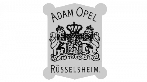
A geometric, rectangular crest serves as the base. At the top, the emblem had the founder’s name, while at the bottom, it said “Rüsselsheim”, specifying the location of the headquarters. A detailed depiction of two lions with a crown in the center added sophistication.
1889 – 1893
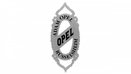
All the inscriptions from the previous loo were kept but placed on a different base. It was much simpler, but the bold name of the brand written diagonally across the emblem definitely caught the attention.
1893 – 1899
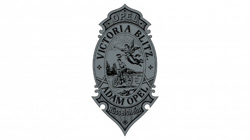
Although the previous shape was used as an inspiration, this logo looked very grand. The top and bottom decorative elements featured “Opel” and “Rüsselsheim”, respectively. The border of the oval shape had “Victoria Blitz” and “Adam Opel”. Victoria referred to the goddess of victory in Roman culture while the term Blitz was also featured on many bikes. A picture of a boy on a bicycle with an angel flying above it decorated the center.
1899
A black, solid shield with an interesting shape featured four lines with white inscriptions. At the very top, it said “Opel” in large, title case, old-style font. Below, it stated “Motorwagenfabric” followed by “Rüsselsheim a. Main”. The designers went for a very stylish serif font to add some elegance against the brutality of the background.
1899 – 1902
The very intricate and detailed design is very different from what was used earlier. It introduced new colors and focused on the brand name. This emblem was used to advertise the first automobiles of the brand. The latter did not feature any logos.
1902 – 1906
The designers returned a more simplistic style. The emblem has a shape of an eye. The “pupil” has “Opel” written in the title case, sans-serif typeface. “Motorwagenfabric” is printed above it, while “Rüsselsheim” arches at the bottom.
1906 – 1909
The black and golden emblem looked as if it was carved in the wood. Title case, large, sans-serif letters were decorated with elegant designs and symmetrical patterns. At the bottom, it stated “A. Opel Rüsselsheim A/M”
1909 – 1910
A basic, yet delicate cursive inscription, “Opel”, was written on a slight diagonal, going upwards. It infused some energy and reflected Opel’s desire for greater achievements.
1910 – 1921
Although the emblem resembled a shape seen back in 1902, it had different colors and feel. The center part featured a deep blue while the border looked like a laurel weave pattern of golden color.
1921 – 1928
An updated logo looks like an abstract version of the previous one. The bright yellow immediately attracts attention, while black adds contrast, boldness, and professionalism. There are no patterns, just solid colors.
1928
A square with rounded corners was split into four sections, one for each letter. It was golden color seen previously combined with white. Although the idea looked very interesting, it did not stay for long.
1928 – 1937
The designers left only the outlines of the oval shape and the inscription. They were yellow. The bright red circle, which now served as the base, also had a yellow border.
1930
The oval shape used earlier remained. The pattern around the border was an abstract drawing of a border from the 1910 emblem. It was black just like the “Blitz Rad”, which was printed in the center. For the base, the brand went for yellow, which created a bold color palette.
1930 – 1936
A new brand representation was developed with the introduction of a new truck line. It was based on the familiar eye shape. Inside, the emblem had a bold inscription that stated “Blitz”. The letter “I” was stylized as part of a thunderbolt. The latter looked like a “Z” with one of the ends going above and the other going below the word. It was created for delivery trucks. The company used a lightning bolt, which became its recognizable brand image, for the first time.
1936
Bold, sans-serif lettering was used to spell out “Opel Blitz”. The two words were widely spaced apart. The gap was filled by a thunderbolt that reached to the far left and right, crossing both words. It was also designed for delivery trucks and had a cohesive and powerful appearance.
1936 – 1952
Another version of an emblem for delivery trucks was introduced in 1936. “Opel Blitz” on two rectangles that were placed on a diagonal and slightly overlapped each other. This gave some dynamics to the logo and looked a bit like the lightning bold featured earlier. The white letters were contrasted by a light gray background. The company used a serif font and bold strokes here.
1937 – 1950 (secondary)
An oval shape with a vertical line going down its center and splitting it into white half on the left and yellow on the right served as a background for the name. “Opel” was printed in bold, black letters featuring stylish serifs.
1937 – 1947
The company used a stylized symbol of technical developments and innovation, Zeppelin, as the main emblem for various purposes, including an advertisement, published materials, and cars. A yellow circle that was framing it made an association with a wheel and constant progress.
1937 – 1938 (badge)
A simplified version of the main logo was used as a badge. It featured a thin circle and light gray combined with a white color palette. There was no “dorsal fin” on the Zeppelin.
1938 – 1947 (badge)
The badge was done in a darker gray with more details, including a triple line for the circle. It gave a feeling of confidence.
1947 – 1954
This version was designed for advertisement. It looked more like the one seen back in 1937. The Zeppelin image was elongated, which created a feeling of movement.
1950 – 1970
The company continued to use the oval logo it introduced back in 1937. The only change was a more horizontally compressed oval shape. The lettering also looked a bit different and vertically stretched out. the updates made it look more attractive.
1951 – 1953 (badge)
This was another badge that kept the idea seen before. The modifications included an addition of a wing to the top of the Zeppelin.
1952 – 1964
A lightning bolt was used on its own. It had a 3D appearance and featured various shades of gray. It was drawn just for the delivery trucks.
1953 – 1956 (badge)
This version looked very similar to the one presented in 1951 but featured a sleeker image. It also had a thicker double border.
1954 – 1963
Besides the introduction of a golden color instead of gray the emblem has not changed much. The designers also added a brand name underneath. It featured a title case, sans-serif lettering that followed the ring shape.
1956 (badge)
The badge resembled the main logo, including the color palette. There was no name, though, and the “wing” had a different shape.
1956 – 1957 (badge)
This badge also uses Zeppelin as the center image. The circle around it is much thinner, which creates a feeling of lightness.
1957 – 1959 (badge)
Yet another modification was done to the badge, making it bolder and more solid.
1959 – 1963 (badge)
This is the only badge/logo variation that features an oval shape in combination with the Zeppelin/lightning bolt. The elongated shape enhanced the dynamics and gives a feeling of speed.
1963 – 1964
This variation looks like a blend of a thunderbolt and a Zeppelin. It is black and features a thin circle with a “lightning bolt” going across it.
1964 – 1970
The brand’s advertisements featured this logo for several years. The lightning bolt and circle emblem were no longer the main elements. Instead, it was placed under a large inscription that said “Opel”. The whole emblem had a thin rectangular border and was done in black.
1964 – 1968 (badge)
The company never stopped introducing new badge designs. This version features a lightning bolt combined with a circle, creating a recognizable image and blending elements from different logos seen earlier. It was seen only as a car badge.
1968 – 1970 (badge)
A more elegant alternative was drawn in 1968. It featured thinner lines and more pointed ends. This is another car badge.
1970 – 1978
The designers flipped the two elements of the main logo. The lightning bolt, which now had the ends cut straight, and a circle around it featured thick lines. The name underneath also looked extra bold thanks to thick strokes and slab serifs. A beige background added a bit of softness.
1978 – 1987
A bright yellow replaced the beige and the logo acquired a thick border going around its outer edge. The font has also been changed for a more modern look. Although the emblem above the name was not redrawn, it was no longer as bold and large. Instead, it had a thin, rectangular frame.
1987
This version looks stylish and classic. It is just a ring with the lightning bolt inside taken from the 1970s logo. The emblem is white, though, and has a black outline.
1987 – 2002
The 1978 version was brought back with a few adjustments. Mainly, the yellow was gone and only a muted shade of it was used for the rectangular shape behind the ring. This emblem was designed for advertisement purposes.
1991 – 1995 (badge)
This is a modified ring introduced in 1987. It looked very powerful thanks to a black background and a thicker, white lightning bolt in the middle.
1995 – 2002
All the framing and background were stripped from the logo first presented in 1978. The emblem was also made a bit bigger to give the overall appearance sophistication and power.
2002 – 2007
A modern spin was given to the logo. The name was done in golden, while the ring above it was now metallic silver with a 3D appearance.
2007 – 2009
The name and the emblem featured gradients that gave richness to the overall appearance. The lightning bolt element was also thicker.
2009 – 2017
The modifications made the logo more masculine and luxurious thanks to darker shadows. Across the top of the ring, it stated “Opel” in small, all uppercase letters. The font was quite basic and black.
2016 – 2021
A sleeker-looking lightning bolt was presented in this version. The gray shade has also been changed and looked warmer than in previous logos.
2017 – 2020
The ring emblem from the 1995 logo was used for a short period of time on its own.
2020 – 2023
The designers updated the previous log and added a brand name under the emblem. The lightning bolt had its ends cut at a diagonal now, which added some dynamics.
2023 – now
The sharp and confident Opel lighting bold was redrawn during the redesign of 2023. Now the symbol is composed of two narrowed elongated trapezoids, making up the recognizable “Z” symbol, inscribed into a thinner circular frame. The lettering, set under the geometric emblem, is executed in the uppercase of a bold sans-serif typeface, which is almost the same as the one from the previous version.
Font and Color
The Opel brand probably has a record for the number of logos it had designed. It is partially explained by the long history of the brand. The designers often went for black/gray/silver and white colors for the emblems. There was a lot of yellow and golden as well. For relatively short periods, red was also added to the color palette. When it comes to fonts, the company typically chose bold fonts with geometric motifs. The latest version features Allumi Std Extended Extra Bold.
