Panasonic Logo
Panasonic is a well-known brand in the global home appliances and electronics market. Panasonic Corporation has hundreds of companies, factories, and research centers around the world. Many models of household appliances and electronics are produced under this brand. Two main areas can be distinguished: industrial products (laptops, tablets, and other goods with special protection) and goods intended for use in everyday life (audio equipment, video equipment, kitchen appliances).
Meaning and History
The history of the corporation began in 1918 when Konosuke Matsushita created Matsushita Electric Factory, later renamed Matsushita Electric Industrial Company. The Panasonic brand was one of the brands of the corporation. The desire to conquer the US market led to cooperation with the European Philip, which gave birth to the Panasonic brand in 1955. The goods were sold under the National brand in the domestic market and only in the mid-1980s, the Panasonic brand has entered the Japanese market. By this time, the company mastered a vast array of products and became one of the world’s leading manufacturers, offering products that were of high quality and long service life. In 2008, Matsushita Electric Industrial changed its name to Panasonic Corporation.
What is Panasonic?
Panasonic is one of the leading Japanese electronics manufacturers. Over the years of its existence, the brand has proved its status as one of the leaders in its production.
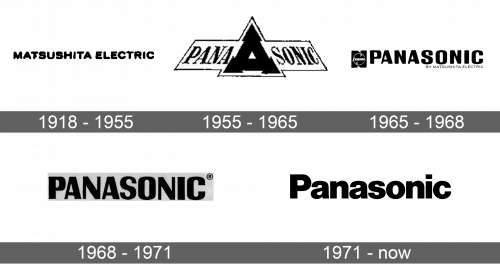
1918 – 1955
The company had a super simple wordmark. It simply stated, “Matsushita Electric” in black, all uppercase letters. The font featured thin lines and lacked serifs or any other fancy details.
1955 – 1965
After the Panasonic brand was formed, a new logo was designed. It had “Panasonic” written in a serif font. The name was split in half by a black triangle with arrows on the end of each corner. The whole emblem had a thin border around it. It looked as if the name was placed on a sign and drawn looking up at it. The emblem gave an impression of innovation, modernization, and improvement thanks to an arrow pointing up.
1965 – 1968
The updated version looked more professional and confident. It featured “Panasonic” written in a bold, sans-serif typeface. All the letters are uppercase and black. The name was complimented by an emblem on the left and an inscription “By Matsushita Electric”. The emblem consisted of the name written in small font framed in a white circle and placed on a black element that resembled “N”. This is a reference to the National brand used by the Panasonic Holdings Corporation in Europe.
1968 – 1971
For a short period of time, the brand used only the wordmark from the previous logo. There was no more emblem to the left of “Panasonic”.
1971 – Today
It was not long before the logo was updated again. This version not only looked minimalistic but also more sophisticated. The word “Panasonic”, done in blue with only the first letters capitalized, was the only element of the logo. This was the first time the brand introduced color into its logo. It was a calm blue that is known to stand for trust and reliability.
Font and Color
The company started with a basic, sans-serif font. It was replaced by a bolder typeface with serifs. In 1965, the designers went for a more rounded, bold, sans-serif font. The last logo features a font that is based on Helvetica Black, Sequel Sans Black Display, or a similar typeface. It has rounded forms with straight cuts for a balanced look. The color palette was predominantly black. Only the logo introduced in 1971 and used for over half a century was done in blue.


