Pearl Milling Logo
The formerly named Aunt Jemima, a popular producer of pancake mix and syrup, underwent a rebranding in recent times, emerging as Pearl Milling. Since 1889, this food business has been a breakfast table essential in the United States and Canada. Chris L. Rutt and Charles G. Underwood, the company’s originators, were pioneers in the flour milling field, creating inventive techniques and goods that became the industry benchmark during their time.
Meaning and history
In the beginning, the product was marketed as “Self-Rising Pancake Flour” and was labeled with the same font style as an identifier. Seeking differentiation from his competitors, Rutt selected an image of Aunt Jemima from vaudeville posters that he encountered in St. Joseph, his hometown, in 1889. The figure was used in various forms until 2021 when PepsiCo Corporation renamed it Pearl Milling Company, its original name from 1889.
The Aunt Jemima Mills was established in 1914 when the mill was purchased by Randolph Truett Davis Milling. Davis improved the pancake flour recipe and gave the company its current name. Quaker Oats later bought the mill in 1926 and trademarked the Aunt Jemima image, which has been the longest-serving trademark in American advertising history. The logo underwent another transformation in 2021.
Haddon Sundblom, an illustrator hired by Quaker Oats, created the famous portrait of actress Anna Robinson as Aunt Jemima in the mid-20th century. Designer James J. Jaffee from the Bronx, New York, later reimagined the logo, resulting in a total of nine different versions. Although the iconic African American woman remains on the pancake mix packaging, her image has undergone significant changes over time.
What is Pearl Milling?
Pearl Milling is a new name that surfaced after the recent rebranding of a well-known producer of pancake mix and syrup. The previous name of the company was Aunt Jemima. Since 1889, this company has been an essential part of breakfast tables in the United States and Canada for over a century. The founders, Chris L. Rutt and Charles G. Underwood were pioneers in the field of flour milling, using innovative methods and products that set the standard for the industry during their time.
1889 – 1912
The initial emblem showcases Aunt Jemima, a comical figure from vaudeville. The beloved matron was picked to represent the pancake brand due to the nostalgic memories she evokes of nurturing caretakers and home-cooked meals. The logo displays a full-face portrait of the grinning African American woman wearing a striped cloak and a shawl featuring prominent polka dots. The backdrop is a woven rattan mat. At the bottom, three slender sans-serif inscriptions read “Use,” “Aunt Jemima,” and “Pancake Flour,” with the central one being the most prominent.
1912 – 1925
The revamped Pearl Milling emblem showcases a striking vertical maroon rectangle with a beaming woman of African descent sporting a turban and dotted headscarf. The brand name is inscribed above in a curved style, with “Brand” appearing in a bold sans-serif font. The lower section boasts the producer’s details and “Pancake Flour” in cursive letters, featuring elongated endings.
1925 – 1950
The Aunt Jemima logo has undergone a realistic redesign, imbuing the portrait with features true to those of individuals of the Negroid race. The scarf atop her head is adorned with a pattern, knotted at the nape. Her cape is absent, and instead, she dons solely white attire. The brand name and manufacturer details are displayed against her smiling figure, using a tall and grotesque font style.
1950 – 1968
The brand designers have presented a fresh interpretation of the Pearl Milling logo, with the cheerful Aunt Jemima depicted in a contemporary fashion. Her vibrant personality is more evident, and her smile is more genuine. Her skin tone has been adjusted to a more lifelike brown shade, eschewing the previous deep black hue. A headscarf bedecked with diamond-shaped and diagonal-striped patterns in a red-yellow color scheme now sits atop her head. The brand name, consisting of slightly curved letters in a blue shade, is located to the right of the figure.
1968 – 1989
The emblem of Aunt Jemima underwent modifications, which included a reduction in the size of the aunt’s face. The new design portrays a svelte and youthful woman with a benevolent smile, encased in a circular framework. The previous headscarf was replaced with a headband adorned with geometric patterns, partially covering the curly hair, while the cape was supplanted with a white collar. The color palette is low-key, utilizing subdued shades of pastel red, brown, black, and white. The layout of the inscription remains unaltered, but the font style now features bold and curved lines, with closely spaced lettering and serifs.
1989 – 1993
The logo of Pearl Milling underwent a significant chromatic transformation, introducing bright and intense colors to its previous version. The new emblem boasts a gradient-hued, horizontal rectangle serving as the background, accompanied by a circular shape situated in the top left corner. Within it, the cheerful image of an African-American woman is featured, with her head free from any coverings, sporting curly hair instead. Her collar has been modified, now resembling intricate lacework, with pearl earrings adorning her ears. While the font style remains unchanged, it is now displayed in white instead of black. This particular rendition was crafted in honor of the trademark’s centenary celebration.
1993 – 2020
Further alterations were made to the Aunt Jemima ensign, supplanting the former quadrangular perimeter with a circular one, displaying the identifiable countenance of a gratified melanin-rich woman, with her cranium slightly inclined. The backdrop chroma underwent a metamorphosis from vermilion to a golden hue, whilst the lettering style presently features emphatic oblique font. A chic triangular brushstroke accompanied by a speck atop replaced the conventional crossbar on the letter “A,” rendering it the most conspicuous modification.
2020 – 2021
In mid-2020, Quaker, which is owned by PepsiCo, revealed a rebranding of the Pearl Milling logo, as a reaction to social pressures that demanded the termination of advertising and marketing that perpetuates racism. Consequently, the logo no longer features the image of an African-American woman, and only the name is present, rendered in an italicized font.
2021 – Today
Following protests against racism, the corporation initiated a rebranding process that included a change in the company’s logo. The updated emblem showcases a yellow circle containing the image of the initial flour mill structure atop a horizontal rectangle, accompanied by “Since 1889” on both sides. The current name is positioned at the base, composed of two lines of text, and rendered with shadowed letters that generate a 3D illusion.
2023 – Today
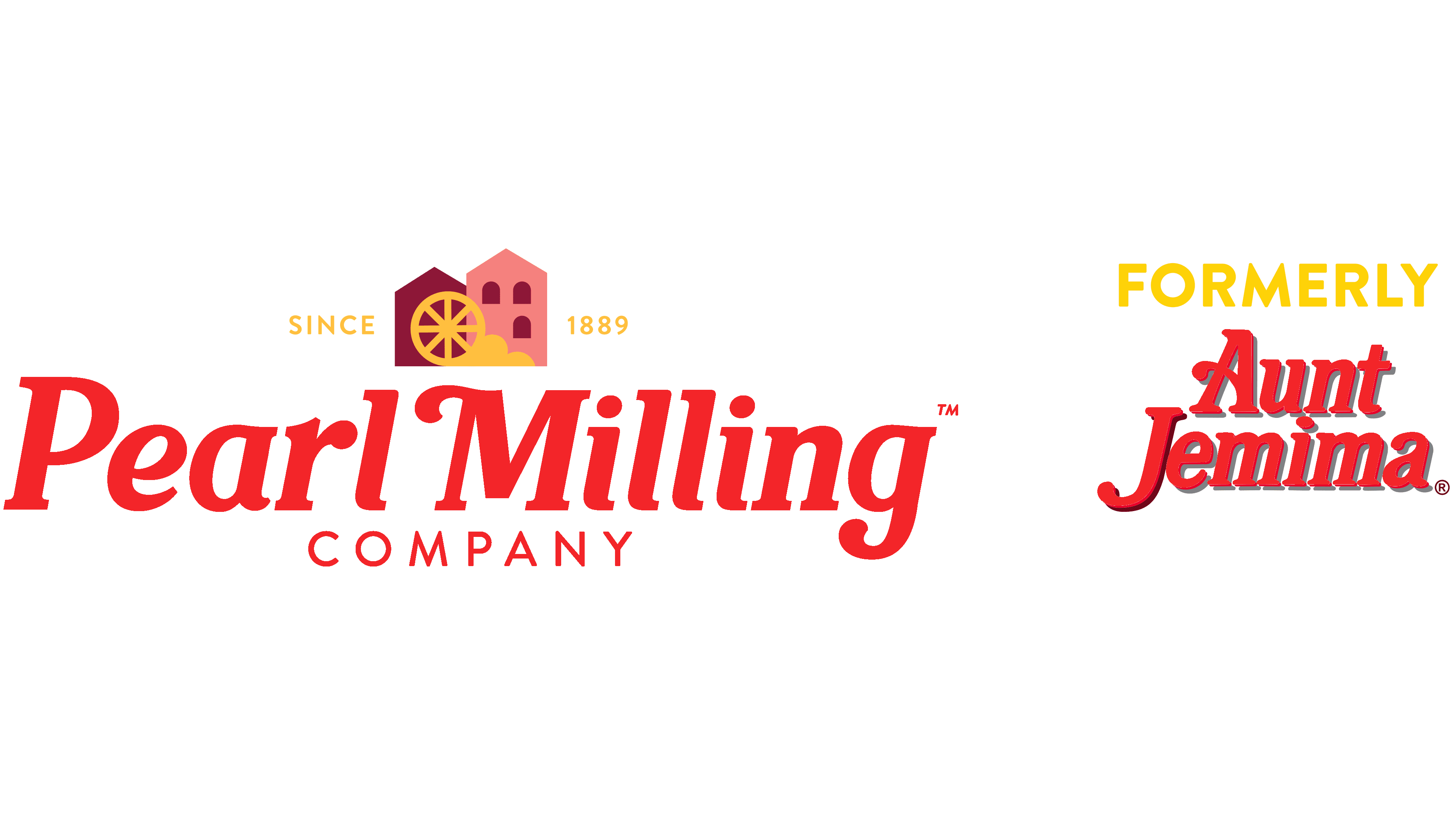
The logo features the bold red lettering of “Pearl Milling Company” with a rustic mill wheel icon placed above. The mill wheel is set against the backdrop of two quaint red buildings that evoke the imagery of a historic mill. Near the mill wheel, the text “SINCE 1889” is written in small, uppercase letters, establishing the brand’s longstanding heritage. To the right side of the image, the text “FORMERLY Aunt Jemima” is inscribed, with “FORMERLY” notably smaller and above the more prominently featured “Aunt Jemima”, which is underscored to highlight the company’s original name. This part of the logo serves to inform the viewer of the brand’s evolution from its previous identity. The entire logo is set against a plain white background which ensures that the elements are clear and distinct.
Font
Throughout its existence, Pearl Milling’s logo has gone through several transformations regarding its font styles, displaying a broad spectrum of discrepancies. Nevertheless, recent versions of the emblem manifest a likeness in typography. As an acknowledgment of its past, the new logo derives its typeface from its predecessor, Aunt Jemima, mimicking its engravings. The letter shapes exude an elegant composure, characterized by supple curves that strongly resemble the characters of the Classic Round Bold Italic font.
Color
The brand emblem employs a lively chromatic palette comprising diverse tints of crimson, coupled with touches of golden, snowy, coppery-brown, and ebony shades.


