Pittsburgh Penguins Logo
This is the name of a team of famous hockey players. Thanks to drafting Mario Lemieux, the team has risen to great heights and was able to win trophies in 1991 and 1992. They were also lucky to have other star hockey players playing as Pittsburgh Penguins. Interestingly, it is Pittsburgh that many historians consider to be the birthplace of professional sports.
Meaning and History
Since the foundation back in the late 1960s, the history of the Pittsburgh Penguins is a series of ups and downs, successes and failures, a change from a championship period to a time of stagnation in the NHL underdog list. The name of the team has a somewhat comical origin. The stadium where the team was going to play looked very much like the shelters the Eskimos build to survive on the north. Logically, penguins should have become the neighbors of the Eskimos.
What is Pittsburgh Penguins?
Hockey history would not be the same wouldn’t be there the Pittsburgh Penguins team. Today, Pittsburgh’s home arena of many years is one of the most recognizable in America and the oldest in the NHL. In 1999, Lemieux turned years of unpaid wages due to financial hardships into equity and became co-owner of the team. In 2000, he retired and became the first player-owner in NHL history before retiring again midway through the 2005–06 season.
1967 – 1968
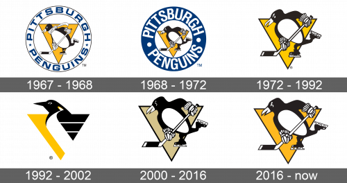
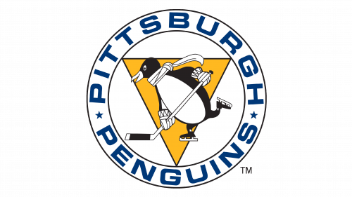
It all started with a round emblem with a penguin hockey player as their main character. It was drawn in motion in black in white with a white scarf and gloves and hockey stick in both hands. A yellow triangle with thin black borders pointing downwards served as a background. Around the perimeter, the name of the team was written in deep blue using simple uppercase letters with two stars dividing the words.
1968 – 1972
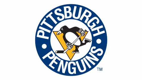
The emblem was redesigned and looked much bolder. The name of the team was written in larger and bolder letters with circles substituting the stars. The colors were also switched, so the letters were done in white on a blue background. There was no more scarf and the triangle looked smaller. The penguin also had noticeably wider shoulders, which made him look stronger.
1972 – 1992
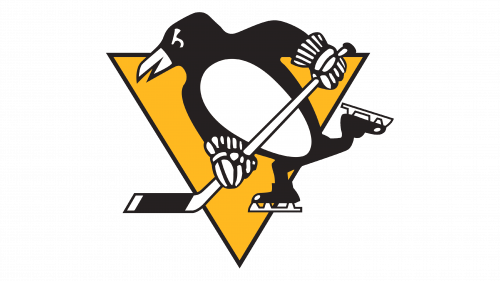
The logo lost the round element with the team’s name. The triangle and penguin were left almost unchanged and were only enlarged. There was still that determined look and motion and it was not hard to guess who the logo belonged to.
1992 – 2002
The design of the new logo carried the same concept as the original logo but looked very different from the original version. There was still a yellow triangle, but now a majority of it was covered by the body of the penguin. The penguin itself was drawn more realistic and it was only its head and upper part of the body. The part where it would have its wings was drawn as three strips that stretched horizontally to fill the triangle. The head was the only part that was sticking out of the triangle.
2000 – 2016
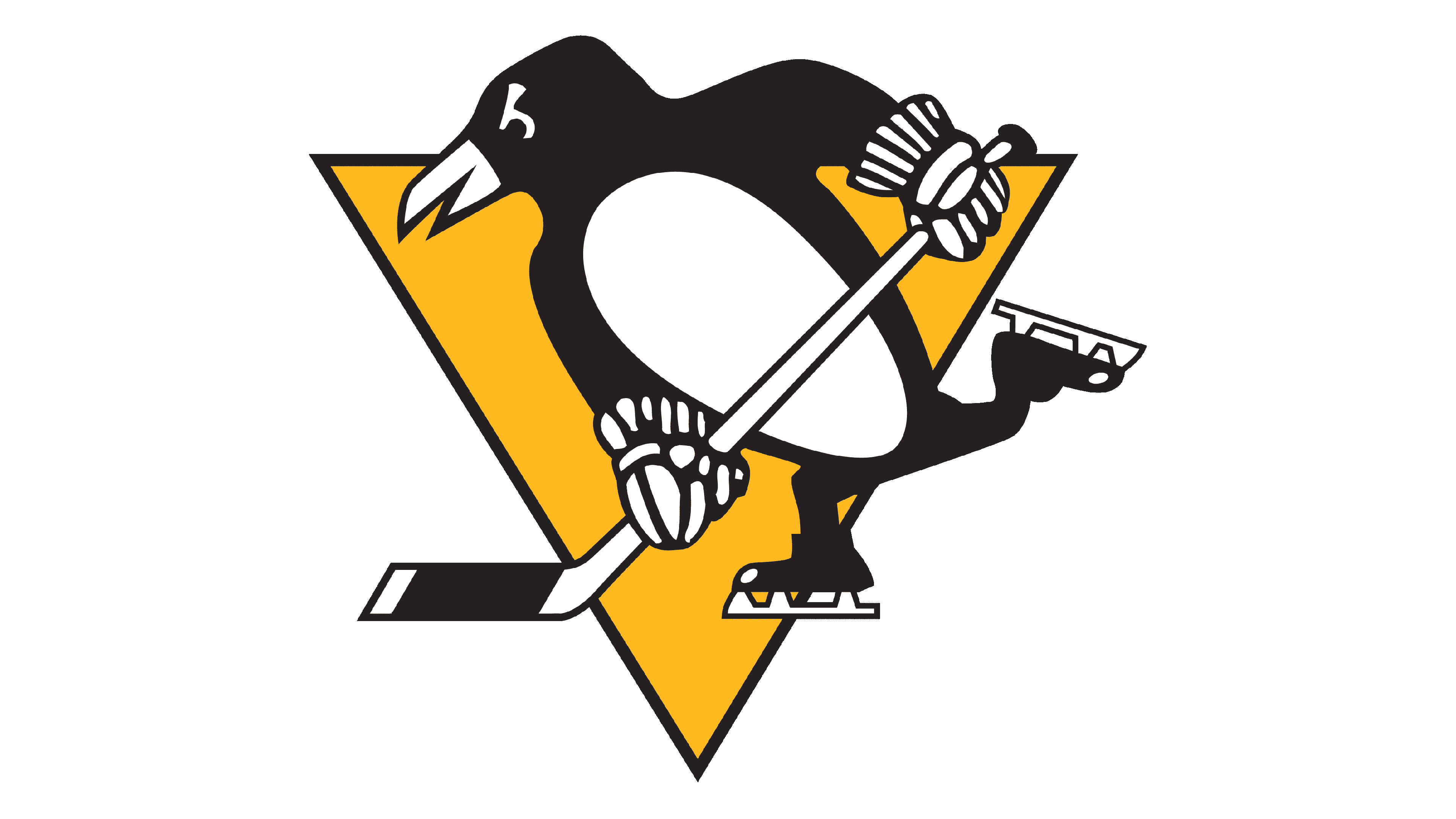
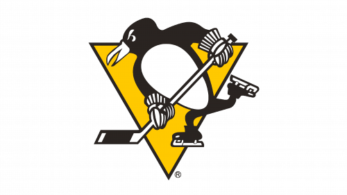
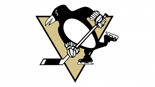
The team brought back the logo created back in 1972. It was exactly the same in terms of the penguin running with a triangle in the back. The triangle, though, was a different color and looked more golden than yellow.
2016 – Today
The colors in the logo were changed again. Although the penguin was still drawn using a black and white color scheme, the triangle was yellow once more. It was a deeper shade of yellow, which created an even better contrast. Overall, there is a sense of energy and even passion.
