Planters Logo
Snacks, especially if they are considered to be the healthier alternative, have always been quite popular. With over $1 billion in sales, market leadership in numerous snacking categories, and widespread consumer recognition, Planters is undoubtedly one of the most iconic snack brands. The brand even has a Mr. Peanut character, which was originally drawn by a student Antonio Gentile in 1916, represent it in advertising.
Meaning and History
![]()
Planters Peanuts was founded in 1906 as a result of the vision and ambition of Amedeo Obici and Mario Peruzzi, who he had convinced to become his business partner. In 1925, Planters opened its first international office in Toronto. In early 2021, the brand was sold to Hormel for an astounding $3.35 billion, along with several other Kraft Heinz brands. In 2024, the company introduced Mr. IPA-Nut, its first venture into the craft beer market. Before being acquired by Hormel relatively recently, Planters Peanuts was a part of The Kraft Heinz Co.
What is Planters?
Planters is an iconic snack food brand from the United States that is well-known and adored worldwide. The brand sells snack mixes, mixed nuts, flavored cashews, peanuts, seeds and other nuts.
1916 – 1919
![]()
This logo has been created over a hundred years ago. There are no fancy details. Nonetheless, the designers turned to different fonts and font sizes to create an eye-catching and entertaining brand image. As expected, the logo features a classic color palette.
1919 – 1924
![]()
The color palette has been preserved this version looks splendid thanks to a decorative cursive font that spells out the name. The logo features two other fonts: one relatively basic, sans-serif font and a bold typeface with serifs for the word “Peanuts”. A clever combination of the parent company name and the word “Peanuts” on one line, separated only by font, creates a very interesting design.
1924 – 1927
![]()
It looks like the way how its brand name will be printed has been determined. Thus, this logo update touched only the other details. The parent company’s name, Pennant, is squeezed between the name and its product – Salted Peanuts. The designers continued to play with combining different fonts in one logo, but the “Planters” line was undoubtedly the star.
1927 – 1943
![]()
The “Pennant” line is gone just like the beautiful cursive typeface. A bold font with barely noticeable serifs made the name look confident. The second line features “Salted Peanuts” printed using the same font, only smaller characters. The inscriptions use all caps, making the first letters slightly bigger to create the impression of a capitalized word.
1943 – 1988
![]()
This simple logo gave birth to all the other versions and can still be seen on Planters Cheez Balls. There is only one line. It features bold, straight, and clean strokes. There is minimal spacing between the letters, which enhances a solid and reliable image of the company. The brand went for yellow for the inscription and set it on a dark base. Such color choice was meant not only to grab the attention but also to create an association with something happy and positive.
1988 – 1997
![]()
It might look like nothing has changed besides the addition of a white border and an oval base instead of a square. An attentive eye, though, will notice that the characters not only got slightly shorter but the strokes were rounded to create an even friendlier image.
1997 – 2005
![]()
This logo features an already famous Mr. Peanut. It was quite logical to add this character to the logo as well. It is set on an orange background right next to the blue rectangle with the brand name. The whole logo is set on a diagonal, which gives the logo dynamics and shows the energy one will get after a Planters’ snack. Besides adjusting the inscription to fit the diagonally placed base, the font has stayed the same and was still done in bright yellow. The logo looks fun and colorful and invites one to take a moment and relax with some Planters.
2005 – 2006
![]()
For a short period of time, the logo consisted of only the name and a base. The latter looks like a rectangular piece of material stretched with its corners being pointed. To add even more dynamics, the designers added curved lines with pointed ends above and below the name. The logo looks minimalistic and peaceful.
2007 – 2017
![]()
Mr. Peanut has been brought back. He looks more polished and acquired an illusion of volume thanks to highlights. The banner with the name also has a gradient to create a feeling of depth. The designers took it a step further and added volume to the inscription as well. They attempted to create an image that would appeal to the contemporary consumer.
2015 – 2020
![]()
Although the logo features just the brand name once again, it looks very impressive. The inscription has a three-dimensional appearance with an indent in the center and a blue shadow. To enhance a grand look, the designers arched the name. This version turned out modern while still preserving the brand image that has been forming for decades.
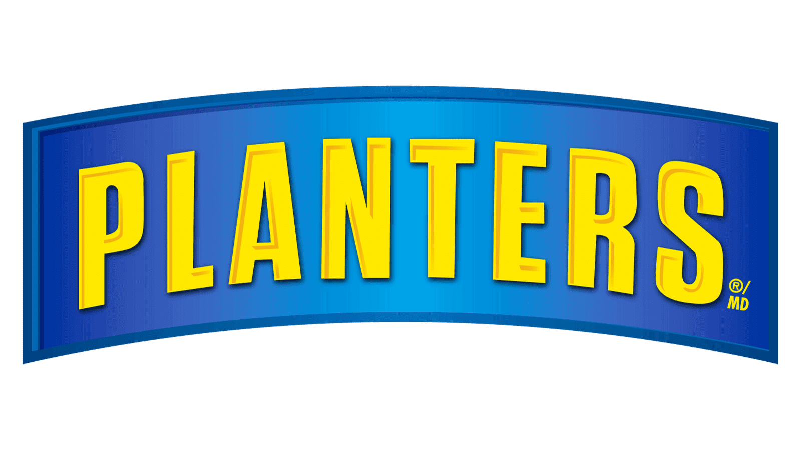
2020 – Today
![]()
Designed by Jones Knowles Ritchie in 2020, the logo has been adjusted to create a bolder brand image. The letters got shorter for a more put-together look and the font has been modified as well. The blue shadow got significantly darker, almost black, creating a deeper and more dramatic image.
Font and Color
For the first thirty years, the logos featured a black-and-white color palette. It is a classic choice and was a great option for an era when color was not as popular. Since 1943, the yellow color has become the key color of the brand. It is a happy and energetic color that also stimulates appetite. There is also a blue color. It is a color that is associated with trustworthiness and reliability.
For the first decade, the company was testing different fonts to find its identity. One can see bold, serif font and more delicate cursive inscriptions. In 1927, the logo featured a bold font with barely noticeable flare serifs. It was not until 1943 that the logos began to use a font many associate with the Planters brand. It resembles the Zuume Soft Bold font or Rift Soft Bold font.