Pringles Logo
Pringles is one of the top potato chip brands in the world. It originates in the US precisely as an answer to the usual problems associated with the chips even now – grease, excessive air inside the bags, and so forth. The solutions offered by Pringles were apparently successful enough to create a popular generation-spanning product.
Meaning and History
This brand of chips has been introduced into the market by Kellogg back in 1968. The reasons behind the name or the logo aren’t clear. There are several possible explanations to the name. As to the image on the emblem, it’s completely unknown who the face is supposed to be other than a generic moustached gentlemen.
What is Pringles?
Pringles is a brand of American potato chips introduced in 1968 by Kellogg’s. They are widely known for being sold in long tubes, where chips are stacked in a big tower, as opposed to the usual packaging. They come in 21 different flavors all over the world, making them among the most famous chip brands worldwide.
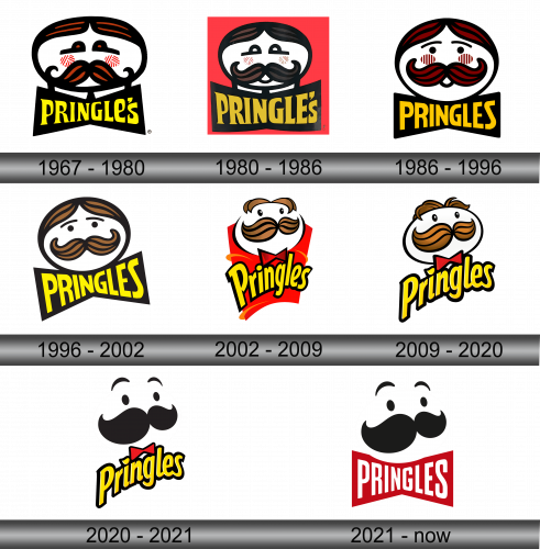
1967 – 1980
The first logo featured a heavily whiskered man, but not exactly as we know him. It was a white oval with a massive ginger, curled moustache outlined heavily in black. The same went for the hair, which was sleeked to both sides in this variation.
The brows are simple ginger dots with long black lines sprouting away from them. Also note the blush spots that would disappear in a few variations.
The writing beneath said ‘Pringle’s’ in cartoonish and uneven yellow letters. In this variation, there is an apostrophe, meaning there was some Mr. Pringle they took inspiration from. It vanished the very next time.
1980 – 1986
The 1980 revision retained the core design but introduced a significant change: a red square was incorporated as the background, offering a distinct visual contrast.
1986 – 1996
Not much changed, conceptually. The face is now more of a circle, and the hair is brownish rather than ginger. The brows are no longer dots but thin black lines with a pair beetle-eyes right below them. Also notice a miniscule opened mouth right underneath the whiskers.
The writing didn’t change much, besides being repainted orange and getting rid of the apostrophe. Now these chips are the Pringles.
1996 – 2002
The next variation saw several key things. Firstly, the hair was bleached to a chestnut color, the blushes and the mouth disappeared. Additionally, the face once more was widened to an oval and tilted to the left a bit.
The writing, for its part, was narrowed in the middle and widened closer to the ends. This gave it a butterfly-like shape. The color also reverted back to yellow.
2002 – 2009
In 2002, they gave the product an iconic look most people know it by. They tilted the head from the 1996 design up and to the right to add volume. Simultaneously, the sleeked hair also gained some volume. Lastly, they removed the brows and added some glint to the eyes in a form of small white specks.
On the foreground, they put a sort of red tube to resemble the usual cans they sell these in. To match, the head got itself a little red bowtie.
The writing also changed. It lost the butterfly look and instead a new cartoony design, where only the first letter was uppercase and they were all on the same level.
2009 – 2020
Very few elements changed this time around. The hair is now more detailed and curly, and the face is slightly illuminated. Lastly, they removed the red tube from the background.
2020 – 2021
2020 saw a lot of simplification. The outlines on everything (including the head, the moustache and nearly everything else) are gone. The whiskers themselves kept the shape more or less, but changed the coloring. It’s now completely black, as are the eyes. The hair vanished – instead they introduced a pair or floating lines as brows.
The bow-tie and the writing remained themselves, and they, for some reasons, got to keep their black outlining.
2021 – Today
This logo iteration, implemented in 2021 and primarily employed outside the United States, closely resembles its U.S. counterpart in terms of style. The primary distinction lies in the name, which is rendered in white and placed within what can be likened to a red bowtie shape located beneath the facial element.
Emblem and Symbol
Unlike the previous designs, the 2020 style can change ever so slightly. For various reasons, some features of the face can change when you put it on different cans. Sometimes the eyes are closed tight, sometimes they are closed in delight, and sometimes just one of them is closed.
