PSV Logo
PSV, or PSV Eindhoven, is a renowned football club based in Eindhoven, Netherlands. Established in 1913, it has a rich history of achievements, including numerous Eredivisie titles and a UEFA Champions League win. Known for their red and white striped kits, PSV plays its home matches at the iconic Philips Stadion. Over the years, the club has been a nurturing ground for talented players, many of whom have gone on to achieve international acclaim. With a dedicated fan base and a reputation for showcasing attractive football, PSV remains a formidable force in Dutch and European football.
Meaning and history
PSV Eindhoven, commonly known as PSV, is an iconic football institution hailing from Eindhoven in the Netherlands. Established in 1913 as a team for Philips employees, it quickly transformed from a modest factory squad to a footballing giant in Dutch sports.
Throughout its illustrious history, PSV has clinched the Eredivisie title numerous times, with its most dominant period coming in the late 1980s and the 2000s. Their crowning achievement on the international stage was in 1988 when they outshone all to secure the UEFA European Cup.
The Philips Stadion, PSV’s home ground, has been a fortress for the team. With a capacity exceeding 35,000, it has witnessed countless memorable matches and has been a hub of passionate support.
PSV’s legacy is also enriched by its knack for nurturing young talents. Numerous football stars have either begun their careers or played pivotal roles at PSV, including Ruud Gullit, Arjen Robben, and Ruud van Nistelrooy.
Off the pitch, PSV is more than just a football club. It’s deeply woven into Eindhoven’s social fabric, representing the pride and ambition of the city. In recent years, while challenges have been aplenty, PSV’s commitment to excellence, both in youth development and on-field performance, remains undeterred, making them a perennial powerhouse in Dutch football.
1913 – 1917
The initial emblem representing PSV was straightforward in design and symbolism. It featured a rounded shape bordered by a dark contour. Set against a pristine backdrop, the alphabets “PH” and “V” prominently displayed the club’s foundational initials. Intriguingly, within the confines of the “P”, one could spot the term “SPORT.” The characters were artistically intertwined, and notably, the “V” bore a striking resemblance to an electric lamp’s filament, nodding perhaps to the club’s connection with Philips, a renowned name in the electronics industry. This blend of simplicity and symbolism provided the club with a unique identity in its early days.
1917 – 1933
Back in 1917, creative minds fashioned a refreshed emblem, retaining its traditional circular framework. This iteration showcased an actual electric bulb, bearing the label “PHILIPS” — a clear nod to the roots of PSV. Gone was the intertwined lettering, and the term “SPORT” ascended to a superior position within the design. The logo’s vacant expanse was gracefully adorned with monochrome botanical motifs. This emblematic design graced the team until 1933. Interestingly, there was a nostalgic resurgence in 2016 when team members donned jerseys featuring this emblem to honor their rich legacy and pay tribute to their historic milestones.
1933 – 1937
In 1933, a distinctive symbol emerged, characterized by an oval patterned with stripes, a triangular banner, and the bold “PSV” lettering. The characters, the mast of the flag, the contours, and the peripheral lines boasted a deep black hue. Parallel streaks in vibrant red and pristine white harmoniously mirrored the team’s attire, emphasizing unity and team spirit. This design embodied the essence of the club, symbolizing its enduring legacy and commitment to excellence. It was not just an emblem but a representation of the team’s heart and soul, showcasing their history, pride, and dedication to the sport.
1937 – 1948
Within the flag, there’s a petite elliptical shape, rendered in a pristine white hue. Encircling the more expansive oval is a decorative pattern, bathed in a lustrous gold shade. This gilded touch also graces the boundaries that separate the vibrant red and immaculate white bands. The choice of these colors and designs intricately weaves a story of elegance and precision. Each element, from the minor details to the broader strokes, has been thoughtfully chosen to reflect a harmonious blend of tradition and innovation. The golden outlines not only add an aesthetic appeal but also emphasize the distinction and prominence of the design, creating a visual treat for onlookers.
1948 – 1953
During the twilight years of the 1940s, Philips Sport Vereniging embraced a logo reminiscent of age-old heraldry, segmented by a delicate obsidian streak. The upper section, encapsulated within a pristine white backdrop, bore the team’s condensed moniker. Meanwhile, the lower segment showcased alternating crimson and alabaster vertical bands. These stripes, over time, evolved into a defining feature, etching an indelible mark in the annals of PSV’s visual legacy. This fusion of contemporary design and traditional elements highlighted the club’s commitment to its roots while signaling a forward-looking vision. The emblem, with its stark contrasts, not only represented the team’s spirit but also cemented its unique identity in the sports realm.
1953 – 1960
The creative team reimagined the previous insignia, which originally featured an elliptical shape paired with a triangular banner. In this metamorphosis, they modified the count of horizontal bands, giving every edge a sleek and obsidian finish. Simultaneously, they infused the flagpole’s core with a pristine white hue. This reworking was a thoughtful blend of preserving legacy elements while introducing contemporary touches. The meticulous attention to detail, from the subtle shifts in line density to the nuanced palette adjustments, manifested the club’s evolution. The emblem’s revamp not only displayed their rich heritage but also encapsulated the forward-thinking vision that the team aspired to represent.
1960 – 1974
The expansive elliptical shape, the banner, and the crimson and alabaster bands now boast a gilded outline. The compact ellipse, the standard’s shaft, and the written detail all shimmer in the same aureate hue. This choice of the lustrous gold adds an element of luxury and prestige, reflecting the club’s distinguished stature. The use of gold is not just an aesthetic decision but a testament to the team’s legacy and achievements. It stands as a symbol of excellence, striving for the best, and illuminating the path for future victories. Every detail, from the broad shapes to the slender inscriptions, resonates with the commitment to uphold the golden standard in performance and presentation.
1974 – 1982
The border encircling the emblem evolved to adopt intricate patterns, reminiscent of the designs from 1937 to 1948. The decorative elements feature a series of consecutively looped horseshoes. These horseshoes, often regarded as symbols of good luck and prosperity, hint at the club’s storied history and aspirations for fortune in their endeavors. The continuous chain of horseshoes not only beautifies the logo but also weaves a narrative of unity, strength, and perseverance. It’s a nod to traditions while embracing change, and the subtle interplay between the past and the present. The spiraling details imbue a sense of motion, suggesting that the club is always moving forward, yet grounded in its rich legacy. Every horseshoe, meticulously crafted, stands as a testament to the team’s enduring spirit and commitment to excellence.
1982 – 1990
The insignia has reverted to a deep ebony hue. This shade prominently adorns the lettering, the petite elliptical shape, and the interior segment of the border. The rich blackness provides a sense of gravitas and tradition, drawing attention to the emblem’s core elements. The transition back to this color emphasizes a nostalgic nod to past glories while making a contemporary statement. Every brush stroke in the deep shade speaks volumes about the club’s history and its intent to stay rooted while evolving. The return to black is not just a color change; it signifies a deeper connection to origins, a sense of identity, and a commitment to timeless values. In a world filled with color, sometimes, the power of simplicity and tradition conveyed through a singular shade can make the most resounding statement.
1991 – 1996
During the dawn of the 1990s, the punctuation marks following “P,” “S,” and “V” were eliminated. The once-prominent gold lines that separated the white from the red bands also vanished. The surrounding border showcased an orange hue, contrasting with the timeless combination of the pennant and flagpole which displayed black and white shades. This period marked a significant shift in design aesthetics, reflecting the club’s desire to embrace modernity while retaining elements of tradition. The choice of the vibrant orange encapsulated the energy and passion of the times, while the unchanging black and white elements served as a reminder of the team’s enduring legacy and rich history. The emblem’s transformation captured the evolving spirit of the club, as it seamlessly blended the past, present, and future.
1996 – 2013
The creative minds behind the design decided to omit the diminutive oval from the banner. They magnified the abbreviation, amplifying its presence, and opted for a gilded border. This decision underscored a fresh perspective, emphasizing the essence of the abbreviation while simultaneously bestowing an opulent touch with the golden boundary. The change not only rejuvenated the logo’s appearance but also subtly communicated the club’s aspirational vision and commitment to excellence. The transition from the earlier version to this revamped design was not just about aesthetics; it symbolized growth, evolution, and a forward-thinking approach, ensuring the emblem remains relevant and impactful.
2013 – 2014
In 2013, to mark a century since the club’s inception, the emblem underwent a contemporary transformation. This revamped design was a fusion of the 1996 badge, elegantly encircled by a golden laurel garland symbolizing victory and tradition. Displayed prominently at its base was the numeral “100,” signifying a century of legacy and achievements. Furthermore, the medallion’s oval contour was adorned with the pristine “Est 1913” inscription, grounding the design in its historic roots. This rejuvenated badge not only commemorated the past milestones but also ushered in new beginnings, blending history with modern aesthetics in a captivating manner.
2014 – 2016
Following the grand festivities marking a century of existence, a refreshed emblem saw the light of day on January 1, 2014. While this novel design paid homage to the club’s inception by preserving the foundation date reminiscent of the anniversary emblem, it stripped away the additional embellishments. This revamped logo, therefore, presented a cleaner and more streamlined look. It echoed both the club’s proud history and its forward-looking vision. By opting for simplicity, it showcased the club’s focus on its core values and foundational ethos, eliminating distractions and emphasizing the essentials that had been there since its glorious beginning.
2016 – Today
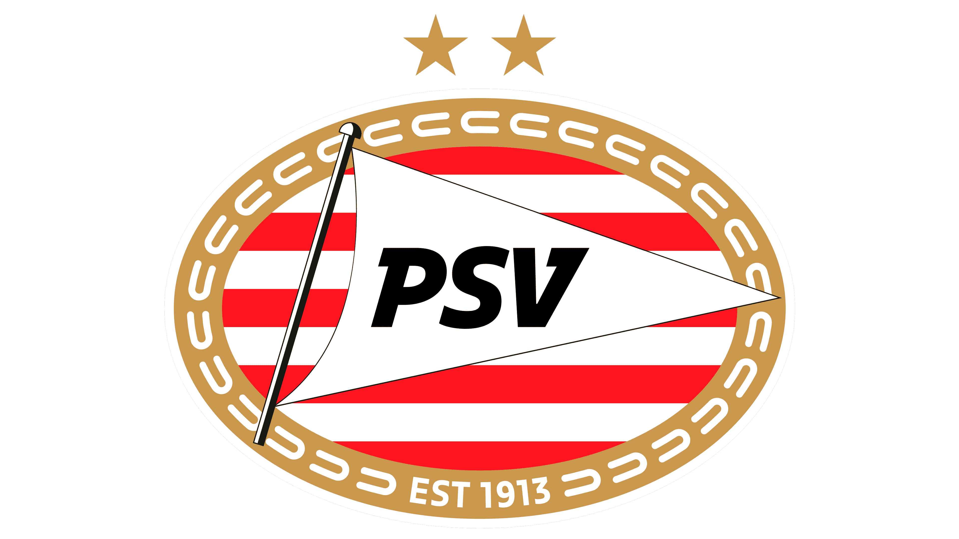
The foundation year of the club is prominently displayed at the base of the emblem’s frame. The marking “EST 1913” serves as a pivotal point, bifurcating the horseshoe design into distinct halves. This significant date is not just a mere inscription; it echoes the club’s rich heritage and storied journey that began in that momentous year. Every element surrounding this date, especially the horseshoe pattern, seems to pay homage to the roots and traditions the club is built upon. By integrating this date into the emblem’s design, it’s a constant reminder of the club’s legacy, its humble beginnings, and the many milestones achieved since its inception. It stands as a testament to their unwavering spirit and commitment through the years.


