Quaker Logo
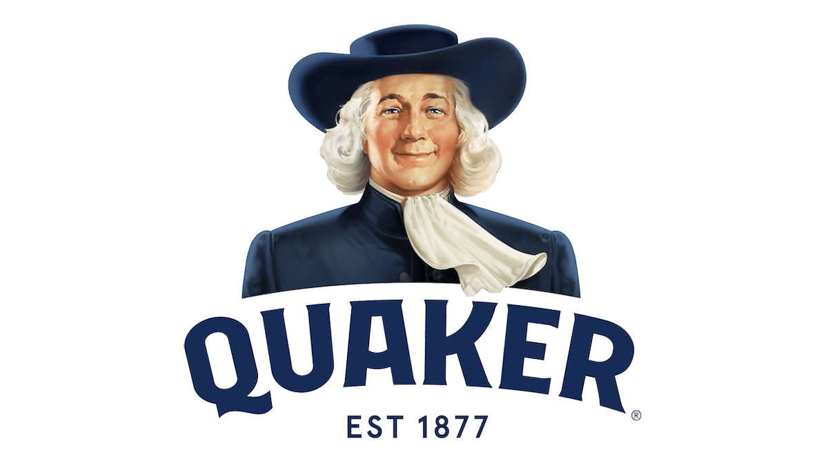
When founding the Quaker company, Henry Parsons Crowell was motivated by the desire to create a basis for a more positive tomorrow. New developments like its recognizable cylinder packaging strengthened Quaker’s position as a commonplace staple in the developing branded food industry. Even in modern times, the company’s primary visual trademark is still the instantly identifiable image of a man dressed in traditional Quaker attire, with minor alterations made throughout the years.
Meaning and History
The Quaker Mill Company, a tiny oat milling enterprise was established in Ravenna, Ohio in 1877. This is where Quaker Oats got its start. A fact that the brand would rather erase from its history is a period in the late 1940s and early 1950s when it funded researchers who fed oatmeal with radioactive calcium and iron to disabled children as part of experiments. This more-than-a-century-old classic was absorbed by PepsiCo during the early 2000s. With its growth from small beginnings to a massive company with dozens of brands, Quaker Oats is today experiencing more success than it has ever had.
What is Quaker?
Quaker is an American manufacturer of oatmeal and other food and beverage products. A distinguishing feature of Quaker Oats has always been its ability to set trends rather than follow them.
1876 – 1946
The logo encompassed a full-length picture of a gentleman wearing traditional Quaker attire, complete with the recognizable wide-brimmed hat. The company believed that it appealed to customers because it stood for moral principles like integrity and honesty. The man even holds a paper that says “Pure” in his left hand. There is no other connection to this religious group. At the time, the logo did not have a brand name.
1946 – 1956
It was not until the 1940s that the character was no longer portrayed standing. Instead, the logo depicts a portrait of the same man. There is a rumor that it was inspired by famous Quaker William Penn. The company denies the association with the religious organization and the William Penn figure. The emblem was designed by Jim Nash Associates and left a very positive and happy impression thanks to the smile on the man’s face.
1956 – 1970
Designed by Haddon Sundblom, this version is done in color and features bright red, and dark blue, as well as white and tan colors. It is almost exactly the same image, only colored. The image is framed by a round “Q” letter, which creates an impressive overall look while also hiding more meaning behind it.
1970 – 2012 (corporate)
An abstract image in sky blue color and full name underneath was created by Saul Bass as a corporate logo. A white silhouette of the face is placed on a square with rounded corners. It was used for almost half a century. It is rumored that this design cost a six-figure sum.
1970 – 1986
Instead of using red for the initial, the designer used it for the background. The rounded square resembled the corporate logo, just like the full name added at the bottom. The company kept the image quite recognizable despite making some adjustments to make it more relatable to the market.
1986 – 2007
A bold background was once again replaced by a thin oval frame of a red color. The name is printed in white using a serif font. It is placed on a blue banner with a yellow and red border on top and bottom. By this time, it was a classic image.
2007 – 2014
The face of Quaker man was no longer the main and only element of the logo. In fact, the name of the brand takes a key position and the dark blue backdrop with a golden frame enhances its grand appearance. Additional layering made the logo look complete and well-designed without losing its original identity.
2010 – 2011
The designer Wallace Church combined the logo idea with the Quaker man inside the “Q” with the full name and a slogan right underneath. The hat brims slightly go beyond the initial, making the character look proud to represent the brand. It is also worth noting that for the first time in many years, the logo did not have red. Such a small detail brought out the reliable and trustworthy features of the brand.
2011 – 2012
This logo looks like an updated 1986 version. The updated emblem has a lighter and more modern appearance.
2012 – 2017, 2013 – 2018 (international), 2013 – Today (some countries)
Since it was no longer considered healthy to be on the heavier side, the face of the Quaker man got a little slimmer. The update made the portrait look more relative to the contemporary consumer.
2017 – Today, 2019 – Today (international)
The fact that the iconic Quaker man emblem has lasted for so long demonstrates how successfully Quaker Oats has been able to preserve its tradition and brand consistency over many years. The company actually returned to the earlier versions of its logo without the red notes. The font was slightly adjusted just like the man’s attire.
Font and Color
From 1986 and until 2014, the company used a font that closely resembled the Friz Quadrata Bold font. For a short period, the logo designed by Wallace Church featured a font called Archer. The 2012 logo features Klub 06 Bold font design by Pierre Pane-Farre with the addition of barely noticeable serifs. The font used in the next logo looks very similar but has more curves and elegance.
The color palette of the brand has stayed pretty consistent over the years. One of the key colors is a deep blue. The latter stands for loyalty, trust, sincerity, and stability. There is also a powerful red that catches the attention and symbolizes the brand’s passion for its values and ultimately its product. The white and beige play a less dominant role and help to create a balanced image.


