Raid Logo
Raid is an old bug repellent solution designed by Americans in 1956. Since then, it was the most iconic insecticide measure in the West, and it even became a by-word for such products. They are mostly sold as bug sprays made from several synthetic bug-killing chemicals with many variations in sale.
Meaning and History
1955 – 1961
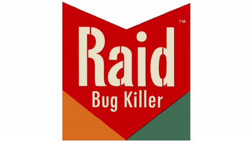
The original logo was a complex shape. Take a square, cut a triangle out of its top and put two more triangles into its corners and you’ll get what it is. The biggest part was a bright red arrowhead with text written on it. The bottom triangles were orange and green respectively.
The text in the middle said the product’s name in big white letters, followed by a smaller ‘bug killer’ note below.
1961 – 1991
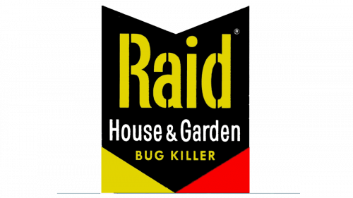
They changed the color scheme in 1961. The main bit turned black, and the two triangles became yellow and red in turn. The text bits from the previous version were bright yellow, but there was also a new line between them that said ‘house & garden’ in white.
1991 – 1994
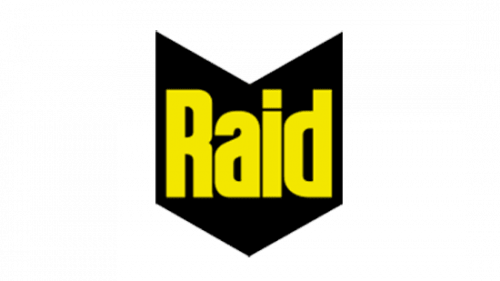
For the 1991 design they simply left the black portion and the single word ‘Raid’ on it. The letters got bolder and thicker than before, but the font persisted.
1994 – 1999
In 1994, they placed the text bit in front of the logo, while also rotating it into a diagonal position. The last touch is a bold yellow line between much of the wordmark.
1999 – 2011
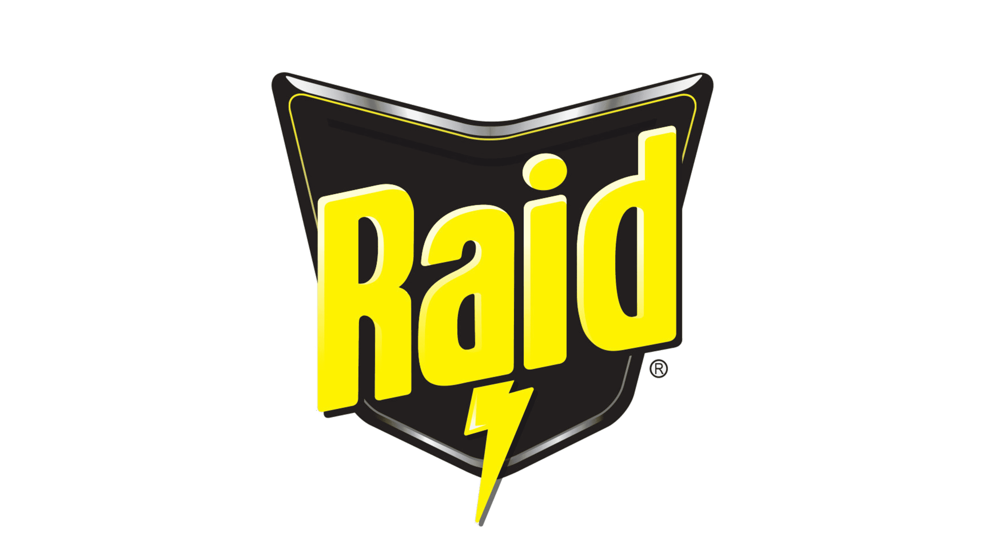
3D elements were added in 1999. Namely, the letters enjoy perspective effects now, the black figure received a realistic metal rim, while much of the logo started using shading and lighting effects, as well. Lastly, the line beneath the wordmark was replaced by a vertical lightning bolt.
2011 – today
The shapes introduced in 1999 were kept, but most 3D effects were removed, including the perspective, shading and lighting. On another note, the metallic frame lost in width, and the lightning bolt grew longer.
