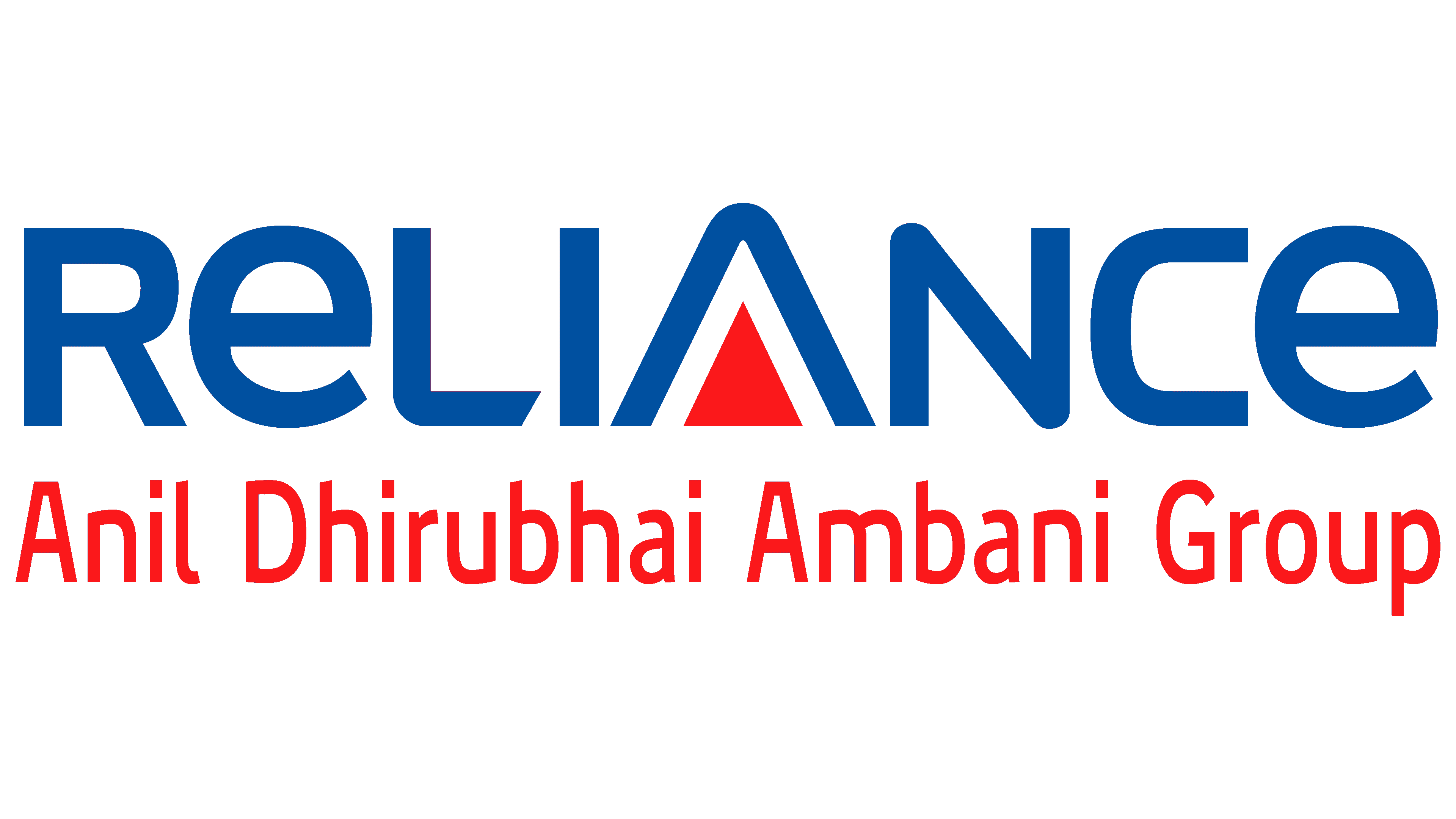
Reliance Anil Dhirubhai Ambani Group Logo
Reliance Anil Dhirubhai Ambani Group, led by Anil Ambani, operates in diverse sectors such as telecommunications, financial services, media and entertainment, infrastructure, and energy. It’s recognized mainly for its ventures like Reliance Communications and Reliance Capital. The group serves an extensive market primarily in India. Anil Ambani, the pivotal figure, directs the group’s trajectory, focusing on innovation and broadening market reach. Despite facing challenges, it continues to seek development and expansion in its multifaceted domains, emphasizing its influential footprint in the Indian industrial landscape.
Meaning and history
The Reliance Anil Dhirubhai Ambani Group (ADAG), managed by Anil Ambani, came into existence post-2005, following a split in Reliance Industries Limited (RIL), initially founded by Dhirubhai Ambani. The division resulted in two entities: ADAG and Mukesh Ambani’s Reliance Industries. ADAG ventured into diverse sectors, including telecommunications with Reliance Communications, and financial services with Reliance Capital. The group faced substantial turmoil, including debt issues and legal disputes but continues striving for resurgence and stability. The company’s evolution reflects its adaptive strategies and endeavors to maintain a significant presence in its operational sectors.
2002 – 2010
The emblem embodied the company’s moniker, pervading the full extent of the horizontally rectangular space. The characters, crafted with smoothness and a hint of breadth, were subtly squat. A notable focal point was the “A,” depicted as an intertwined duo of triangles; the larger one presented in blue and its smaller, deep-red counterpart within. This creative integration served as a distinctive substitute for the conventional crossbar in “A,” seamlessly blending with “Reliance” and rendering it a unique insignia.
Moreover, a striking juxtaposition was observed in the concluding “CE” of the logo. These letters were designed employing divergent styles and cases, where “C” was rendered with straightforwardness, devoid of customary curves, portraying a rough appearance. Conversely, the “E” appeared in a lower case, exhibiting a gentle aura due to its rounded edges.
This design, while maintaining a semblance of simplicity, subtly introduces elements of uniqueness and individuality, highlighting the brand’s identity. The interplay of colors and the distinctive representation of the letters encapsulate the brand’s essence, making it a memorable visual entity. The intricate alterations in the style and case of the letters instill a sense of diversity within the uniformity, symbolizing the multifaceted nature of the company. The deliberate intricacies within the logo serve as a silent yet powerful ambassador of the brand’s ethos and its unwavering reliance on innovation and uniqueness. The creative nuances infused within the logo make it a harmonious blend of tradition and modernity, symbolizing the company’s journey and its adaptability in the evolving business landscape.
2010 – Today
The pivotal transformation witnessed in this rendition of the logo predominantly pertains to the typography. In this iteration, the characters are manifested as more extended and not as broad as their predecessors. The integral “A” persists as the elemental centerpiece. Substituting the linear form, a tangible red triangle is employed, rendering the letter marginally elevated compared to its former state.
This subtle yet profound metamorphosis in design elements brings forth a fresh visual appeal, maintaining the brand’s distinctive identity while introducing refined dynamism. The modifications in dimensions and structural aspects of the characters imbue a renewed aesthetic vitality, ensuring the logo’s evolving resonance with contemporary design sensibilities. The nuanced elevation of the central “A” and the explicit introduction of the triangular form accentuate the logo’s visual harmony, consolidating its emblematic significance. This transformation is a meticulous endeavor to encapsulate the brand’s evolving ethos and its pursuit of design excellence, ensuring the sustained relevance of its visual identity in an ever-evolving aesthetic landscape. The enhancement in the design details exemplifies the brand’s commitment to innovation while preserving the essence of its original identity, creating a balanced and visually compelling representation of the brand’s legacy and its forward-looking vision.


