Scania Logo
The Swedish company Scania is the world’s largest manufacturer of trucks, buses, engines, and chassis. From the very beginning, Scania has relied on strict quality standards. Scania trucks have long been considered among the most reliable and efficient in the world. Today, the company’s production volumes are very large. Powerful, well-designed Scania trucks are intended for transportation of any type and are in constant demand. They can be found on the roads of many different countries.
Meaning and History
![]()
The Swedish company Scania was founded in 1891. It started with the production of bicycles, and in 1987 produced the first passenger car. In 1902, Scania introduced the first truck. Thanks to a merger with another company in 1911, Scania-Vabis was created. It produced passenger cars until 1929, after which it focused on trucks. In 2008, the brand became part of the Volkswagen Group, which received 68.6% of the voting shares.
What is Scania?
The Swedish brand Scania is owned by the Volkswagen Group. For many years, Scania has been known primarily for its trucks. Although, some remember that Scania once made passenger cars and even bicycles.
1901 – 1911
![]()
It is not surprising that a bicycle pedal crane served as the basis for the emblem. After all the company initially made bicycles. The emblem is metallic with golden accents and dark blue details. At the top of the circle, it stated “Scania”, while at the bottom it said “Maskinfabriks Aktiebolaget”. A griffin head of a red color decorated the center. Slightly above it, it stated “Malmo”.
1911 – 1954
![]()
The golden and dark blue were inverted on the circle. The new inscription said “Aktiebolaget Scania-Vabis”. The griffin now looked grander, and there was no “Malta” on the emblem. It was placed on a round background with a golden border.
1954 – 1969
![]()
The round base was gone and the emblem looked minimalistic. The whole emblem was dark blue while golden was used for the inscriptions and borders. Around the circle perimeter, it stated “Scania Vabis” using bold, sans-serif font. The griffin appeared daring and full of determination.
1969 – 1984
![]()
For fifteen years, the brand used a simple emblem that consisted of just one word. It stated “Scania” in silver, all uppercase letters. The sans-serif letters are interconnected with a thin line of the same color.
1984 – 1995
![]()
A large, dark blue circle served as the base, while the white outlines of two circles overlapped each other inside of it. The familiar griffin head was placed in the center. It had the same color palette, except for the white outline which made it stand out even more. Above it, the emblem stated “SAAB” and at the bottom, the emblem had “Scania” written in all uppercase, bold, white letters without serifs. The logo looked very grand.
1995 – 2017
![]()
The company brought back the bicycle pedal crane as the base. It was completely blue in the center and a griffin head filled most of that space. The outlines were light gray in color. There were no inscriptions, but the logo was nonetheless very recognizable.
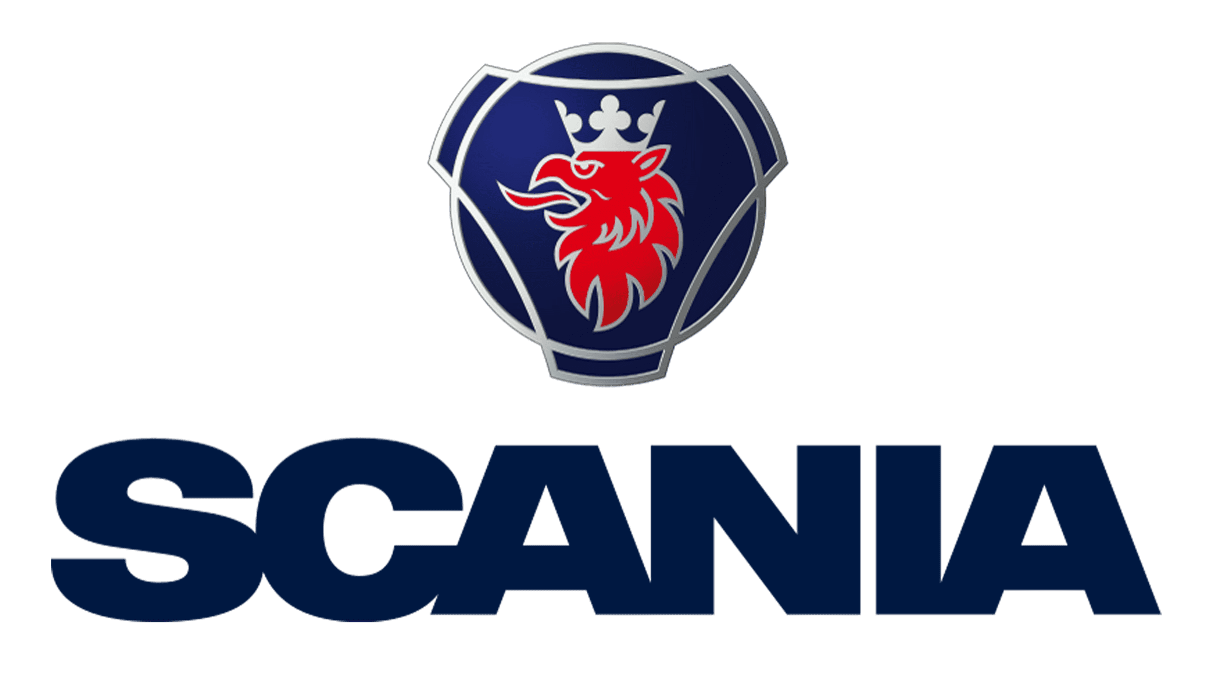
2017 – Today
The designers from a Brand Union agency used the emblem it had previously and added the name below it. The griffin emblem now had a silver outline, but otherwise looked the same as it did back in 1995. The inscription was done in the same blue and featured bold, all uppercase letters that were so closely spaced that they touched in some places. The new version looks modern and impressive.
Font and Color
The brand always went for bold, sans-serif fonts for its logos. The latest custom font is similar to Helvetica Neue 93 Ext Black. A dark blue color has always been part of the brand image. It stands for stability, loyalty, and security. There is also a golden color, which adds some warmth and royalty to the emblem. The latter was sometimes replaced by silver, which gives the logo just as grand of a look.