Škoda Logo
Skoda cars are popular all over the world and are rightfully considered a guarantee of quality, comfort, and durability. The Skoda auto business has a rich and fascinating history. Skoda has produced a good number of cars. In addition to passenger cars, the company produces buses, trucks, and agricultural machinery. Although the Skoda company is considered Czech, since it historically appeared on the territory of the Czech Republic, this automaker is rightly called a division of the German auto concern.
Meaning and History
The roots of the brand go back to 1895. After a broken bicycle that the founders decided to start their own production, focusing on quality, reliability, and affordability. In 1898, Laurin & Klement began manufacturing bicycles and a year later motorcycles, which soon became popular and received several awards. By 1905, the company stopped motorcycle production and switched to cars. The first car became wildly popular. In 1925, the company merged with Skoda Works of Pilsen, founded by engineer Emil Skoda. During the war, the company switched to the fulfillment of military orders. In 1991, the brand became a division of the German company Volkswagen.
What is Skoda?
The automaker Skoda is a recognized brand that manufactures passenger cars, as well as mid-range crossovers and other products in this industry. The main office0 is located in the Czech Republic. Today, it is part of VAG.
1895 – 1905
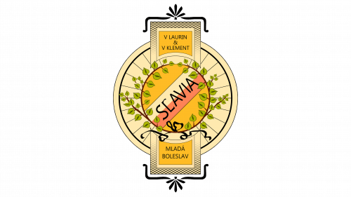
The name Slavia was used for bicycles and motorcycles. The logo was a bicycle wheel decorated with leaves, which symbolized Slavic origins. Although the founders’ names were not on the logo initially, they appeared on it a bit later. At the bottom, it had the factory location done in a similar style as the names.
1900 – 1905
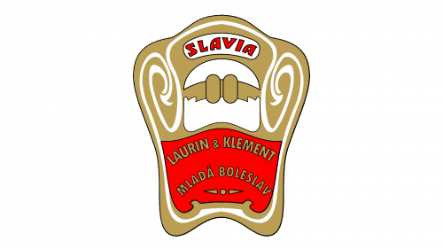
This logo was used on the fuel tanks of Slavia motorcycles. It featured gold, red, and white colors. Thanks to the intricate design it looked quite interesting and stylish. Just like the original one, the logo had the name of the founders as well as the location.
1905 – 1925
The initials of the founders are enclosed by a laurel wreath, which is associated with winners and glory. Thus, the laurels implied brand’s success. The initials are done in gold on a scarlet-red background. The wreath is drawn using delicate white lines on a black background. The whole emblem has several borders to create a luxurious look. The design was influenced by Art Nouveau, one of the artistic styles of the early 20th century.
1913 – 1929
This is a very minimalistic logo compared to the other versions. It was just the names of the founders written using artistic, fine cursive writing. Thanks to the classic black color and font choice it looked truly magnificent. The top of the letter “L” curves beautifully over the inscription. The “&” symbol is also very stylish.
1923 – 1925
The logo is an abstract drawing of an Indian head in a traditional dress with five feathers. This silhouette with a flying arrow against it is thought to represent the rapid advancement and application of modern technologies in the products. The new name of the business is indicated under the arrow. The whole emblem has a thick round border.
1925 – 1933
Despite the radical change in the name due to a merger, there are still some similarities. The logo was oval, but the brand name continued to play a major role, remaining in the center surrounded by laurels. The background was a rich blue, which combined with golden and black colors created a powerful and luxurious look.
1926 – 1933
This emblem is based on the 1923 version. The colors were inverted to create a lighter brand image. The shape of feathers has changed. There was no name inscription either.
1933 – 1986
A bolder version of the emblem introduced ten years ago was presented to the public. It featured a dark blue color, which contrasted beautifully against white. Otherwise, it was the same shape as the previous emblem.
1986 – 2011
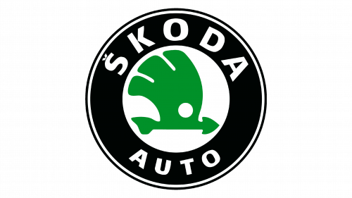
This version looks more powerful as it features a thick black border replacing the blue one. At the top of the border, it said “Skoda” at the top in bold, uppercase white letters and “Auto” at the bottom using the same font, only a smaller size. A double thin white and black outer outline added even more interest.
1993 – 1999
1999 – 2011
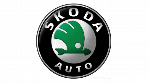
A modern spin was given to a familiar image thanks to the metallic coloring of the white parts. The other elements also appeared to have some volume. The shape and color scheme of the logo was kept unchanged.
2011 – Today
The most significant changes were made to the main part of the logo – the winged arrow became much larger and more eye-catching. The color of this element has been changed from “natural green” to a new intense color “Skoda Green”. The outer edge has silver metallic trim. The logo has a 3D appearance and looks modern and stylish.
2022 – Today
The most drastic update was the introduction of a different color palette. The whole emblem was done in a light green color that looked surrealistic and implied the innovative nature of the company. In addition to the round emblem, which was done in a minimalistic style similar to the one seen in 1933, there was the brand name. The latter had large, all uppercase letters that had smooth, geometric lines.
Font and Color
The company used several different fonts throughout its history. It started with basic, sans-serif styles and moved to more elegant, cursive fonts later on. For some period, there was no inscription, but the latest logos featured a bold, sans-serif typeface that resembles Eurostile Extended Black. The color palette also varied. Initially, golden and black colors were dominating it. Then, the brand went for the blue and white color scheme. Since 1986, green, white, and black became the new image of Skoda.


