Southampton FC Logo
Southampton Football Club stands as a notable name in English football. Founded by members of the St. Mary’s Church Young Men’s Association, they initially took the field in Southampton. Their creation aimed to provide a recreational outlet for the local community, fostering both physical fitness and camaraderie. Known affectionately as “The Saints”, they have carved a unique identity in the football world.
Meaning and History
Southampton FC first saw the light in 1885, emerging as a beacon for local sports enthusiasts. Over the years, they have journeyed through the highs and lows of football. In 1897, they marked their territory by moving to The Dell, their home for over a century. This move signified their growing influence in the sport. A pivotal year, 2001, saw them transition to the St Mary’s Stadium, symbolizing a new era. This period encapsulated growth, challenges, and resilience, highlighting their evolution in English football.
What is Southampton FC?
Southampton FC is a professional football club based in Southampton, England. They compete in the English football league system, embodying a rich tradition and history in the sport. Known for their red and white stripes, they have become a symbol of pride for their supporters. The club’s journey from humble beginnings to competing on a national level illustrates their enduring spirit and commitment to football.
1974 – 1995
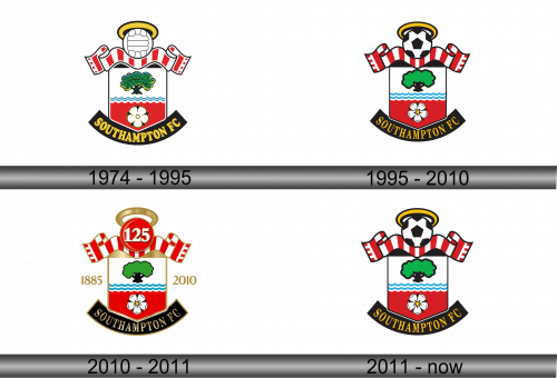
The emblem of Southampton FC flaunts a rich tapestry of symbols. Atop, a halo hints at their nickname “The Saints”. The crest brandishes red and white stripes, echoing their kit colors. A green tree anchors the center, symbolizing growth and vitality. Below, waves represent Southampton’s maritime heritage. At the base, a white rose adds a dash of elegance, rounding out a design steeped in local pride and footballing passion.
1995 – 2010
This updated Southampton FC crest introduces a soccer ball, crowned with a halo, emphasizing the sport’s centrality to the club. The red and white stripes now adorn the scarf, resonating with their iconic jerseys. Waves beneath the tree retain their maritime homage, while the tree itself remains a steadfast symbol. The rose, repositioned to the crest’s base, blooms with prominence. These tweaks reflect an evolution, blending tradition with a refreshed, contemporary spirit.
2010 – 2011
This iteration of the Southampton FC crest celebrates a milestone, marked by “125” atop, reflecting the club’s 125th anniversary. Flanking the number are two ribbons with the club’s founding and current year, 1885 and 2010, which anchor the design in history. The rest of the crest remains true to its roots with the iconic tree, waves, and rose, but these anniversary elements add a layer of temporal celebration, connecting past glories with present ambitions. The golden touch to the anniversary number adds a noble sheen, commemorating a storied past.
2011 – Today
Returning to its classic look, the crest strips away the anniversary elements, focusing again on the timeless core. The celebratory “125” and the years are gone, leaving a cleaner design. The central soccer ball, encircled by a halo, remains prominent, underscoring the club’s footballing mission. The red and white scarf, the lush tree, the serene waves, and the solitary rose all stay as enduring symbols of the club’s heritage and connection to Southampton. This crest nods to tradition while maintaining a modern aesthetic.

