Telus Logo
Telus, born from the unification of Alberta Government Telephones Commission (AGT) and BC Tel, stands as a Canadian telecom titan. It actively delivers an array of services: internet, voice, entertainment, healthcare, and video. Headquartered in Vancouver, British Columbia, Telus has grown to become one of Canada’s leading telecom providers, emphasizing innovation, customer service, and community support. Its creation marked a pivotal moment in Canada’s digital infrastructure development.
Meaning and history
Telus emerged in 1990, a fusion of AGT and BC Tel. Born in Canada, it targeted telecom innovation. Headquarters landed in Vancouver. Its mission: deliver top-notch telecom services. Internet, voice, entertainment – Telus covered all. It quickly ascended as a telecom leader in Canada. Community service and customer focus became its hallmark. Digital infrastructure in Canada evolved, thanks to Telus. The company also ventured into healthcare solutions. With years, it embraced sustainability and technology. Telus’ growth is marked by strategic acquisitions, expanding its reach. It stands as a symbol of Canadian innovation in telecommunications.
What is Telus?
Telus is a beacon of telecommunications in Canada, pioneering in delivering diverse digital services since 1990. From its inception, it has woven a network of innovation, offering everything from internet and voice to healthcare technologies, all while championing customer satisfaction and community support.
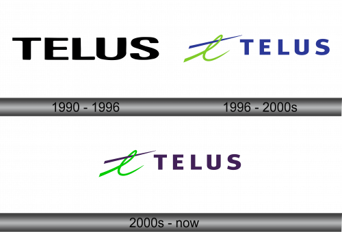
1990 – 1996
The logo presented is a bold statement of simplicity and modernity, displaying the name ‘TELUS’ in stark, solid black letters. Each character boasts a clean, sans-serif font, exuding a contemporary vibe that speaks to the brand’s forward-thinking ethos. The typography is evenly spaced, ensuring legibility and a visual balance that suggests reliability and structure. Its minimalistic design stands as a testament to the brand’s straightforward approach to communication services. This emblem, devoid of any icons or embellishments, underscores the company’s confidence in its name alone being a symbol of innovation and quality in the telecommunications realm.
1996 – 2000s
The logo evolves, adding dynamism with a green swoosh, symbolizing growth and vitality. The ‘TELUS’ text, now in blue, contrasts sharply against the green, promoting a sense of trust and calm. This design choice introduces energy and motion, suggesting a company that’s progressive and on the move. The logo’s green flair actively echoes its dedication to sustainability, and the blue script confidently underscores its corporate conscience. This refreshed emblem captures the essence of a brand that’s both environmentally conscious and anchored in the digital age.
2000s – Today
The logo retains its dynamic swoosh, now in a vivid lime green that slices over a dark line, infusing it with zest and vitality. “TELUS” stands boldly beneath in a deep purple hue, signifying creativity and wisdom. The swoosh’s upward trajectory suggests a forward-thinking momentum, while the purple conveys a blend of the company’s integrity and innovative spirit. This iteration of the logo presents a harmonious blend of energy and sophistication, reflecting a brand that’s both lively and dignified.


