Tostitos Logo
Tostitos is the flagship brand of PepsiCo, which manufactures and sells corn and potato chips and other snack foods, Frito-Lay division. It is said that Tostitos chips are perfect for dipping in Tostitos sauces and salsa. They create a tasty combination of crunchy and delicious. There are Tostitos probably for each taste as they offer a good variety of tastes and forms of chips.
Meaning and History
Herman Kay bought a potato chip company in Atlanta, Georgia, and began making potato chips, which he sold from the trunk of his car. In the 1960s, the company merged with Derrick Lautert’s Frito to create the iconic Frito-Lay brand. In 1979, Frito-Lay launched Tostitos, initially presenting only two flavors. The company now sells chips almost all over the world. It has been a sponsor of the Fiesta Bowl from 1995 until 2014. In 2017, Tostitos and Uber teamed up to launch a limited edition microcontroller-enabled bag that was able to detect the presence of alcohol on the breath to be used during the Super Bowl.
What is Tostitos?
Tostitos is a brand of tortilla chips and sauce produced by Frito-Lay since 1979. It all started with noting how the Mexican cornflower tortilla was made and turning the idea into a product that is loved in many countries.
1979 – 1985
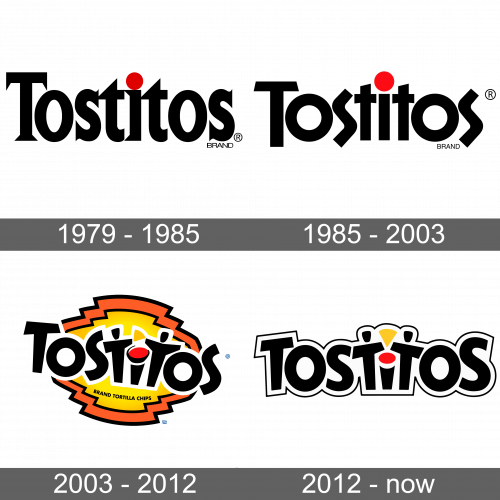
The logo of the new brand was quite simple, yet had some character. It featured bold strokes and sharp, pointed serifs. All the letters were closely spaced apart. The first letters were capitalized, while the dot above the “i” was done in red and instantly caught attention. A small inscription “Brand” was placed right under the last “s”. It was also black and had thin, all-uppercase lettering.
1985 – 2003
Although the logo still consisted of black lettering and a red dot, it looked very different. The font has not only lost serifs but also featured more interesting strokes and terminals. The letters “s” stood out as they were not aligned with the other letters and looked more like a zigzag, wavy line. The “Brand” part was moved slightly to the left to give way to the “S”.
2003 – 2012
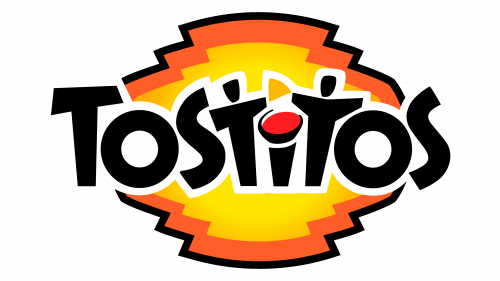
The designers played with the previous font to create a funky inscription. It had a white outline and was placed on a bright background that was yellow in the center and outlined by an orange. The background colors were separated by a thin black outline. This created a bright and happy brand image. Actually, not many know that the logo is meant to represent people who have a good time eating Tostitos and sharing it with others. After all, a large bag of chips is perfectly suitable for a large group of friends. The two “T”s in the word are two friends sharing a chip by dipping it in salsa, which is the dot above the “I”.
2012 – Today
The fun background was removed, while the name was written straight like it was before. To make the white outline stand out, the designers added a thin line around it. The lettering, mainly the two “S”s, was slightly redrawn. In addition, the “T”s were now a mirror image of each other, with the chip pointing down. This created some symmetry and made the updated emblem look balanced.
Font and Color
Initially, the black color dominated the color palette, and red was represented only as a dot. In 2003, this has changed, as the company introduce more bright colors. Now, there was yellow, orange, and white in addition to black. The new color scheme created a cheery, positive, and full-of-energy brand image. Although the fonts have been changed several times, the brand image stayed very recognizable and it was easy to trace it to the original logo. Except for the original, it used variations of bold, sans-serif fonts that perfectly combined smooth lines and sharp cuts.
