Unity Logo
Unity is a multi-platform software for programming and designing video games. Its release occurred in 2005, and it’s now downloadable on Windows, macOS, Linux, and other platforms. The engine is used widely among indie game devs, allowing them to use a broad spectrum of programming languages and instruments for designing and creating games and interactive content.
Meaning and history
Unity Technologies, the company brainchild behind the Unity game engine, was founded in Denmark in 2004 by David Helgason, Nicholas Francis, and Joachim Ante. The company’s mission was to create an accessible and relatively cheap game engine that could be used jointly by a community of indie game developers and smaller studios.
The first version of the Unity game engine appeared in 2005 and was initially running on Mac OS X, but later the company developed its Windows and Linux versions.
Since its release, Unity has become one of the world’s most widespread software for game creation, with millions of innovators utilizing it to create games for all the platforms available for now. In addition to games, Unity has also been useful for other applications. These include architecture visualization, film and animation, and virtual and augmented reality experiences.
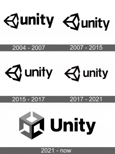
Unity Technologies has gone through a line of reinventions of its logo and branding strategy over the years. Each time, the company slightly renewed its approach to translating its focus on inventiveness, and creativity, and creating a community of like-minded specialists around its brand.
What is Unity?
Unity is a versatile video game development engine that allows game designers and programmers to create and develop games for multiple platforms. Initially released in 2005, Unity is now available for Windows, macOS, Linux, and other platforms. The engine is popular among indie game developers due to its broad range of programming languages and tools for game design and creation of interactive content.
2004 – 2007
The original Unity logo bore a striking resemblance to the contemporary one we all recognize today. However, the primary contrast lay in the thickness of the lines composing the iconic emblem and the font style of the lowercase inscription positioned on its right-hand side. The emblem itself was created using a medium-weight, disciplined line style, while the accompanying logotype employed a sleek, contemporary sans-serif font with smooth design elements.
2007 – 2015
In 2007, the Unity logo underwent a redesign, with the lettering style remaining unchanged. However, the lines of the emblem became thinner, while the thickness of the lines in the graphic increased. This shift in the design placed greater emphasis on the visual elements of the logo rather than the text.
2015 – 2017
The Unity wordmark changed in 2015, where the original custom sans-serif typeface was replaced by a more traditional font with wider contours in the lowercase letters and cleaner lines. This change simplified the logotype and complimented the iconic geometric emblem, creating a well-balanced and refined look for the brand.
2017 – 2021
The 2017 repackage of their logotype resulted in a slightly altered inscription. The characters ‘t’ and ‘y’ had gotten prolongated lower tips, and the ‘t’ also received a straight horizontal line instead of the one with the cut edge it had before.
2021 – today
The year 2021 saw another redesign of the Unity brand identity. It showed a cube emblem placed in a perfect isometric projection, with white parts resembling XYZ lines. The wordmark was also updated to feature bold letters and a jet-black color scheme, replacing the previous all-lowercase font.
Font
The Unity primary badge features a heavy and stable title case lettering set in a modern geometric sans-serif font, giving it a confident and brutal look. Similar fonts to the one used in this insignia include Nimbus Sans Novus D Heavy and Europa Grotesk Nr 2 SH ExtraBold.
Color
The Unity visual identity is predominantly black and gray, with white used as a background color. This color palette is intended to convey professionalism and stability and gives the logo a strong and timeless appearance.
