Acer Logo
Acer is not only a universally recognizable brand but also enjoys great popularity in many parts of the world. It is not often that a company is able to grow big and make a large impact on the industry. Acer, though, was able to achieve this and deliver computer systems, laptops, and smartphones that are in demand. The list of products made under this brand does not end there as it also manufactures consumer electronics, various accessories, and much more.
Meaning and History
Stan Shea established Multitech International in 1976. In just three years the first Taiwanese computer for export was developed. Several years later, the brand introduced the first ever 32-bit PC, ahead of IBM. It also expanded its presence in Europe and Asia by opening offices in Germany and Japan At the end of the 80s, the company created a new division, Acer Laboratories Incorporated, that was responsible for the development and manufacturing of the chipsets. The next year, the entire corporation was renamed Acer. The business has been among the top PC producers since 1994.
What is Acer?
Acer is a Taiwanese computer and electronics manufacturing company. Many individuals have products of this company, and the history of the company contains many interesting facts.
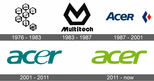
1976 – 1983
Seven icons were placed into hexagons and formed almost a perfect flower, except one of the “petals” was placed slightly lower. These icons were drawings, along with text and even numbers. They all stood for various products and values of the brand.
1983 – 1987
The new logo reflected the original name of the company. It was written using a bold, sans-serif font. the letters “M” would look italicized if it was not for a vertical last line that looked completely straight. Above the name, there was a geometric shape with two peaks pointing up. Just like the original, this logo used a white and black color palette.
1987 – 2001
This is the first time the logo featured “Acer” on its logo. Although all the letters looked capitalized, the first letter was enlarged. To the right, there were three diamond shapes. The first one was the smallest and overlapped a white one that blended in with the background. The white shape overlapped a diamond that was dark blue just like the name of the company.
2001 – 2011
This logo served as the base of the Acer logo that was used by the brand for over twenty years. This version featured a turquoise color. The letters were all lowercase and bold with some thinner lines for an elegant touch. There were no other elements in the logo.
2011 – Today
After using the previous version for ten years, the company updated its look by using a slightly different font and thicker lines. It was a lime green color.
Font and Color
The color palette of the company changed with each new logo. Initially, it was a typical black that can make any logo look bold and professional. Then, it was replaced by deep blue and red for a confident and powerful look. Next, the world saw a turquoise and soon a lime green. This color is used to represent the company’s focus on growth and environmental awareness. The company always used sans-serif fonts. The two latest versions used a unique font that had smooth lines.


