West Bromwich Albion Logo
West Bromwich Albion is a professional football club based in England. Workers from George Salter’s Spring Works founded the club in West Bromwich. They created the club to provide a recreational activity for the factory employees.
Meaning and history
West Bromwich Albion, often referred to as “The Baggies”, was established in 1878. Originally, the club participated in regional football competitions before joining the Football League in 1888. Their first major success came in 1892 when they won the FA Cup, a prestigious national cup competition. Throughout the 20th century, the club maintained a competitive presence in English football, experiencing fluctuations in success. Key moments include winning the league title in 1920 and securing five FA Cup trophies by 1968. The club’s history is marked by its resilience and strong community ties, emblematic of its industrial origins.
What is West Bromwich Albion?
West Bromwich Albion is an English football club that competes in the national league system. Known for its rich history, the club has won various national trophies, including the FA Cup. It serves as a cultural pillar for its local community in West Bromwich.
1969 – 1972
The logo depicts a bird perched on a branch, flanked by holly leaves and berries. The bird, rendered in a brown hue, has intricate patterns on its wings and body. Beneath the bird, the branch extends outwards with several leaves in a deep green, each holding clusters of red berries. The logo exudes a naturalistic charm, showcasing a scene reminiscent of the English countryside.
1973
In this updated emblem, the bird rests against a shield with vertical blue and white stripes. The emblem returns to a detailed representation, with the bird and foliage featured within a shield. The bird is brown, perched on a branch, and surrounded by vibrant green leaves and red berries, echoing earlier designs. Atop, “W.B. ALBION” in bold white letters against a blue background declares the club’s identity. Below, a triangle containing “FC” anchors the design. This badge re-introduces complexity and historical elements, blending tradition with a refreshed sense of identity.
1972 – 1975
This emblem features a notable shift to a minimalist aesthetic. The intricate bird and branch are absent, replaced by a stylized, golden-hued throstle. This throstle, an iconic symbol for the club, sits in a simple yet elegant pose within a green, circular background. The background is bisected by a curved line, adding a dynamic element. This design strips away complexity, favoring a bold and modern representation that reflects a new era for the club.
1970s
The emblem returns to a detailed representation, with the bird and foliage featured within a shield. The stripes suggest regality, reminiscent of heraldic symbolism. The bird, still perched on a branch, is now white with dark brown accents, contrasting boldly against the striped background. The holly leaves and berries maintain their lush green and red colors, adding vibrancy. This design elevates the club’s visual identity, infusing it with a more pronounced sense of tradition and pride.
1975 – 1986
The iteration simplifies to just the initials “WBA” in navy embroidery. Gone are the bird and shield, focusing purely on the lettering. The font is elegant and flowing, with a timeless quality. This design highlights a shift towards minimalist branding, a stark contrast from the previous detail-rich badge. It exudes sophistication with a nod to classic monograms.
1986 – 1994
The bird and holly make a comeback in this design, sitting atop the bold, black initials “W.B.A.” The bird, detailed in shades of black and white, clutches the branch gracefully. Below, the initials, presented in a solid, sans-serif typeface, convey strength and clarity. The merging of classic imagery with modern typography signifies a blend of heritage with contemporary branding. This emblem marries the past’s natural elements with today’s design sensibilities.
1994 – 2000
This emblem marks a grand departure from the previous one, introducing a regal coat of arms.The logo is an elaborate coat of arms with rich symbolism and baroque flourishes. A stag rests atop a knight’s helmet, signifying dignity and vigilance. Surrounding the shield are intricate, acanthus-like scrolls in blue and gold, exuding a regal aura. The shield itself has a dark blue background with the letters “H” and a white stag symbolizing strength and grace. At the bottom, a red banner with the Latin motto “LABOR OMNIA VINCIT” proclaims “Work conquers all”, epitomizing dedication and persistence. This emblem blends heraldic tradition with the ethos of triumph through effort.
2000 – 2001
The logo reverts to a simpler crest design, focusing on the club’s iconic throstle and blue and white stripes. The throstle is perched assertively on a branch, with detailed feathers contrasting against the stripes. Holly leaves and berries are strategically placed, symbolizing the club’s endurance. The crest is devoid of ornamental flourishes found in the previous emblem, opting for a cleaner and more modern aesthetic. This shift represents a blend of tradition and contemporary design, emphasizing the club’s identity.
2001 – 2006
In this emblem, subtle changes are present. The throstle appears in a more streamlined design with fewer details. The color palette is slightly brighter, and the branch’s position has shifted, creating a balanced composition. The berries and leaves remain prominent, but with a softer touch. This version of the crest continues to respect the club’s heritage while presenting a fresher, more stylized image. The overall effect is a cleaner and more modern visual identity for the club.
2006 – 2011
The emblem evolves significantly, adopting a bolder, more modern appearance. “WEST BROMWICH ALBION” now arches prominently across the top. The throstle is redesigned with sharper, more defined features and perches on a singular holly leaf with a bright berry cluster. The striped background is simplified to bold blue and white, creating a striking contrast. This logo presents a cleaner and more contemporary image, with a focus on clarity and visual impact. The refresh represents the club’s forward-looking aspirations while maintaining its historical symbols.
2011 – Today
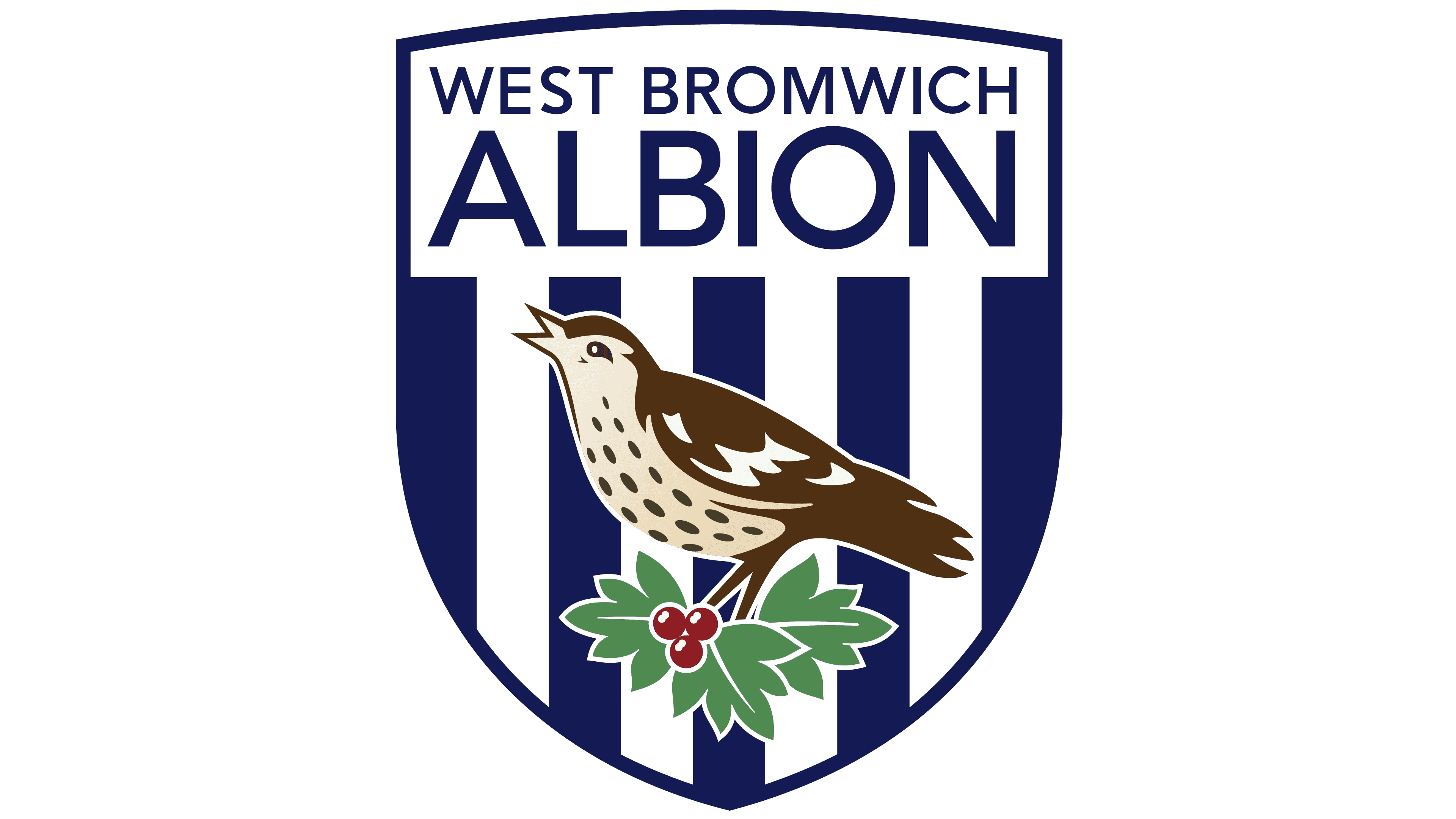
This logo remains largely consistent with its predecessor, maintaining the strong blue and white vertical stripes. The name “West Bromwich Albion” is presented in an arched form, crowning the top of the shield. The throstle, still featured as the centerpiece, stands proudly above the holly leaves and berries. The design keeps the modern and clean look, with crisp lines and clear imagery. The continuation of this design reinforces the club’s brand identity while ensuring recognizability and tradition.


