Wingstop Logo
Fast food brand Wingstop is associated with flavorful chicken wings and aviation-themed decor in its multiple restaurant locations. Wingstop Inc. is the franchise owner and operator of a chain of restaurants specializing in the preparation of portioned chicken wings (and lately chicken thighs) with the sauce of the customer’s choice. The sauces and rubs are what makes the Wingstop dishes unique and loved by everyone who gets a bite.
Meaning and History
The brand’s journey began in 1994 in Texas, when a buffalo-style chicken wing restaurant quickly attracted customers with its tasty chicken dishes and no less delicious sauces that went with them. The chain was founded by entrepreneur Antonio Swad. He is also the person who launched other popular restaurants, such as Pizza Patrón and Porch Swing. Over time, the brand was able to provide its services to customers all over the world thanks to franchising. In 2003, the chain was acquired by Gemini Investors, which sold it to Roark Capital Group seven years later. The brand had a fairly successful IPO in 2019.
What is Wingstop?
Wingstop Inc. is a chain of fast food restaurants specializing in chicken wings with more than close to two thousand locations worldwide. The company has also developed its own website and mobile ordering application.
1994 – 2014
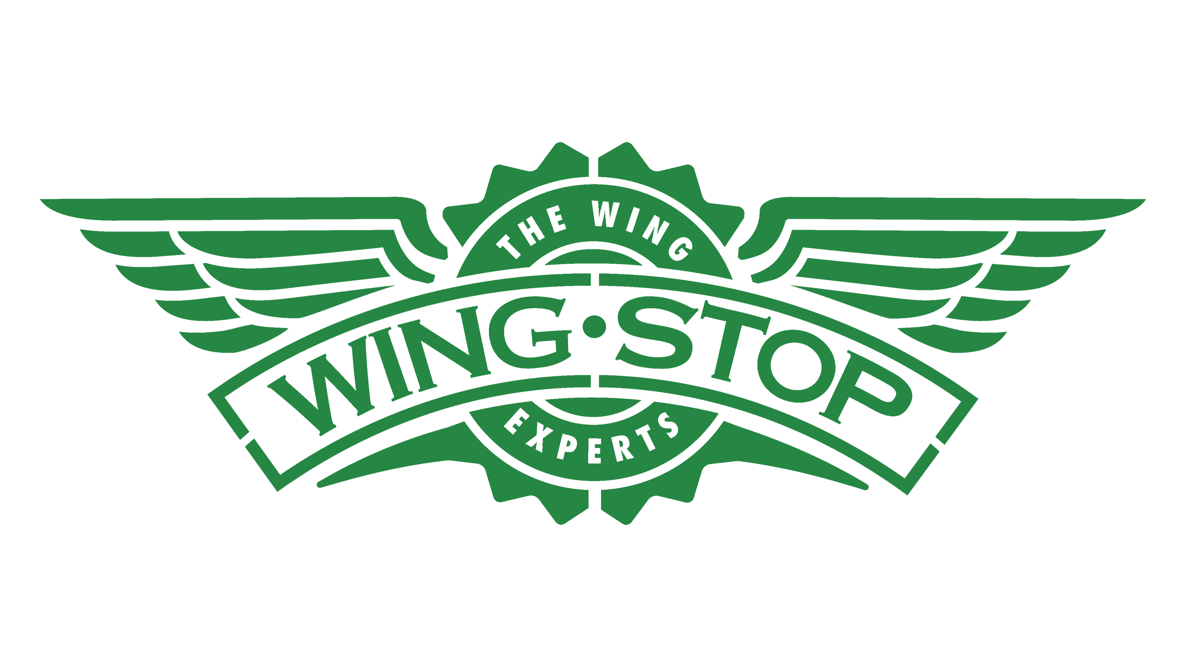
A winged rounded emblem served as the basis of this logo and was quite appropriate considering the name of the company. The round emblem has a zigzag borer and is done in a solid dark green color with white inscriptions. The wings, on the other hand, were white and used green only to outline each feather. An arched banner was placed in front and had “Wing-Stop” printed using a bold font with flare serifs and all uppercase characters. To make the inscription even more sophisticated, the designers added a thin shadow line that created an appearance of volume. The badge declared that the company is “The Wing Experts”. The logo turned out well-balanced and professional.
2014 – Today
The logo was modified 20 years after it was originally introduced. The basic elements were kept the same and the main change was the color. The green got lighter and brighter. In addition, the wings were now done in green with a white outline, while the zigzag border featured an enlarged pattern. The inscriptions were also updated to look cleaner and more modern. The designers removed the shadow effect and made the borderline of the banner also a single line to match the inscription. A few other small updates were done to give the logo a more minimalistic look that was more appropriate for modern trends.
Font and Color
The company used a font with a delicate flare serif that is similar to CopperPlate Bold or Copper Penny CAS SC to print its name. In the original version, they also added a shadow, which was later removed to create a cleaner look. The slogan was also originally written using a fancier serif font with high-contrast strokes, while the later version features a basic sans-serif font.
The company went for a mainly green color with a white base. The green color evokes positive emotions and gives freshness. It symbolizes health and purity. The shade is reminiscent of nature and evokes a feeling of calmness. The white background served as a neutral contrasting color that added a touch of perfection.


