Wonka Logo
Wonka is a whimsical brand of confectionery inspired by Roald Dahl’s 1964 novel, “Charlie and the Chocolate Factory”. It was brought to life to capture the magical essence of Willy Wonka’s fictional candy empire. The brand, initially created by Quaker Oats Company in conjunction with the 1971 film adaptation, aimed to blend fantasy with reality, offering a unique range of sweets that evoke the book’s inventive spirit. Its creation took place in the United States, aiming to delight and surprise consumers with its fantastical candy creations.
Meaning and history
Wonka, born from Roald Dahl’s imagination, became reality with Quaker Oats in the early ’70s, aligning with a film release. Nestlé acquired the brand in 1988, expanding its whimsical offerings globally. Over the years, Wonka introduced numerous fantastical sweets, from Everlasting Gobstoppers to Nerds. In 2015, Ferrero purchased Nestlé’s U.S. confectionery business, including Wonka, further blending fantasy with candy craft. Production evolved, embracing innovation while retaining the magic.
The brand’s journey is a testament to its enduring appeal, capturing hearts with a sprinkle of Wonka magic. Ownership changes mirrored the confectionery industry’s shifts, with each steward adding their touch. Wonka remains a symbol of creativity in candy, a bridge between fiction and delightful treats.
What is Wonka?
Wonka is a fantastical brand of sweets, sprung from the vibrant imagination behind Roald Dahl’s literary world. It serves as a real-life gateway to the whimsy and wonder of Willy Wonka’s chocolate factory, offering an array of candies that mirror the innovation and magic of its fictional counterpart.
1971 – 1981
In the logo, under the arch of the letter W, there is a figure of Willy Wonka making a greeting hand gesture. This portrayal of Wonka, complete with his iconic top hat, infuses the logo with a personal touch, directly connecting the brand to its imaginative founder. The design’s stark white lines on the dark background enhance this visual trick, drawing the eye to the whimsical character at the heart of this chocolate adventure.
1980 – 1982
In this iteration, the logo adopts a more personable touch with a caricature of Willy Wonka at its heart. Encircled by a looping ribbon that bears the “Willy Wonka” inscription, the figure salutes joyfully, capturing the playful and inviting essence of the brand. The entire motif, set against a deep brown backdrop, evokes the richness of chocolate, while the white line art pops with simplicity and charm. This design trades the abstract for the approachable, embodying the brand’s friendly and magical allure.
1981 – 1993
Transitioning to a triangular form, the logo’s new shape commands attention, a departure from previous circular boundaries. The iconic figure of Willy Wonka, still jovial and welcoming, is now framed within a circle at the triangle’s heart. Below him, the bold, playful lettering of “WILLY WONKA’S” stretches, filling the base with a confident presence. This design choice suggests stability and strength, anchoring the brand’s fantastical identity in a more pronounced, unmistakable silhouette. The change amplifies the brand’s presence, making it a standout emblem of chocolate wonder.
1993 – 1996
In this rendition, the logo maintains its playful spirit through a monochromatic palette. Willy Wonka’s figure is outlined with lively strokes, lending it a handcrafted allure. The font for “Willy Wonka” appears whimsically uneven, enhancing the logo’s distinctiveness and underlining the brand’s imaginative character.
1996 – 1999
The logo pivots to a dynamic slant, exuding energy and forward motion. “WONKA BAR” is emblazoned in vibrant, swirling font, with a playful top hat perched on the first letter. The top hat, a nod to the brand’s fictional founder, adds a touch of classic charm. The color scheme shifts to a rich chocolate brown juxtaposed with a bright yellow, invoking the allure of candy and the golden ticket legend. This design leans into a sense of excitement and adventure, much like the stories from which Wonka springs.
1996 – 2008
In 1996, ownership of the Wonka brand shifted from Sunmark Corporation to Nestlé. Over time, Wonka evolved into a comprehensive brand encompassing an array of confectionery delights and chocolate treats, including SweeTARTS, NERDS, Laffy Taffy, and more, distributed across more than 15 countries globally.
Under Nestlé’s stewardship, a new iteration of the packaging emerged. The iconic hat emblem migrated to the right side of the “W” and took on a blue hue. While the typography became less intricate, hints of its original charm remained evident, particularly noticeable in the stylized “A’s” and “R.” Moreover, the wordmark underwent adjustments to enhance readability, catering specifically to the brand’s youthful audience.
2008 – 2015
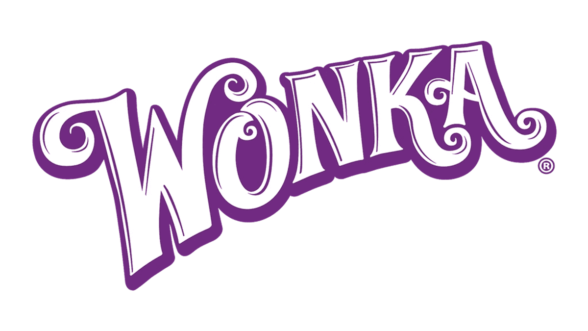
This logo takes a whimsical turn with its letters dancing in a flow of purple and white, reminiscent of a candy swirl. Eschewing the solidity of the 3D effect from before, it opts for a more fluid and organic feel, with curls and flourishes that suggest a fantastical and playful brand. The purple hue, often associated with both royalty and the mysterious, is lighter here, lending a friendly and inviting atmosphere. It’s a return to the fanciful roots of Wonka, emphasizing the enchantment and creativity at the core of the brand.
2015 – 2018
A deviation from previous character-focused designs, this iteration opts for a vibrant “Candy Shop” typeface reminiscent of swirling sweets, complete with highlights and shadows for a three-dimensional effect. Subtle incorporation of the “Nestle” brand hints at corporate ownership. The font choice and styling exude sweetness and excitement, appealing particularly to a youthful audience.
2023 – Today
The latest logo adopts a minimalist, contemporary approach, presenting “Wonka” in a playful, curvilinear typeface that evokes creativity and whimsy. Purple tones lend an air of luxury and mystery, synonymous with the Wonka brand, while swirling elements within the lettering evoke the brand’s fantastical and imaginative essence.


