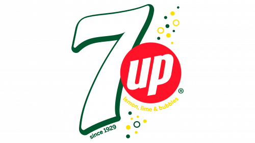
7UP Logo
7up is the original lemon & lime soft drink from America. There were some prior and after this one was introduced, but this one popularized the formula that most similar non-alcoholic beverages use even now. Since the 90s, they’ve been a subsidiary to Dr. Pepper.
Meaning and History
The drink was first introduced in 1929 as a ‘lithium-containing’ soft drink. Basically, it was marketed as a simple means to improve one’s mood. The name ‘7up’, however, wasn’t adopted until 1936. The name likely refers to lithium that was still one of the major ingredients. Its atomic mass is 7, after all.
1929
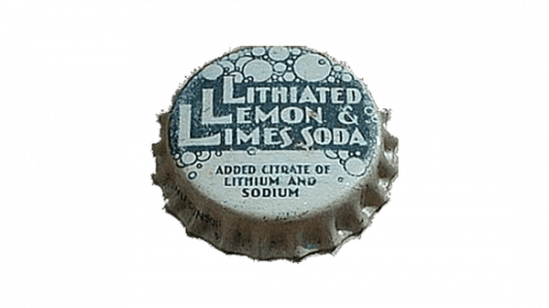
The very first logo of 7UP was printed on the aluminum bottle cap of the beverage and featured a bold stylized “Lithiated Lemon & Limes Soda” lettering in a geometric sans-serif font, written across the solid green rectangle and decorated by numerous bubbles in different sizes, with the outline in the same shade of green.
1929 – 1932
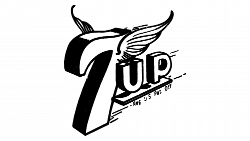
The first logo was usually a black-and-white brand name. It actually resembled a cartoonish episode, seeing how they took great care designing and drawing this emblem. They gave it a lot of volume and depth, which resulted in it looking very 3D for the time.
The ‘7’ in front had small wings closer to the top, and it actually looked as if the entire structure was flying down. The ‘up’ part was two capital yet small letters positioned on a shelf of sorts just behind and to the side of the main element.
1930 – 1931
The logo, used by the 7UP brand in 1930, featured quite a complicated composition, with the circular medallion divided into several segments: one for the stylized hand-drawn “7UP” inscription, the second, placed in the middle, for the additional lettering, and the bottom one with the bold serif “Seven Times As Good” motto of the brand.
1930
The redesign of 1930 has created a new image for the beverage brand: the tall “7”, with the bottom part of its elongated vertical bar decorated with bubbles, was based on a badge with the mountain landscape and a human standing on the left from it with its hands spread up. The underlined lowercase “Up” was placed in the upper right corner of the badge, while the “Lemon Soda” was underlining the logo.
1931 – 1939
In 1931 the 7UP logo got simpler and more progressive. The shadowed name of the sting was drawn in a custom handwritten typeface against a plain white background, and enclosed into a square frame. The lettering was decorated by several outlined bubbles.
1939
In 1939 all lines and contours of the 7UP badge were cleaned up and strengthened. Now the white logotype was placed on a solid black badge with rounded corners, and the nine bubbles got solid white now, with no outlines.
1939 – 1969
The emblem adopted second was the first truly colored logo. It had a red square sandwiched between two rather thin black lines. The red space was also filled with many white bubbles, seeing how it contained some carbonated water now.
Lastly, the name part was still white with black shadows, except the letters were now lowercase and there were no additional elements, such as wings or a shelf.
1966 – 1974
The predecessor of the iconic 7UP logo we all know today was introduced by the brand in 1966. It was green lettering in a heavy geometric sans-serif font, with the “7” separated from the “up” by a solid red dot. The composition was drawn on a transparent background with no additional elements.
1968 – 1974
By 1968, it was decided to simplify the design somewhat. What it meant for the logo is that only a red square and the white lettering now remained. They got rid of everything else.
1975 – 1980
The redesign of 1975 has created a very ornate composition, with the name of the brand executed in solid green circles of different sizes. Between the digit and the letters, there was a small red badge with the white “7UP” inscription, placed diagonally at the bottom line of the logo.
1977 – 1978
In 1977 the company introduced a new logo, which was completely different from all previous versions. This emblem featured elegant and sophisticated contours of the letters, and a super minimalistic black and white color palette, which enhanced the feeling of luxury and sophistication.
1980 – 1987
In 1980, the lettering was rearranged. Notably, they rotated the whole thing slightly counter-clockwise and emboldened the letters. The lowercase became uppercase, and they generally became thicker. Between the digit and the ‘U’, they also put a little red circle surrounded by thin white. This was meant to symbolize a bubble.
1987 – 1995
In 1987, they basically just took the name part away from the square confines and colored the letters dark green. The bubble remained red, and everything on the logo now had a thin white outline.
1989 – 1995
Another redesign, held in 1989, has simplified and straightened the 7UP badge, removing the outline of all elements, and switching a shade of green to a lighter one. The badge started looking more modern and friendly.
1995 – 2000
In 1995 the shade of green got deeper again, and the logo was stretched vertically, with some inclination to the right, which resulted in an emboldened and elongated vertical bar of the “7”.
2000 – 2010
Another labeling material, this time they made the letters and the digit silver with some shading, while also adding thick white outline and some thin green line further away. The circle became a ball (they basically gave it volume), and there was also a yellow & green ‘100% natural flavors’ ribbon below.
2010 – 2015
The 2010 logo was very much like the 1987 variant, except smoother, softer and white instead of green. The outline, comically, was now green instead of white. The red circle in-between also became a red ball this time.
2015 – 2024
The redesign of 2015 has refined the contours of the elements and darkened up its color palette, adding more gloss to the bright red sphere and thinning the dark-green outline of the characters. The logo looks very modern and stylish, with nothing extra or unnecessary.
2024 – Today
The 7UP logo redesign, held in 2024, has simplified the shapes of the badge, bringing them two-dimensional again. The white lettering, diluted by a massive red dot, is now written against a plain bright-blue background and lacks any additional elements, such as contouring or framing.
Emblem and Symbol
There are actually a lot more minor emblems used for subtypes of the original 7up. For instance, the 7up Gold uses the same emblems, except with the golden circle in the middle. 7up Plus had its own array of logo, often featuring a lot of color pink. There were many variations, you get the gist.
