Coca-Cola Logo
It is hard to find an individual who would not know what Coca-Cola is. The high quality of the drink and beautiful advertising brought Coca-Cola extraordinary success. Coca-Cola became the most famous brand and preferred drink in the world in a very short period of time. The Coca-Cola soda can help to cheer up and quench thirst on a hot summer day, replenish glucose reserves in the body, and increase stress resistance. Today, this soda is known in all countries of the world and is used as a component for alcoholic and non-alcoholic cocktails, and in its pure form.
Meaning and History
Coca-Cola has one of the most famous logotypes in the world. On May 8, 1886, the company was founded in Atlanta by pharmacist John Stith Pemberton. First drinks were presented as a medicine “for any nervous disorders” and were offered for bottling in a pharmacy. In 1893, an immigrant from Ireland acquired the Coca-Cola recipe from Pemberton’s widow. Together with his brother and two other associates, Asa G. Candler founded The Coca-Cola Company in Georgia. Cocaine was removed from the drink in 1905. During World War II, Coca-Cola opened two factories, one in Africa and one in Europe. The name Coca-Cola is a combination of the names of the two main ingredients found in the original recipe, kola nuts, and coca leaves.
What is The Coca-Cola?
This is a legendary drink brand with over a century-long history. The modern Coca-Cola drink recipe is one of the biggest trade secrets of today. According to statistics, 94% of the world’s population has tried Coca-Cola at least once in their lives or heard about the drink.
1886 – 1887
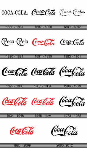
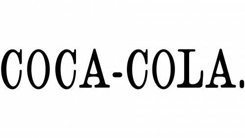
The first logo was rather plain. It featured the name of the company was written in all uppercase letters and was black. the addition of serifs made it look more elegant. There was a small dot at the end.
1887 – 1890
The logo recognized across the globe was first introduced shortly after the drink was created. It featured very intricate lettering inherent to pointed pen Spencerian calligraphy. Only the first letters were capitalized and looked different. The first letter “C” had a swirl that was underlining the first letter and was thicker than the other letters. The second word was written lower than the first and was about on the same level as the underlining swirl of the “C”.
1889 – 1892
The company decided to go with a more simple version of the logo, although both “C”s still had curves. They looked exactly the same and had small diamonds under the top curve. It was written in one line. The lowercase letters had serifs.
1890 – 1891
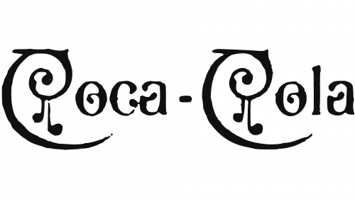
The new logo had a very different design than any of the previous versions. Some additional curved elements were added to all the letters and there were no more serifs.
1891 – 1899
In 1891, the Coca-Cola brand decided to come back to the logo design introduced in 1887 and has kept the same style ever since. There were only a few minor adjustments, which mostly made some elements slightly thinner and more delicate. The end of the “C” that was underlining the word now looked a lot sharper and more pointy. The font color was changed to a bright red one. There was also a thin, rectangular border around the emblem.
1893 – 1901
The company made its logo look a lot bolder. The first letter “C” was taller and wrapped around the next one. The ends of the first letters were redrawn and some other unnoticeable adjustments were introduced.
1899 – 1903
The company played with the logo design once again, but unless comparing the two logos side by side, it was hard to notice the updates.
1903 – 1934
All the letters looked even bolder than they did before, although fine, thin lines that created a beautiful contrast were still preserved. The lowercase letters were also made bigger. Other small details have been modified.
1906 – 1919, 1973 – 1985, 2008, 2012
This emblem was deployed on containers from 1906 up to the point in 1919 when Coca-Cola ceased utilizing paper tags. From the years 1973 to 1985, special edition bottles were crafted featuring this logo to mark the anniversaries of certain companies and bottling establishments. In the years 2008 and 2012, this design found its application again on holiday bottle packages, although the recreations were not entirely accurate. The usage of this emblem during different periods signifies its enduring importance in the brand’s history, reflecting the company’s nostalgic connection to its past and its inclination to commemorate its long-standing legacy. The occasional inaccuracies in recreation hint at the challenges in maintaining historical design integrity while adapting to modern production methods.
1934 – 1946
 The logo stayed almost untouched. The design was slightly improved but stayed true to its origins.
1946 – Today
The letters look somewhat thinner and the ends got sharper. The whole logo seemed to be stretched out vertically just a little. Otherwise, it looked very similar to the logos used since the last century.
1986 – 2009
The logo used during this period looked a lot like the one seen in the 1930s as it was bolder compared to a logo used since 1941.
Font and Color
The famous Coca-Cola logo is designed by Frank Robinson, Pemberton’s accountant. To do this, he used the so-called Spencerian calligraphy – the standard adopted in business correspondence in the United States before the advent of typewriters. Robinson is convinced that two large Latin Cs will look great in ads. Indeed, a distinctive font is what has actually made the brand. Its swirly design adds a degree of elegance and beauty. The colors of the logo were also very well chosen. Initially, the logo was black, but later, the familiar red color was introduced. Bright and attention-grabbing letters decorated with a lot of extra swirls look optimistic, fresh, youthful, and appetizing.
