Baskin-Robbins Logo
Baskin-Robbins is a popular American brand of ice cream cafes and sweet-shops. Initially, it was just a small ice cream shop in California, but over time the brand grew to immense sizes. Nowadays, it’s a worldwide brand, as well as the most popular chain of cafes in this category.
Meaning and History
The company was established in California, USA in 1945. Initially, they had several short-lived names, but they eventually settled upon Baskin-Robbins – after the second names of both founders. In late 2020, they’ve been purchased by Inspire Brands, a large food-oriented conglomerate from US.
1947 – 1991
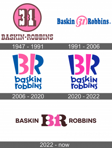
The first real BR logo established the emblem design used for the longest time by this company. It featured a pink circle with the number 31 written in white inside it. According to them, ‘31’ refers to the number of flavors traditionally offered in their cafes. The digits were a vintage style, slightly Gothic – with wide blocks on their tips.
The same font was used to write the company name below this emblem. Back then, it said ‘Baskin-Robbins Ice Cream’. The letters were all capital, brown and much smaller than the digits above.
1991 – 2006
The 1991 logo featured a similar concept, but a simpler execution. The numbers were now pink; they put them in the center of the logo and capped them with an incomplete pink ring. On each side, they placed a part of their then-name: ‘Baskin’ on the left and ‘Robbins’ on the right.
This time, the written parts were violet, and the font changed to the ordinary bold serif font.
2006 – 2020
The emblem in the 2006 logo is an example of a very creative design. They took the letters ‘BR (after Baskin and Robbins) and highlighted the parts in the middle that looked like ‘31’ in pink. This way, they both identified the company and put their iconic ‘31’ emblem on it.
Below, they’ve written the company name in the same blue color the rest of the ‘BR’ part is colored in. This time around, they stacked the words and made all the letters there lowercase.
