Starbucks Logo
Starbucks is a worldwide (originally American) chain of coffee stores. They are known for a wide array of coffee and coffee-related products with new offers being introduced all the time, as well as their outspokenness against pollution. Most notably, they try to use environmentally-friendly packages and ingredients.
Meaning and History
The name Starbucks doesn’t have anything to do with coffee. When the founders started the company back in 1971, they simply adopted the name because it sounded catchy. Because Starbuck is the name of a character from Moby-Dick, the logo also features an aquatic dweller, namely a mermaid. No idea why her in particular.
1971 – 1987
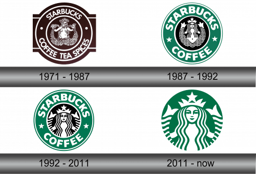
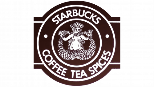
The very first logo was almost completely dark brown, except for white parts. For instance, the mermaid was one of such parts. It had a bare white torso with some brown elements, while her hair and two tails that went up from two separate sides were quite the contrary – brown with some whiteness for context.
Because it was set against a brown circle, it was also outlined in white. The circle was then surrounded by a white ring, then a thicker brown ring with the text ‘STARBUCKS • COFFEE TEA SPICES’ on it. Then a white ring again and two brown rectangles that sprouted from each side to give an effect of a wrapper.
1987 – 1992
In 1987, Starbucks decided to make a mermaid less detailed and more like a clip-art. Everything stayed the same concept-wise, although they added a star inside a crown she wore. This same design was used by Starbucks ever since.
Also, they turned the dark brown color into black and restricted it to the center. The main ring was now light green and featured the words ‘STARBUCKS ★ COFFEE’ in pretty much the same font, although thicker. The wrapper ends also disappeared.
1992 – 2011
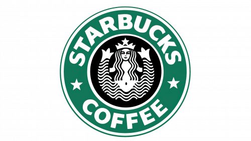
The logo stayed pretty much the same after the 1992 overhaul. The only real change was that the mermaid was now depicted waist-high plus both tails. Other than that, everything remained the same.
2011 – today
They went even further in 2011 by basically taking the central black piece with the mermaid inside, repainting it green and using it as a primary emblem. The outer ring with the text on it was scrapped, but the mermaid herself wasn’t touched at all.
Emblem and Symbol
The only reason why Starbucks used a random mermaid (or rather a siren) as their mascot was because the name of the company features a widely-known (for Americans) character from the book Moby-Dick. Since it already sounded nautical, they also included an image of a beautiful mermaid on a logo.
