Accenture Logo
Accenture is an international professional consulting and outsourcing company. Originally based in Ireland, Accenture is one of the leaders in the global market for professional services and digital technologies. It serves clients across the globe. One of Accenture’s top priorities throughout the company’s history has been to drive innovation that delivers value to its customers’ business on an industrial scale.
Meaning and History
Accenture’s history dates back to the late 1980s when the company was the consulting department of the accounting firm Arthur Andersen, which was based in Dublin, Ireland. In 2001, after a series of intra-corporate litigations, Arthur Consulting spun off into a separate structure and was named Accenture. Accenture’s name came from a combination of the words “accent on the future”. The head office of the company is located in New York. The company serves clients in over 120 countries and works with 75% of Fortune Global 500 companies.
What is Accenture?
Accenture is a consulting firm. It provides a wide range of services and solutions in the field of IT, finance, strategy, management, technology, and optimization of the company’s operations to any interested organization.
2001 – 2017
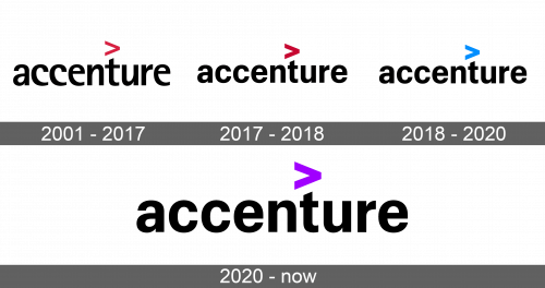
When the company became a separate entity and came up with a new name, it used that name as the main element of the logo. It was written using all lowercase letters and a vertically stretched sans-serif style font. The bottoms of the letters “C” and “E” looked like scoops or hooks. Above the letter “T”, there is a “>” symbol done in red color, which contrasted greatly against black letters.
2017 – 2018
Several years later, the company changed the font used for its logo. The new font had more rounded forms. There were clean lines and cuts. The letter “T” had a slightly diagonal cut at the top, which complimented the “>” symbol above it. The interesting accent detail in the form of a symbol also acquired a bolder look. Otherwise, the letters were still black and lowercase.
2018 – 2020
It was not long before a new change was introduced. The changes were not as substantial, though, as the last time. In fact, the only difference that one would notice is the change of color of the symbol. The red color was gone, and the company replaced it with a bright blue color, which typically stands for loyalty, stability, and intelligence and greatly compliments the essence of this company.
2020 – Today
The accent symbol color was updated once more. This time it was presented in purple color. The purple color represents creativity, transformation, power, and wisdom. It combines the calm stability of blue and the fierce energy of red, the colors the company has used before. Otherwise, the logo stayed unchanged from the year 2017.


