Adobe After Effects Logo
Adobe After Effects is a powerful video editing and visual effects software. It’s widely used in post-production for film and TV, offering tools for compositing, animation, effects, and more. Users can create intricate motion graphics and cinematic visual effects. Its key features include layer-based editing, a vast array of visual effects options, and integration with other Adobe apps. After Effects is essential for professionals in video editing, motion graphics, and visual effects industries.
Meaning and history
Adobe After Effects, a pivotal tool in video post-production, embarked on its journey in 1993. Initially crafted by the Company of Science and Art, its debut version, tailored for Mac users, broke new ground with its layering and compositing capabilities. Recognizing its potential, Adobe acquired the software in 1994, propelling it into a phase of dynamic evolution and seamless integration within Adobe’s suite.
Each iteration of After Effects brought novel features, enhancing its sophistication. The introduction of “parenting” in version 3.0 revolutionized how visual elements interconnect, while version 4.0 enriched the toolset with mask feathering and the exploration of 3D space. The 2013 shift to the Creative Cloud subscription model marked a new era, ensuring consistent updates and synergy with other Adobe applications.
Throughout its history, After Effects has been pivotal in crafting mesmerizing visual effects for cinema and television. Its timeline-centric methodology enables complex layering and nuanced animation, endearing it to motion graphics experts. The support for third-party plug-ins has further diversified its capabilities, fostering a rich ecosystem of added functionalities.
After Effects is recognized as a fundamental instrument in the realms of animation, motion design, and visual effects. Its growth mirrors the evolving demands and artistic innovations in digital video production, securing its position as a linchpin in the world of digital creativity.
What is Adobe After Effects?
Adobe After Effects is a renowned digital visual effects and motion graphics software, primarily used in the post-production process of film making, video games, and television production. It offers a comprehensive set of tools for animation, compositing, and special effects, enabling creators to bring cinematic visual effects and intricate motion graphics to life. This software stands out as a staple in the creative industry, known for its robust features and seamless integration with other Adobe products.
1993 – 1995
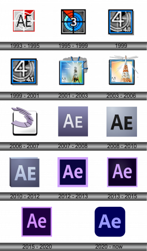
The logo for “After Effects” features a square icon in shades of gray, red, and white, adorned with two uppercase black letters “AE” in a plain, sans-serif font of medium weight. The primary hue of the icon is a light gray, complemented by a small red triangle positioned in the top right corner of the square, alongside a double white circle and a central white cross.
1995 – 1999
The logo in the image appears to be a stylized number “3,” divided into quarters with contrasting colors and patterns. The number “3” itself is white, bold, and slightly italicized, giving it prominence against the dynamic background. The entire logo is encased in a thin, dark border, and the composition is reminiscent of early digital art or 8-bit graphics, suggesting a theme of digital creativity or technology.
1999
The logo is a graphic centered around the numeral “4,” which is prominently embossed with a metallic sheen, conveying a sense of solidity and modernity. The “4” is set against a circular backdrop that has a brushed metal texture, suggesting a correlation with industry, technology, or machinery. Below the number “4,” there is a smaller inscription, “4.0,” indicating a version or iteration, reinforcing the idea of progression or a series. The entire emblem is framed within a square that has a blue border, providing a contrasting color that makes the metallic elements stand out. This border is not plain but has a subtle gradient, which adds depth to the design. The color scheme of silver and blue suggests a professional and clean aesthetic, often associated with technology or software products. The image as a whole, with its focus on the number and industrial textures, implies strength, advancement, and a step forward in a sequential process.
1999 – 2001
The primary difference between this logo and the previous one is the update in the product version number located in the bottom right corner of the design. It has changed from “4.0” to “4.1”.
The rest of the logo retains its original elements: the bold, embossed “4” set against a circular background with a brushed metal texture, and the blue border that frames the entire square.
2001 – 2003
This logo represents a significant departure from the previous iterations featuring the numeral “4.” Here, the design is more complex and illustrative, featuring an image of a broadcasting tower. This tower, depicted in black with yellow and green gradient highlights, stands against a sky-blue background, with white lines emanating from the pinnacle to symbolize broadcast signals.
The tower is centrally placed and is the most prominent feature, a change from the abstract numeral design, signaling a shift in branding strategy. The logo has evolved from a simple, version-focused design to a more narrative illustration.
In the background, a gradient from green at the bottom to blue at the top suggests a horizon, giving the logo a sense of space and environment. The inclusion of the Adobe logo in the bottom left corner establishes brand association, a new addition that wasn’t present in the previous logos. This design is enclosed in a three-dimensional square with a significant drop shadow, adding depth and a modern touch to the logo. This represents a move towards a more dynamic and realistic design language, contrasting with the flat, digital aesthetic of the earlier versions.
2003 – 2006
The evolution of the logo from the previous version involves several notable changes, particularly in its graphic elements. The broadcasting tower remains the central motif, but it is now rendered with more detail and color variance, including hues of orange and white, enhancing its three-dimensional appearance.
The background retains a blue sky, but the previous uniformity is replaced by a burst of light radiating from behind the tower, introducing a sense of dawn or activity commencement. The Adobe logo remains in the bottom left corner, maintaining brand consistency.
The square frame and the drop shadow of the previous logo are preserved, keeping the three-dimensional quality and modern aesthetic. The changes reflect a refinement in the logo’s storytelling, focusing on the idea of communication and dynamism in the field of media.
2006 – 2007
The logo represents a dramatic shift from its predecessor. Gone is the illustrative broadcasting tower, replaced by an abstract, swirling element. This new figure, composed of several curved, ribbon-like shapes, conveys a sense of fluidity and motion. The design is more minimalist and artistic, emphasizing form and space over the literal representation seen in the previous logo.
Color has also transitioned from the realistic blues and oranges to a monochromatic scheme with shades of purple, suggesting creativity and originality. This abstract creation floats over a soft, off-white background, encased within a rounded square with a subtle shadow that gives a slight impression of depth.
This evolution in design moves away from literal imagery to something that could represent transformation, agility, or a cycle of continuous development. The absence of any direct reference to broadcasting could imply a broader scope for the product’s capabilities or uses. Overall, the changes signify a brand willing to embrace a more contemporary, design-focused identity that aligns with trends in digital aesthetics.
2007 – 2008
The logo has undergone a complete transformation from the previous design. The abstract, swirling element is replaced by the bold, capitalized letters “AE,” which stand out against a purple background. This typographic approach is a significant shift towards simplicity and clarity, with the letters representing an abbreviation of the product’s name.
The letters “AE” are white, with a subtle shadow that gives them a soft three-dimensional effect. They are slightly left-aligned, leaving more space on the right, which could be interpreted as a design choice to suggest openness or potential for expansion.
The purple background is uniform, without the gradients or textures seen in previous logos, which emphasizes a modern and clean aesthetic. The color purple may be chosen for its associations with creativity and originality, traits likely valued by users of the product.
This new design direction indicates a preference for minimalist branding, focusing on recognizability and adaptability. The simplicity of the design ensures that it can be easily scaled and reproduced across various media, a practical consideration in digital branding.
2008 – 2010
The logo has transitioned from a purple to a gradient background that fades from a lighter shade at the top to a darker shade at the bottom. The letters “AE,” which previously stood stark white against the purple, are now a black, creating a subtler contrast with the background.
These letters have maintained their bold and capitalized style, ensuring the logo’s directness and recognizability. This enhancement of the letters’ depth could be indicative of the software’s sophistication and its ability to create dynamic, multi-dimensional content.
The overall feel of the logo has shifted from a playful and creative purple to a more professional and technical gray gradient. This could reflect a strategic repositioning of the brand to appeal to a more professional or industry-oriented audience.
The absence of additional graphical elements keeps the focus on the brand’s initials, signifying a confident assertion of the brand identity. The simplicity of this design ensures versatility and visibility across various platforms and sizes, an important consideration in contemporary digital branding.
2010 – 2012
The logo continues to evolve, this time adopting a more three-dimensional perspective. The gradient that previously swept from top to bottom now gives way to a more pronounced depth effect, as if the background folds inward. The letters “AE” remain central, but their styling has shifted from the flat design to a more three-dimensional appearance, with gradients that suggest a light source above them.
The color palette has also been muted; instead of the clear contrast between the letters and the background, there is now a more harmonious blend of similar hues. The letters themselves are lighter at the top and become darker towards the bottom, complementing the background’s shading.
Overall, the design retains a minimalist approach but adds a level of sophistication with its play on light and shadow. It suggests a brand that is evolving, deepening, and becoming more nuanced, much like the software it represents.
2012 – 2013
In the logo, a return to a bolder color palette is evident, featuring a vibrant purple frame surrounding a deep navy central rectangle. Inside this rectangle, the letters “Ae” are displayed in a lighter purple, differing from the previous logo’s dark gray “AE” against a gradient background.
The letters have shifted from uppercase to a combination of uppercase “A” and lowercase “e,” which softens the overall look and could suggest a more approachable or user-friendly product. The font style appears to be consistent, maintaining the brand’s recognizability.
This design embraces a flat look, moving away from the shadow and depth effects seen in the previous version. The flat design trend is known for its clean lines and simplicity, which can help in digital contexts where clarity and legibility are crucial.
The contrasting purple hues may be intended to evoke creativity and innovation, traits that are often associated with the product’s capabilities in visual effects and motion graphics. The simplification of the design could reflect an emphasis on ease of use and accessibility, appealing to a broad range of users from amateurs to professionals in the field.
2013 – 2015
The modification from the previous logo is subtle yet distinct—the purple frame that borders the logo has been slimmed down, creating a more streamlined appearance. This thinner frame gives greater emphasis to the central rectangle and the ‘Ae’ lettering within it, drawing the viewer’s eye more directly to the brand’s initials.
This reduction in the frame’s thickness aligns with modern design trends that favor minimalism and the idea that ‘less is more.’ A thinner border can convey a sense of modernity and can make the logo appear more refined and contemporary.
The rest of the logo, including the deep purple background and the lighter purple ‘Ae’ letters, remains unchanged, maintaining brand consistency and recognizability. This continuity suggests a stable and established brand identity, with the minor tweak to the frame signaling an attention to current design aesthetics without altering the overall brand image significantly.
2015 – 2020
This logo presents a darker theme compared to its predecessor. The background is now a deep, dark purple, which gives the overall design a more pronounced and bold appearance. The ‘Ae’ letters at the center are in a lighter shade of purple, creating a striking contrast that ensures the brand’s initials are the focal point.
The purple border surrounding the logo remains consistent in color with the ‘Ae’ letters, but its presence against the darker background adds a layered effect to the design. The logo’s corners are rounded, continuing the trend of approachability and user-friendliness.
The shift to a darker color scheme may suggest sophistication and could be perceived as a move towards a more professional or premium brand identity. Darker backgrounds are often associated with depth and luxury, and in the context of software, they can also be indicative of powerful and robust capabilities.
The logo maintains a balance between modernity and accessibility, with its simple color palette and clear typography. The emphasis on the ‘Ae’ ensures immediate brand recognition, while the dark theme indicates a mature product suited for creative professionals.
2020 – Today
In this rendition of the logo, there is a discernible shift in the purple hue used throughout the design. The background has deepened to a rich, dark blue-purple, providing a more pronounced contrast against the ‘Ae’ lettering, which remains a lighter shade of purple. This choice of a darker background may give the logo a more sophisticated and professional appearance.
The corners of the logo have been further rounded, enhancing the modern and user-friendly aspect of the design. This softer contouring aligns with current interface aesthetics, particularly within app and software design, where rounded corners are commonplace and thought to be more appealing in digital environments.
These adjustments in color depth and corner curvature reflect a continued commitment to a contemporary and approachable branding strategy. The darker background also allows the lighter ‘Ae’ to stand out more, ensuring the logo’s visibility across various platforms and against different backgrounds. The choice to keep the ‘Ae’ in a lighter shade maintains the brand’s connection to creativity and innovation, while the overall evolution of the design indicates an adaptability to current trends and user preferences.
