Okta Logo
Okta stands as a beacon in the tech industry, offering cloud software solutions. Todd McKinnon and Frederic Kerrest launched it with a vision. They chose San Francisco, a hub for innovation, as their starting point. The duo aimed to simplify access to applications through secure identity management. Okta enables companies to protect and connect their technology.
Meaning and history
Okta’s story took off in 2009, marking its inception into the tech sphere. The founders, drawing from their rich experiences, identified a gap in the identity management market. They sought to fill this void with Okta. Over the years, it has become a pivotal player, especially with its public debut on the stock market in 2017. This event underscored Okta’s growing influence and success in the industry. At its core, Okta facilitates seamless, secure access for users across any application, anytime, anywhere. This mission has guided its journey from a promising startup to a global leader in identity management.
What is Okta?
Okta serves as a crucial tool for businesses, focusing on secure identity management. It operates as a single, integrated platform that manages and secures user access to applications and services. By doing so, Okta enhances organizational security and efficiency. Its user-friendly approach ensures that accessing necessary tools is simple and secure for everyone involved.
2009 – 2010
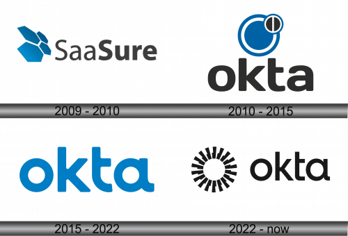
The logo for “SaaSure” presents a graphic of abstract, interlocking shapes on the left, set in a confident blue color that suggests stability and trust. These shapes might symbolize connectivity or the assembly of various components into a whole, reflecting the integration aspect of SaaS platforms. The company name employs a strong, clean sans-serif font, which allows for clear legibility and a modern feel. The “Saa” in “SaaSure” is subtly highlighted, possibly to emphasize the company’s area of expertise in “as a Service” solutions.
2010 – 2015
The logo portrays the name “okta” in a robust, sans-serif typeface that suggests reliability and approachability. Above the title there is a circular blue motif with an overlying dark circle. The design’s use of blue conveys professionalism and security, which are critical in the field of identity management that Okta operates in. The overall look is sleek and modern, aligning with the technological sector.
2015 – 2022
The evolution of the logo strips away complexity for a bolder simplicity. The abstract symbolism is shed, leaving only the name “okta” in a unified, vibrant blue. Each letter connects seamlessly, suggesting integration and flow. The typeface is modern, rounded, and approachable, emphasizing accessibility and friendliness. This minimalist approach reflects a confident brand, one that’s become synonymous with streamlined and effective identity management solutions.
2022 – Today
The logo displays “okta” in black, using a bold, modern sans-serif font that exudes strength and simplicity. To the left, a circle surrounded by radiating lines suggests a burst of energy or rays of light, symbolizing expansion and reach. The stark contrast of black against white conveys clarity and precision, core values for a company dealing with digital identity management. This design merges simplicity with a sense of forward motion.
