Adobe Illustrator Logo
Adobe Illustrator, a leading vector graphics software, excels in creating scalable illustrations, logos, and typography. Its precise tools aid in intricate designs, while its compatibility with various file formats and Adobe Creative Cloud enhances its versatility. Renowned for its professional-grade capabilities, Illustrator is widely used in graphic design, web design, and digital art.
Meaning and history
Adobe Illustrator, a cornerstone in vector graphics software, debuted in 1987, revolutionizing graphic design with its precision and scalability. Initially exclusive to Apple Macintosh, it provided unparalleled tools for digital illustration, quickly becoming a staple in professional design. Throughout its evolution, Illustrator has consistently introduced innovative features, like Bezier curves, enhancing its drawing capabilities.
The 1990s saw Illustrator’s expansion to Windows, broadening its user base. It integrated with Adobe’s growing suite, notably with Photoshop, streamlining cross-application functionality. The 2000s marked a significant shift towards comprehensive creative solutions, as Illustrator played a key role in the Adobe Creative Suite, offering robust tools for designers and artists.
In recent years, Illustrator has embraced cloud-based services, facilitating collaboration and accessibility across devices. Its continuous updates reflect the changing landscape of design, with features like touch compatibility and advanced typography tools. Today, Illustrator remains an industry benchmark, synonymous with high-quality vector graphics and design versatility, catering to a wide range of creative professionals worldwide.
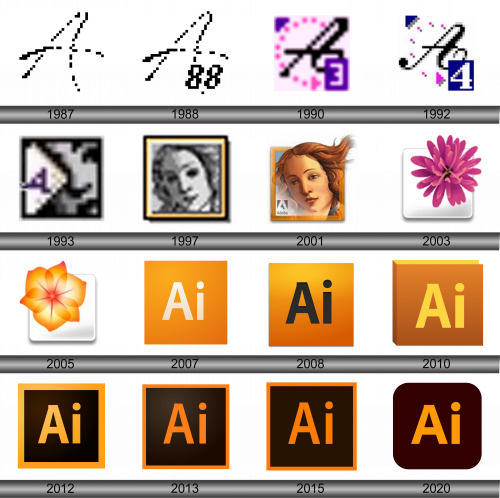
1987
The logo features a pixelated representation of the letter “A”, constructed using a grid of black squares on a white background. This digital portrayal captures the essence of early computer graphics, where each pixel plays a crucial role in creating the overall shape, reminiscent of 8-bit art and design from the dawn of the digital age.
1988
In this logo, the letter “A” is constructed from a series of black pixels, creating a bold and abstract representation of the character. Accompanying the “A” are additional pixels that appear to form the number “88,” denoting the year of a version Adobe Illustrator. This stylized digital emblem serves as a nod to the aesthetics of early computer graphics, where simplicity and directness were key to visual communication.
1990
In the third iteration of the software, the emblem underwent a sophisticated transformation, adopting an array of fresh hues. The mark now presented itself as an assertive and slanted black “A”, nestled within a vibrant fuchsia orb, meticulously crafted from a collection of compact, filled circles. A strikingly bold, eggplant-hued quadrilateral, brandishing a crisp, white numeral “3” at its lower starboard quadrant, joined the composition. Furthermore, a lilac-hued deltoid graced the apex left quadrant, providing a harmonious counterweight to the design. This redesign signaled a new chapter, reflecting the software’s growing complexity and feature set. It signified a leap in visual identity, mirroring the advanced capabilities and enhanced user experience of the upgraded software, marking its stature in the digital design realm with a logo that was both iconic and indicative of its progressive nature.
1992
A rich, deep blue supplanted the previous purple, and a prominent white “4” took the place of the “3”, heralding the software’s latest release. The dots that once formed a crescent surrounding the “A” evolved into square pixels, each casting a subtle gray shadow, adding a sense of depth. This evolution in design not only marked a new version but also a leap forward in the software’s sophistication and capabilities. It represented a transition into a more digital-focused era, with the pixelation reflecting the software’s increasing alignment with the burgeoning digital design industry. The use of shadows brought a touch of realism to the logo, suggesting the software’s potential for creating lifelike textures and depth in graphics, a hint at the powerful rendering abilities that lay within the program’s latest update. This visual shift symbolized the brand’s forward momentum and its commitment to staying at the cutting edge of design technology.
1993
The emblem underwent another creative overhaul. This time it featured a profile of a woman’s visage, superimposed by a pristine banner sporting a regal purple “A”. The imagery was rendered in a classic monochromatic scheme, exuding elegance and a sense of the eternal. This redesign brought forth a fusion of traditional grace with contemporary branding, suggesting the software’s capability to cater to classic design principles while pushing the boundaries of modern graphic artistry. The use of a human element introduced a personal touch to the software’s identity, reflecting its user-friendly nature and the organic creativity it aimed to inspire. The choice of a monochrome palette emphasized the software’s focus on simplicity and sophistication, underscoring its commitment to providing powerful tools that enable designers to create works that are both impactful and enduring. This image stood out as a beacon of the brand’s evolving narrative, one that spoke to both its heritage and its trajectory towards shaping the future of visual design.
1997
The logo features a pixelated grayscale rendition of Venus, reminiscent of the illustrious Botticelli work. She’s enshrined within a square border, boasting a duo of yellow and black, which imparts a striking visual frame. This digital interpretation marries classical artistry with a hint of modern minimalism, reflecting the software’s prowess in bridging art history with digital innovation. It’s a visual metaphor for the seamless fusion of traditional beauty and contemporary design tools.
2001
This logo presents a refined, full-color portrait of Venus, a departure from the previous monochrome depiction. The image is framed in a golden square, with the Adobe branding more pronounced. Unlike the earlier pixelated version, this rendition is smooth and detailed, showcasing the software’s advancing graphic capabilities.
2003
The current logo features a stylized purple flower on a white square backdrop, a shift from the classical artistry of the previous Venus portrait. This floral motif symbolizes creativity and growth, aligning with the software’s creative potential.
2005
This iteration of the logo displays an orange flower with gradient petals, centered on a white square, marking a transition from the previous purple bloom. The warm hues convey energy and innovation, reflecting the software’s dynamic nature.
2007
The logo features the letters “Ai” in white against a gradient orange backdrop, simplifying the previous design’s flower to a clean, modern typography. This shift signifies Adobe Illustrator’s focus on clarity and efficiency in design.
2008
The emblem features the characters “Ai” in a striking, deep hue, contrasting with the luminous orange gradient backdrop. This version enriches the earlier flat orange design with a sense of dimension, infusing the simplicity with a sleek, contemporary edge.
2010
The emblem features the “Ai” letters in gold against a three-dimensional, orange-toned backdrop, adding depth compared to the previous two-dimensional design, suggesting the software’s layered complexity.
2012
The logo displays “Ai” in golden letters set against a dark backdrop within a yellow border, contrasting with the earlier light background, lending a bold, sleek look.
2013
The logo features the “Ai” letters in a bright orange hue set against a dark background, encased in an orange border. It maintains the previous version’s contrast but with a more vibrant orange, enhancing visibility and modernity.
2015
This logo iteration retains the “Ai” initials in a vivid orange, against a deep brown backdrop, encased in an orange frame. It’s a slight alteration from the previous design, darkening the background for a more striking contrast.
2020
The emblem presents a distinct “Ai” monogram bathed in a vibrant amber glow, set against a background of deep espresso. The logo’s soft, curved edges suggest a modern, accessible tool designed for creative fluidity and ease of use in digital design.
