Airtel Logo
Airtel, officially known as Bharti Airtel, is a telecommunications company based in India. It operates in various countries across Asia and Africa and provides a range of services, including mobile and fixed-line telephony, broadband, digital television, and more. Airtel is one of the largest mobile network operators globally, serving millions of customers. The company is owned by Bharti Enterprises and is a prominent player in the telecommunications industry, offering connectivity solutions to diverse markets.
Meaning and history
Founded in 1995, Bharti Airtel, commonly referred to as Airtel, is one of India’s leading telecommunications companies. Its history is marked by significant growth and expansion both within India and internationally.
Early Years (1995-2000s): Airtel was founded by Sunil Bharti Mittal and started as a small company offering mobile network services in Delhi, India. It quickly expanded its operations across India, capitalizing on the growing demand for mobile communication services. During the early 2000s, Airtel established itself as a prominent player in the Indian telecom industry.
International Expansion (2000s): In the mid-2000s, Airtel embarked on an ambitious international expansion strategy. It entered various African markets, acquiring several mobile network operators in countries like Nigeria, Kenya, and Uganda. This move marked Airtel’s presence on the global stage and solidified its position as one of the world’s largest telecommunications companies.
Strategic Partnerships and Innovations: Airtel continued to innovate and invest in its network infrastructure. It formed strategic partnerships with technology companies and introduced new services, including 4G LTE and mobile money services, to meet the evolving needs of its customers.
Ownership Changes: While Sunil Bharti Mittal remained at the helm of Airtel, the company experienced changes in ownership structures over the years. Bharti Enterprises, the founding company, maintained a significant stake in Airtel, ensuring continuity in its leadership.
Diverse Service Offerings: Airtel diversified its offerings beyond mobile services. It ventured into fixed-line broadband, digital television, and enterprise solutions, becoming a comprehensive telecom service provider.
Challenges and Competition: Airtel faced stiff competition from other telecom giants in India, such as Reliance Jio and Vodafone Idea. This competition led to price wars and a constant need for innovation and cost management.
Global Recognition: Airtel received global recognition for its commitment to quality and innovation. It became known for providing reliable mobile and broadband services across its extensive network.
1995 – 2010
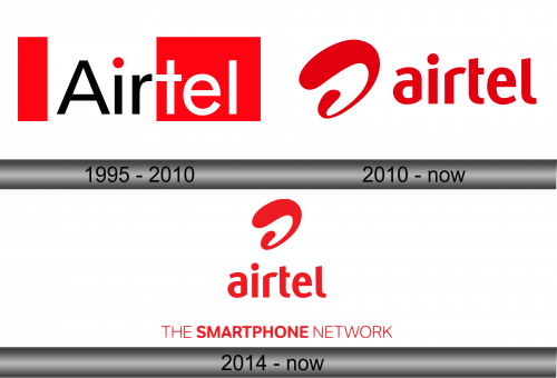
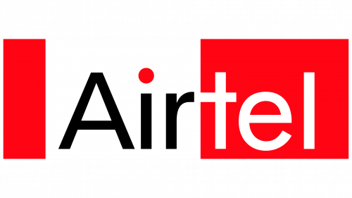
The initial rendition features a bicolored rectangle with a white stripe flanked by two red ones. Against the bright backdrop, the operator’s name begins with “Air,” executed in black letters with a red dot perched above. In the red portion, the second part of the name, “tel,” is displayed. The lettering adopts an unassuming sans-serif font, exuding a sense of austerity with its straight lines. The sole element that deviates from this strictness lies in the connection between the letters “r” and “t,” where they meet along a single line bridging the cap and crossbar.
2010 – Today
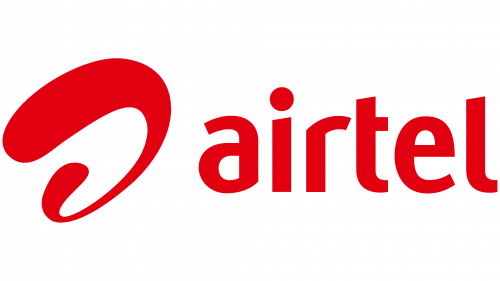
The company’s continued expansion prompted a revamp of its global telecommunications network strategy, necessitating a rebranding effort. This significant strategic shift began in 2010, with the adoption of a new logo proposed by the London-based agency, Brand Union. The emblem, as envisioned by the agency, emerged from a six-month online competition and symbolizes the boundless nature of telecommunications.
The logo is anchored by a stylized letter “a,” often referred to as the “Airtel wave” by the company. This semi-swirling symbol takes center stage, positioned in front of the service name and rendered in vibrant red. It’s composed of a single line, which gradually tapers in distant areas and widens as it approaches, creating a sense of spatial perspective.
2014 – Today
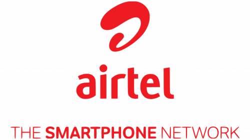
In 2014, the telecommunications company introduced an additional logo alongside the one created in 2010. This version boasts a more structured design, featuring the phrase “THE SMARTPHONE NETWORK,” with the second word boldly emphasized, while the other letters maintain a slender appearance. The motto is presented in a grotesque font and is centered at the bottom of the logo.
Above the motto, you’ll find the company name “Airtel,” presented in the traditional custom lowercase style. Positioned even higher in the design is the brand’s iconic symbol, resembling a wide, contorted spiral. The emblem exhibits a plastic-like quality with its smooth curves and rounded ends and incorporates the letter “a.” It maintains the color red, reminiscent of the previous logo but with a hue akin to a light marsala tint.


