Atari Logo
Atari, an iconic brand rooted in video gaming history, has evolved over the decades. Currently, it delves into various sectors, including digital gaming, online casinos, and blockchain-based projects. While the company maintains a foothold in gaming, it’s also exploring new frontiers like Atari Token, a cryptocurrency. Its global presence remains, catering to a diverse audience with a mix of classic and new-age offerings. Owned by Atari Interactive, a subsidiary of the French publisher Atari, S.A., the brand continues to innovate, blending its rich legacy with contemporary tech advancements.
Meaning and history
Atari, founded in 1972 by Nolan Bushnell and Ted Dabney, revolutionized the gaming industry with the launch of Pong, its debut arcade game. The company rapidly expanded, introducing the Atari 2600 in 1977, a pioneering home gaming console that cemented its place in video game history.
However, the early 1980s saw challenges. The video game market crash of 1983 severely impacted Atari. It split into two in 1984: Atari Corporation (hardware) and Atari Games (arcade games). Warner Communications, the parent company, sold Atari Corporation to Jack Tramiel, former Commodore International CEO. Atari Games remained under Warner’s control, later sold and renamed Time Warner Interactive.
Under Tramiel, Atari Corporation refocused on personal computers but struggled to compete with giants like IBM. The 1990s brought more shifts. In 1993, Atari released the Jaguar, a console claiming to be the first 64-bit gaming system. Despite this, it couldn’t outpace competitors like Sega and Sony.
By 1996, facing declining sales, Atari Corporation merged with disk drive manufacturer JTS Inc. However, the brand wasn’t dormant for long. In 1998, Hasbro Interactive acquired Atari assets, reviving popular games for newer platforms. Come 2000, Infogrames, a French software firm, acquired Hasbro Interactive, thus inheriting the Atari brand.
Infogrames rebranded as Atari, S.A. in 2009, striving to reinvent the once-mighty gaming name. Over the next decade, Atari grappled with financial issues, even filing for bankruptcy in 2013. It emerged leaner, focusing on digital and mobile games.
Today’s Atari navigates a dynamic landscape, melding its storied past with ventures into blockchain and online casinos. A tale of innovation, rise, fall, and rebirth, Atari’s legacy is an integral chapter in the annals of gaming.
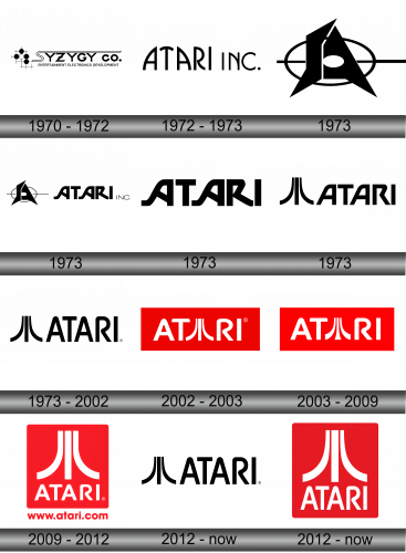
1970 – 1972
Atari’s emblem showcased a unique font design. A prominent elongated section of the white “S” stood out, creating an overarching line above the remaining characters. Contrasting this, the subsequent text adopted a dark hue. Anchoring the design at its base, an additional line provided further insights about the enterprise. A quintet of orbs — a singular white sphere flanked by four darker counterparts — embellished the forefront. These elements were set against a checkered backdrop, lending depth and texture. Notably, the “S” was crafted with a dual-outline, adding a layer of visual intrigue to the design. The entire configuration resonated with Atari’s innovative spirit, weaving an emblematic tapestry that merged classic and contemporary motifs.
1972 – 1973
Following the company’s image overhaul, the logo experienced a fresh transformation. The name “Atari” was presented with the characters “A” and “T” symmetrically aligned, emanating a harmonious aura. Their configuration mimicked a subtle ramp, achieved by softening the apex of the pivotal character. Meanwhile, the “RI” segment was distinctively set apart, emphasizing its individuality. Utilizing uppercase lettering, the typography exuded strength and prominence, all rendered in a deep ebony shade. This design choice showcased a blend of modernity with classic undertones, mirroring Atari’s journey of evolving while staying true to its roots. The emblem stood as a testament to the brand’s adaptability and iconic status in the industry.
April – June 1973
In crafting the emblem, the creative team leveraged distinct visual components to echo the gravitas of a notable logo. They ingeniously modified the characters “S” and “A”, infusing them with an edge reminiscent of broad knife blades. Serving as a foundational backdrop was an ellipse, reminiscent of an archery target, from which linear patterns emanated outward. This fusion of elements underscored precision and directionality, encapsulating the essence of purpose and mission. The unique melding of letter form and symbolic imagery created an indelible mark, establishing a powerful visual narrative that resonated with the brand’s core ethos and identity. The entire design process was a meticulous journey of marrying aesthetics with profound meaning.
June – July 1973
The visual emblem seamlessly integrated with the textual representation. Presented in uppercase lettering, nuances like the curvatures of the “R” and the dual “A”s accentuated their fluid and sleek design, devoid of any sharp angles or indents. Each component was laid out in a linear, horizontal sequence. The cohesive design approach aimed at creating a harmonious interplay between typography and graphics. This alignment not only ensured clarity and readability but also lent a contemporary flair to the overall aesthetic. The synthesis of these features reflected the brand’s commitment to modernity and simplicity, creating a visual narrative that resonated with the audience.
July 1973
During a brief span in early July 1973, a particular emblem was exclusively employed. It was during this fleeting period that the brand showcased this distinctive design, which, despite its short-lived usage, left an indelible mark on the chronicles of brand identity. This fleeting glimpse into the brand’s artistic direction during this specific window of time offers an intriguing perspective on its evolution and its willingness to experiment with its visual representation. Over the years, many logos come and go, but those with a transient presence often pique the interest of enthusiasts and historians alike, given the stories and contexts they encapsulate.
July – August 1973
During this phase, a trilinear design reminiscent of a monolith surfaced. The central line remained straight, while the flanking lines exhibited an inward curvature. Adjacent to this, the company’s name was prominently showcased. Each letter possessed slanted apexes, with the notable exceptions of “T” and “I,” which were fashioned with right angles. Intriguingly, the “R” was designed in a semi-open manner. Its top portion didn’t completely meet the other side, symbolizing Atari’s welcoming nature and willingness to embrace new horizons. This unique design choice underscored the brand’s innovative spirit and its commitment to maintaining a dynamic, forward-looking approach in all its endeavors.
1973 – 2002, 2012 – Today
The distinct Atari emblem is the brainchild of the company’s internal graphic artist, George Opperman, founder of Opperman-Harrington Inc. Atari’s originators, Ted Dabney and Nolan Bushnell, commissioned him for the design of their arcade setups.
In addition to Opperman, Bushnell collaborated with the creative director George Faraco on the logo’s conception. Bushnell handed Opperman an intriguing yet daunting assignment: to craft an emblem, easily discernible from afar, utilizing a few striking strokes, adaptable to varied platforms.
Among the multiple design propositions offered by Opperman, one caught Bushnell’s eye. It featured a bold, central vertical stroke, flanked by contrasting arcs on either side. One arc appeared to ascend, while its counterpart descended, reflecting mathematical graphs of growth and decline. Alongside this unique form, the word “ATARI” was inscribed in a custom font, also developed by Opperman. He added a touch of finesse by gently rounding the apexes of the “A” and “R”. Notably, the “R” was particularly distinctive due to its unconventionally open upper segment.
2002 – 2003
In 2002, the design team revamped the logo by embedding it within a crimson rectangular backdrop. The trio of distinct lines, initially expansive, was compressed and merged within the “ATARI” text, substituting the central “A.” The lettering transitioned to a stark white hue, providing a vivid contrast against the radiant canvas. The font underwent subtle modifications: the apexes of the “T” were gently curved, infusing a harmonious symmetry into the overall design. Furthermore, the transformation intended to enhance brand visibility, ensuring that the logo maintained its impact across various platforms and mediums. This refreshed design marked a new era for the Atari brand, encapsulating both its legacy and its forward momentum.
2003 – 2009
The former deep crimson underwent a transformation, evolving into a more vibrant shade. The iconic Atari emblem received subtle tweaks: designers expanded the base of the lines, giving the lateral curves a semblance of twin crescents, while the middle vertical line mirrored the pinnacle of a trumpet. This rejuvenated design made its debut on the packaging of the 2003 video game, “Putt-Putt: Pep’s Birthday Surprise.” The adjustment was more than just aesthetic; it breathed fresh life into the brand, capturing the dynamic spirit of the gaming industry while paying homage to Atari’s storied legacy in the realm of digital entertainment.
2009 – 2012
The design’s previous resemblance to musical instruments, like trombones and horns, was completely revised. The iconic three-striped emblem was detached from its association with the letter “A,” creating a distinct separation between the logo and the brand name. These two elements were now positioned on separate tiers. Encasing them was a ruby-hued block, its edges softened by gentle curves. Lying directly below this emblematic arrangement was the web address of the company, subtly guiding audiences towards Atari’s digital portal. This redesigned image was not just a visual refresh but a statement, emphasizing Atari’s evolving identity in the modern digital landscape.
2012 – Today
In 2010, Atari made a nostalgic leap, reverting to its iconic 1970s design. This vintage design featured the distinguished three-striped emblem and the brand name beneath, both nestled within a ruby rectangle, its edges subtly curved. An alternate variant showcases a diminutive red insignia on the left, juxtaposed against the brand name on a pristine white backdrop to the right.
This emblem resonates deeply with retro gaming enthusiasts, maintaining its relevance almost five decades post its debut. In the annals of logo design, its legendary stature can perhaps be equated with the Nike swoosh. But unlike the simple Nike checkmark, Atari’s symbol bears a richer narrative.
George Opperman, the mind behind this timeless design, drew inspiration from the rudimentary video game, PONG. As he recounted in a 1983 conversation, the game’s kinetic motion of a ball ricocheting between two paddles, influencing the centerline, was the muse for the emblem.
There’s also an intriguing story behind the stylization of the “A.” Opperman had an ‘aha’ moment while watching PONG, which clarified the design path for him. Interestingly, many interpret the emblem as representing a ping-pong net (the central line) and two opponents (the flanking curves). Some even associate it with Mount Fuji, oriental symbols, or even spiritual emblems, though these connections are far from intentional.
Nolan Bushnell, Atari’s founder, however, dismissed these interpretations as mere “fables.” Responding to Opperman’s interview, he emphasized that the design was devoid of concealed significances. To him, it was a straightforward trio of bold lines, sans any profound subtext. Regardless of its origins or interpretations, this symbol has etched its legacy, illuminating the vast expanse of video gaming history.


